Design consistency across every channel
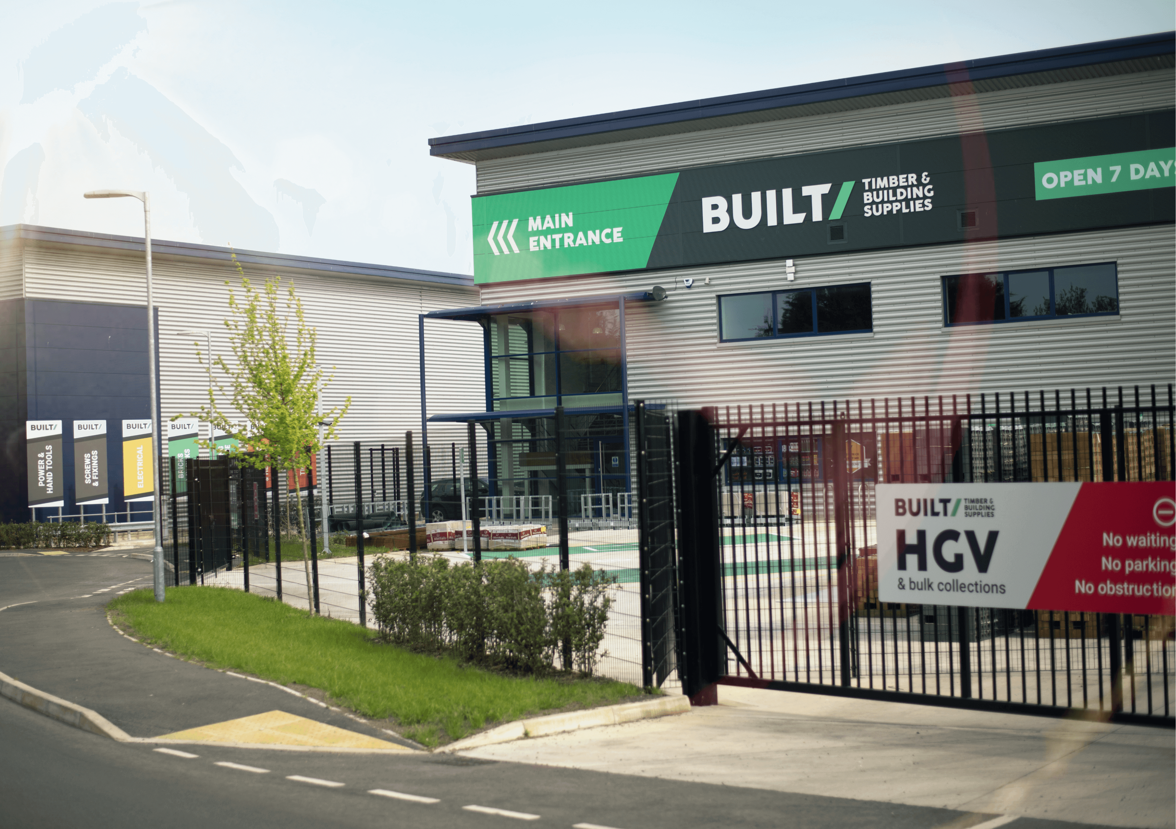
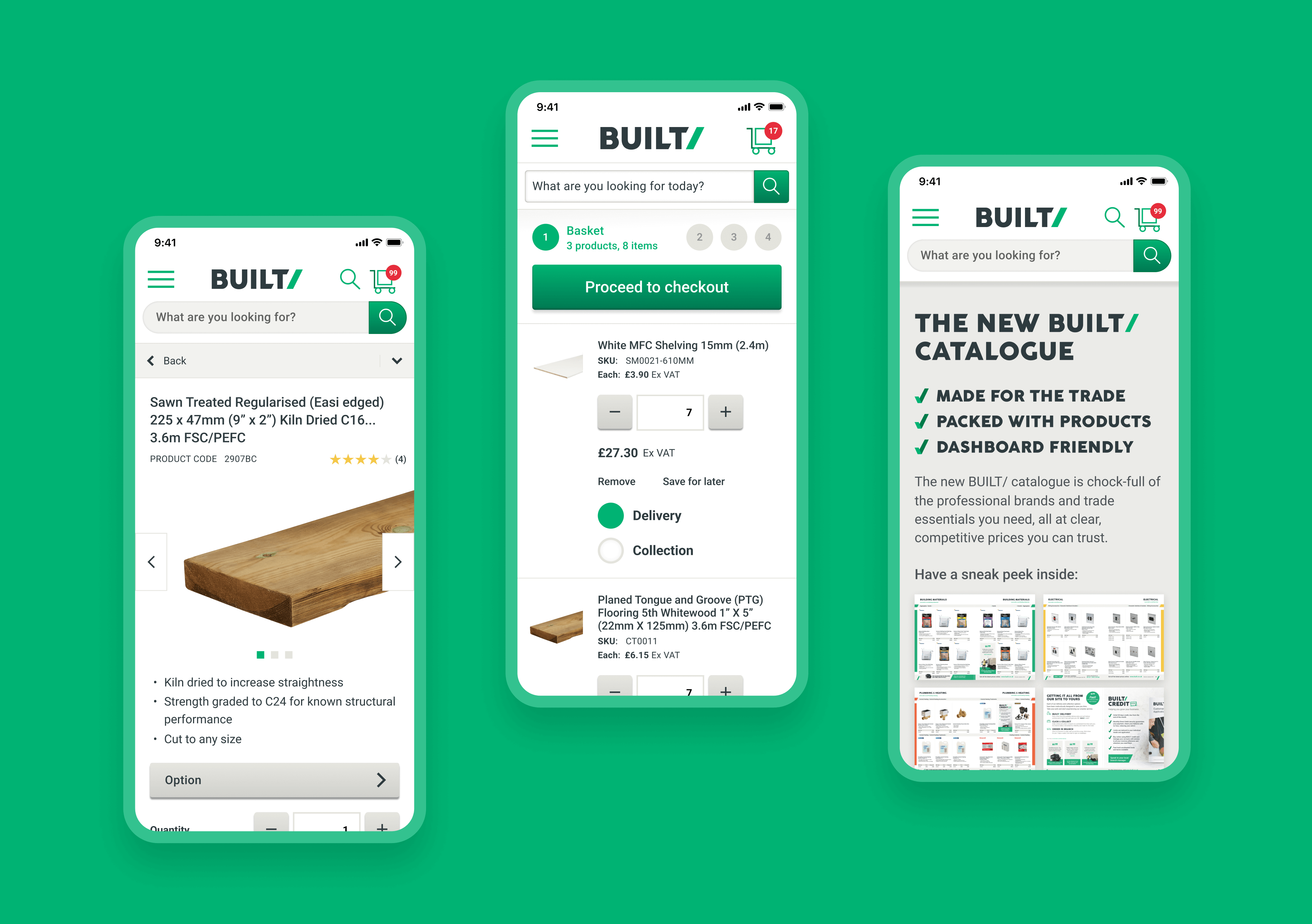
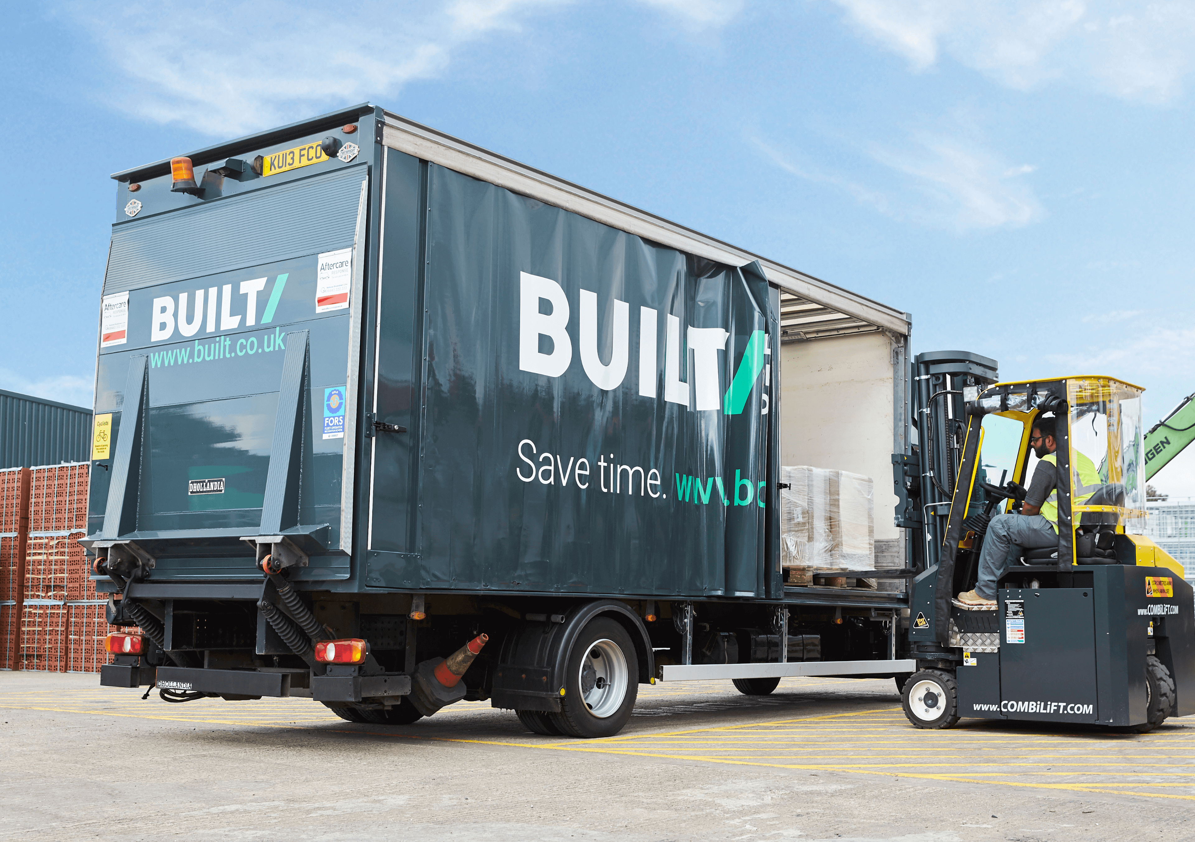
A thorough design system created for 20+ touchpoints across physical and digital spaces.
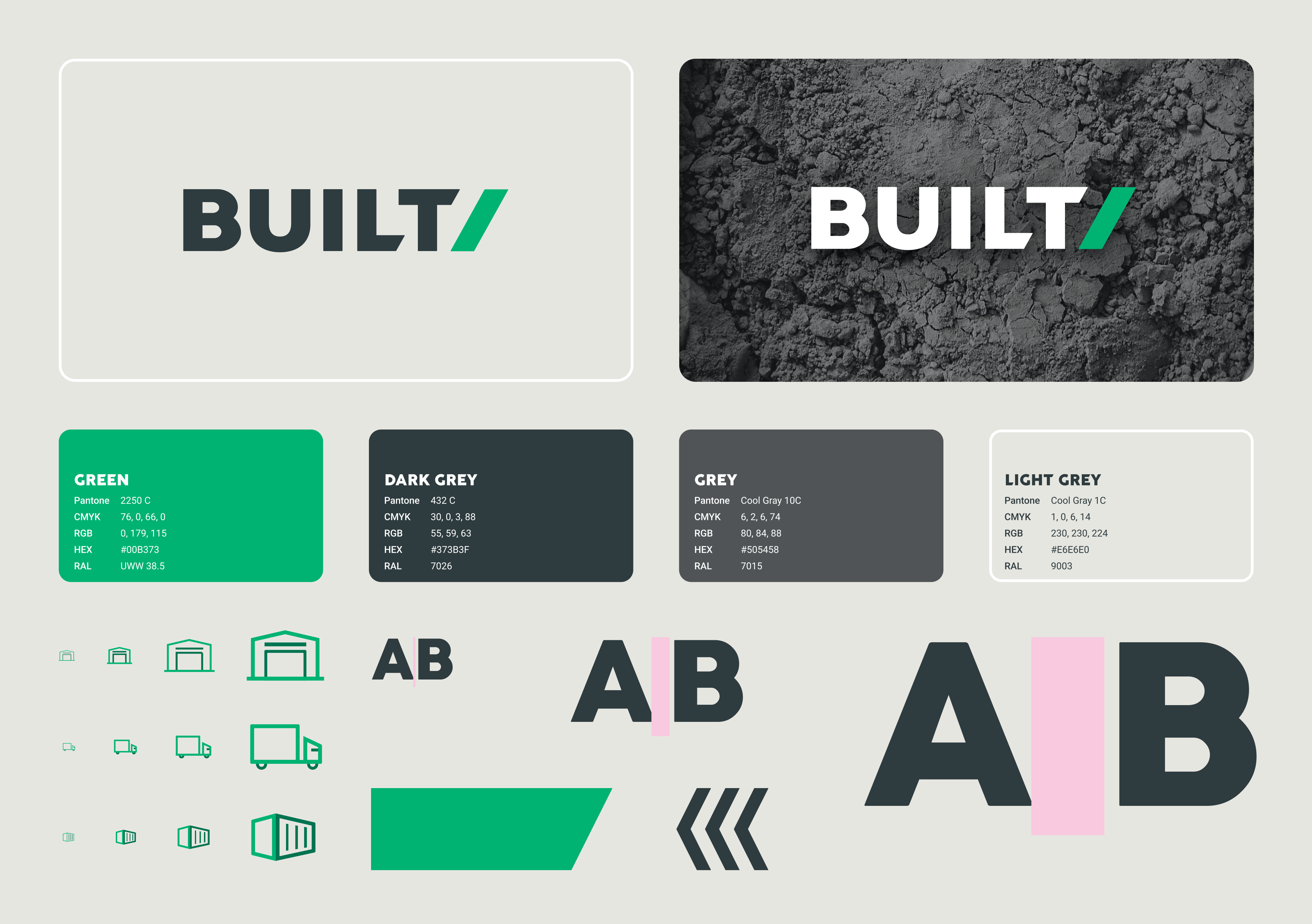
38 scalable icons with responsive variables including app, web, print, and signage.
40% reduction in design time for new features, including physical store changes and updates.
Details
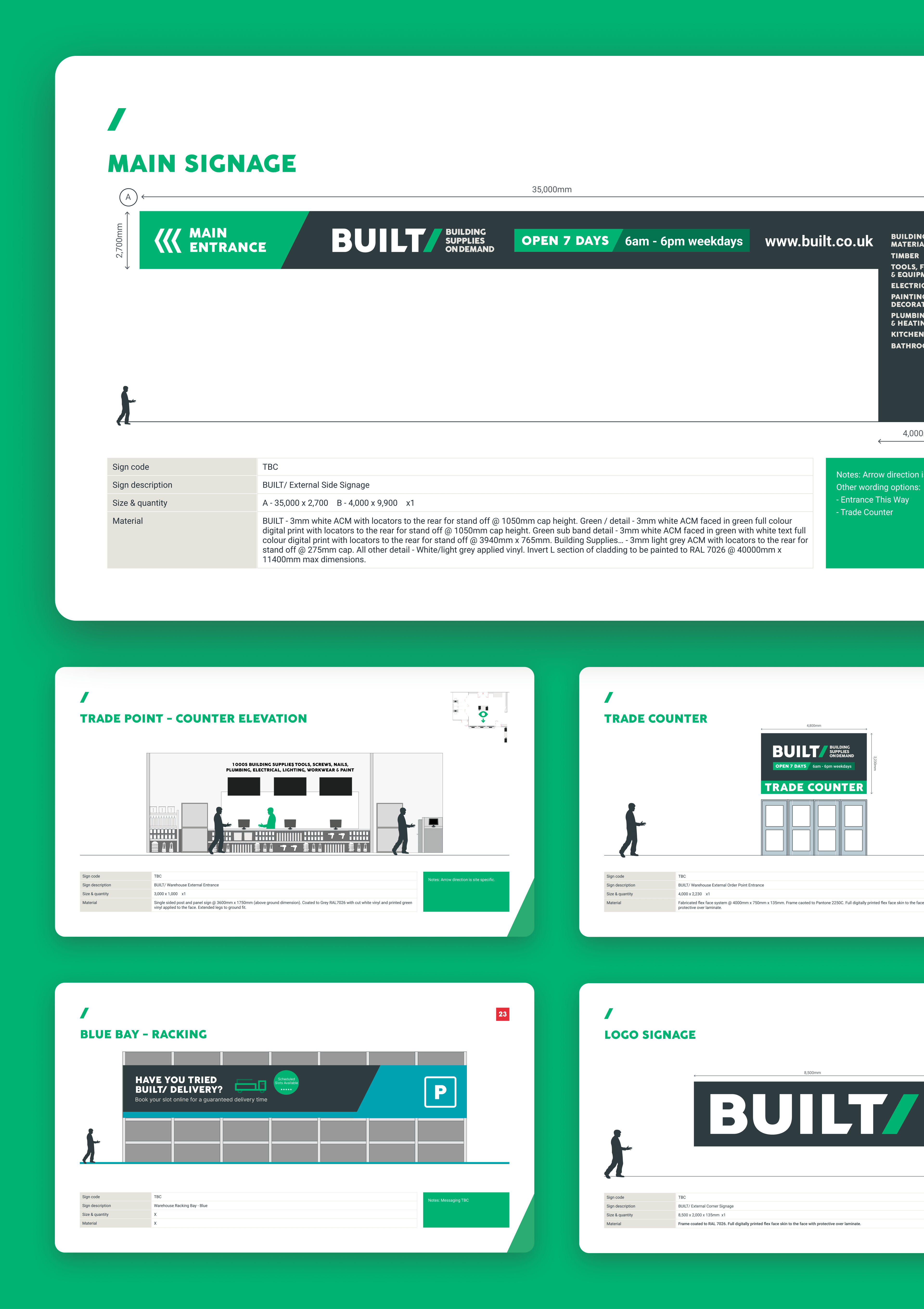
We effectively engineered a cohesive, modular Design System for BUILT/, a Travis Perkins pilot business providing on-demand building supplies to tradespeople. Every element, meticulously designed, cohesively ties together across all touch points - from in-store kiosks to apps and other digital real estate - fostering consistency and meaningful user experiences. By adopting our uniquely circular process, we ensured that every design aspect resonated with the brand's identity and added tangible value, positioning BUILT/ for a seamless launch.
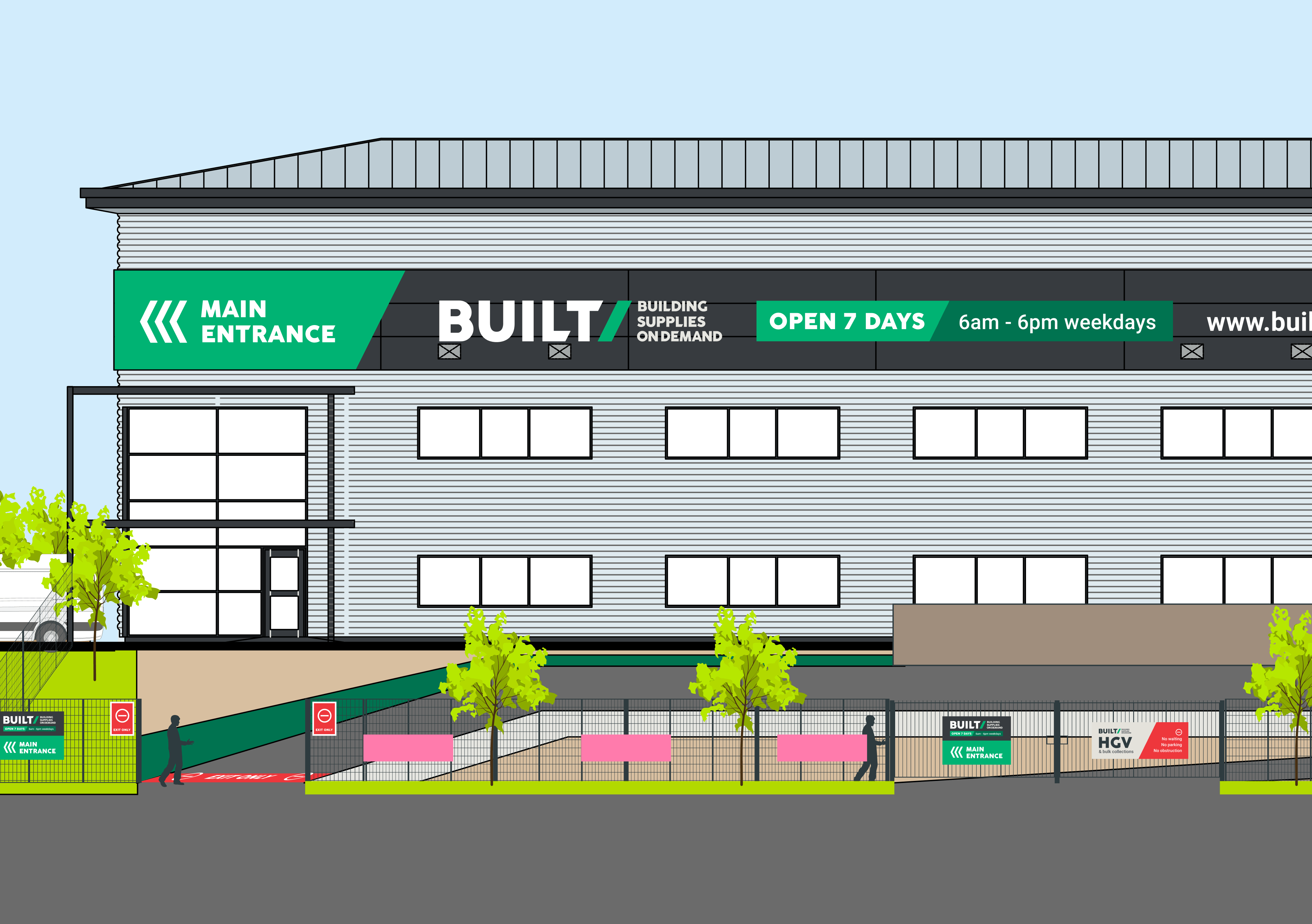
With a clear focus on both digital and physical platforms, our design system empowered BUILT/ to excel across every customer interaction. This comprehensive approach included store signage, promotional material, ecommerce website, apps, SMS, emails, social media, and even click-and-collect experiences. Not just that, we also addressed immersive mediums like video content and VR experiences, successfully merging BUILT/'s presence in the digital and physical realms.
In essence, our strategic alignment with BUILT/ fostered an all-encompassing design system that seamlessly merges the digital with the physical. Our proactive design thinking, adherence to quality, and consistency ensured that BUILT/ stayed ahead of the curve, thriving in their domain.
Glue have provided BUILT/ with a consistent brand across physical and digital environments and possessing such a degree of finish and maturity, that it feels much longer established than it is.

You may also like…
- 4% channel revenue share for 9 consecutive months
- YoY growth performance
- 36% LFL, 37% LFL and 30% LFL growth
- 4% channel revenue share for 9 consecutive months
- YoY growth performance
- 36% LFL, 37% LFL and 30% LFL growth
- 4% channel revenue share for 9 consecutive months
- YoY growth performance
- 36% LFL, 37% LFL and 30% LFL growth
- 4% channel revenue share for 9 consecutive months
- YoY growth performance
- 36% LFL, 37% LFL and 30% LFL growth
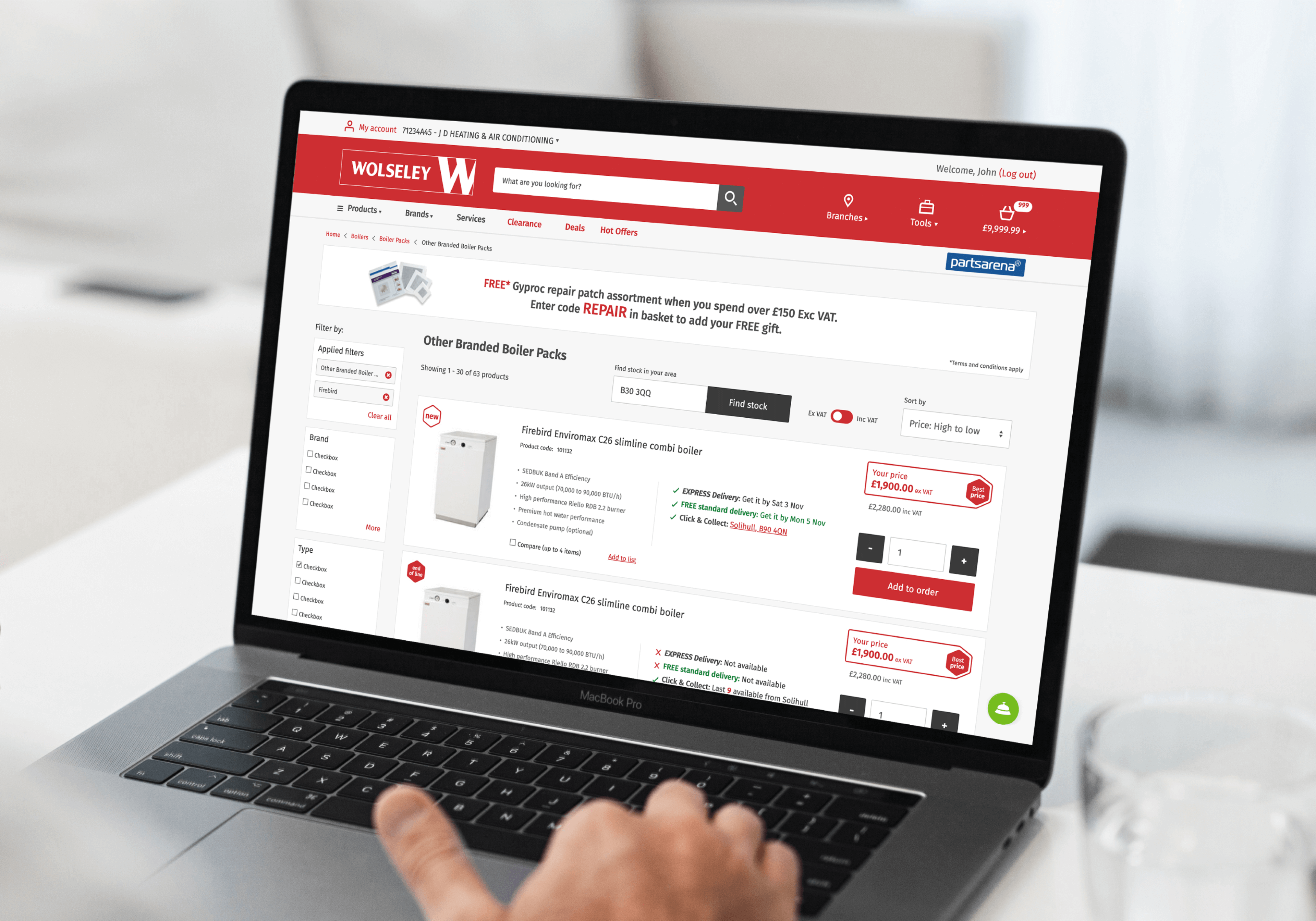
Wolseley UK
Progressive thinking for a digital future
- Increased conversion rates by 1.62%
- Achieved a 215% in-store adoption uplift
- Delivered in 2 sprints
- Increased conversion rates by 1.62%
- Achieved a 215% in-store adoption uplift
- Delivered in 2 sprints
- Increased conversion rates by 1.62%
- Achieved a 215% in-store adoption uplift
- Delivered in 2 sprints
- Increased conversion rates by 1.62%
- Achieved a 215% in-store adoption uplift
- Delivered in 2 sprints
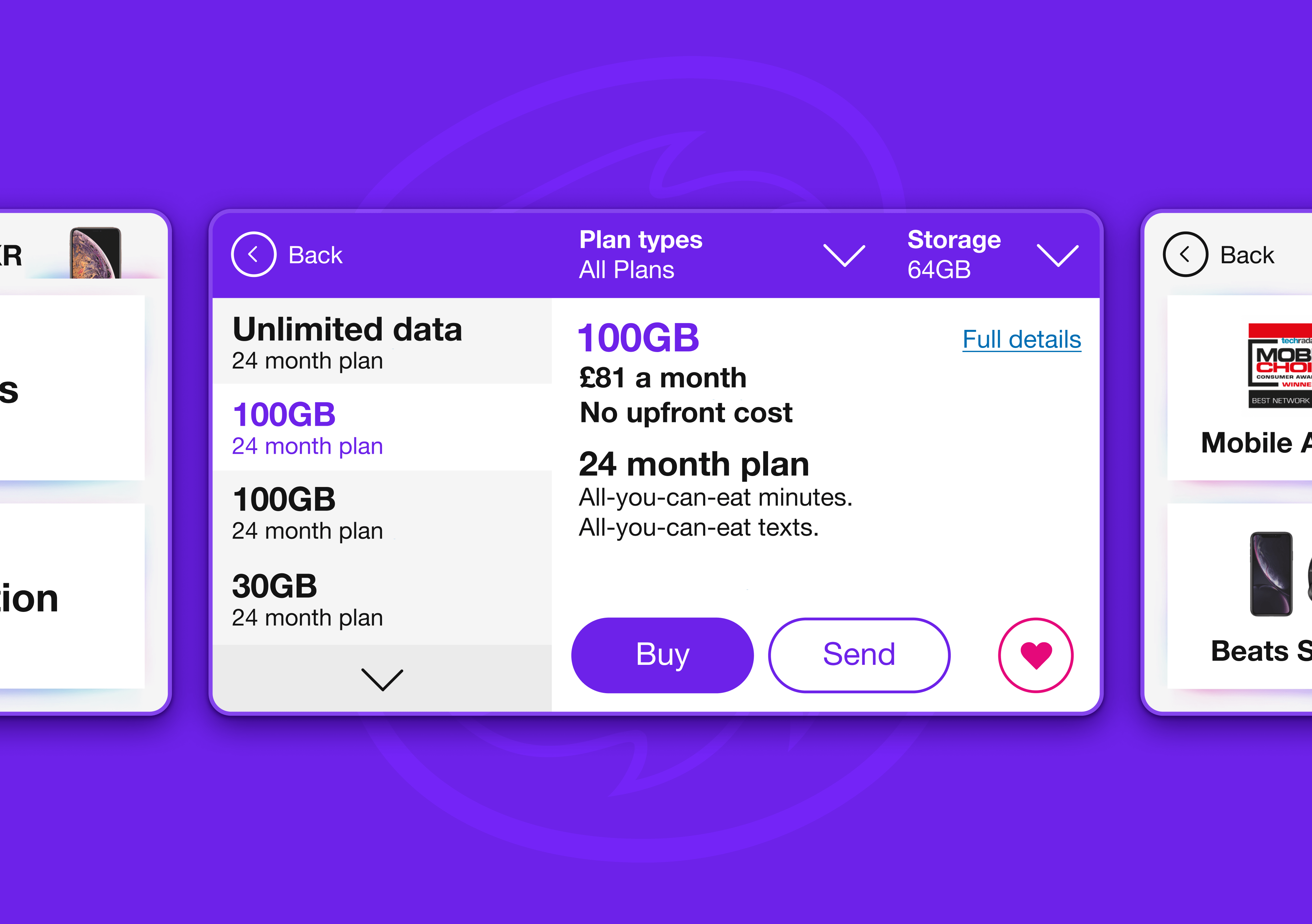
Three
Selling more phone tariffs through digital
