Holland & Barrett

Define, prototype, and validate new propositions
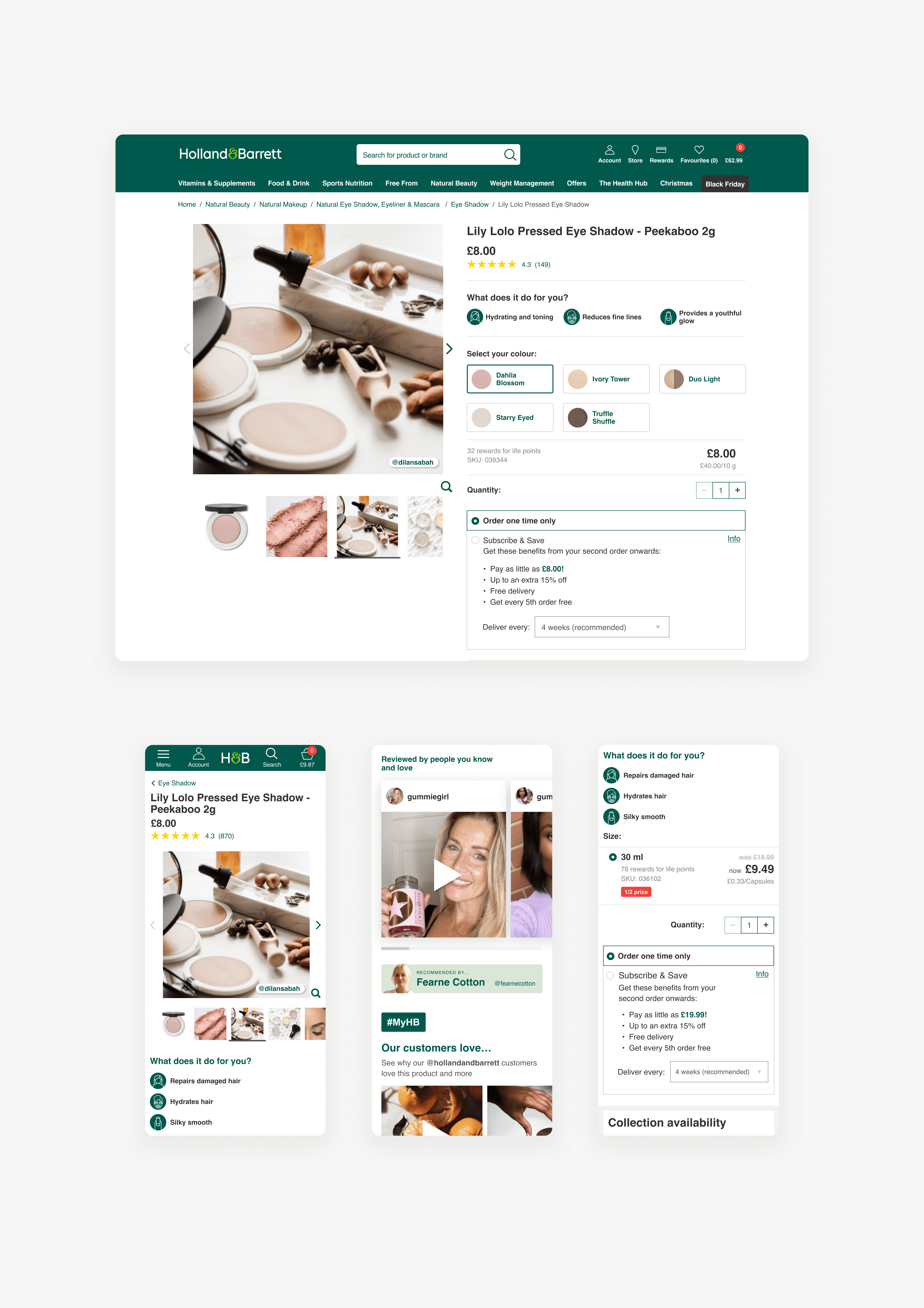
Achieving a 2.24% conversion rate with new product display page (PDP) enhancements.
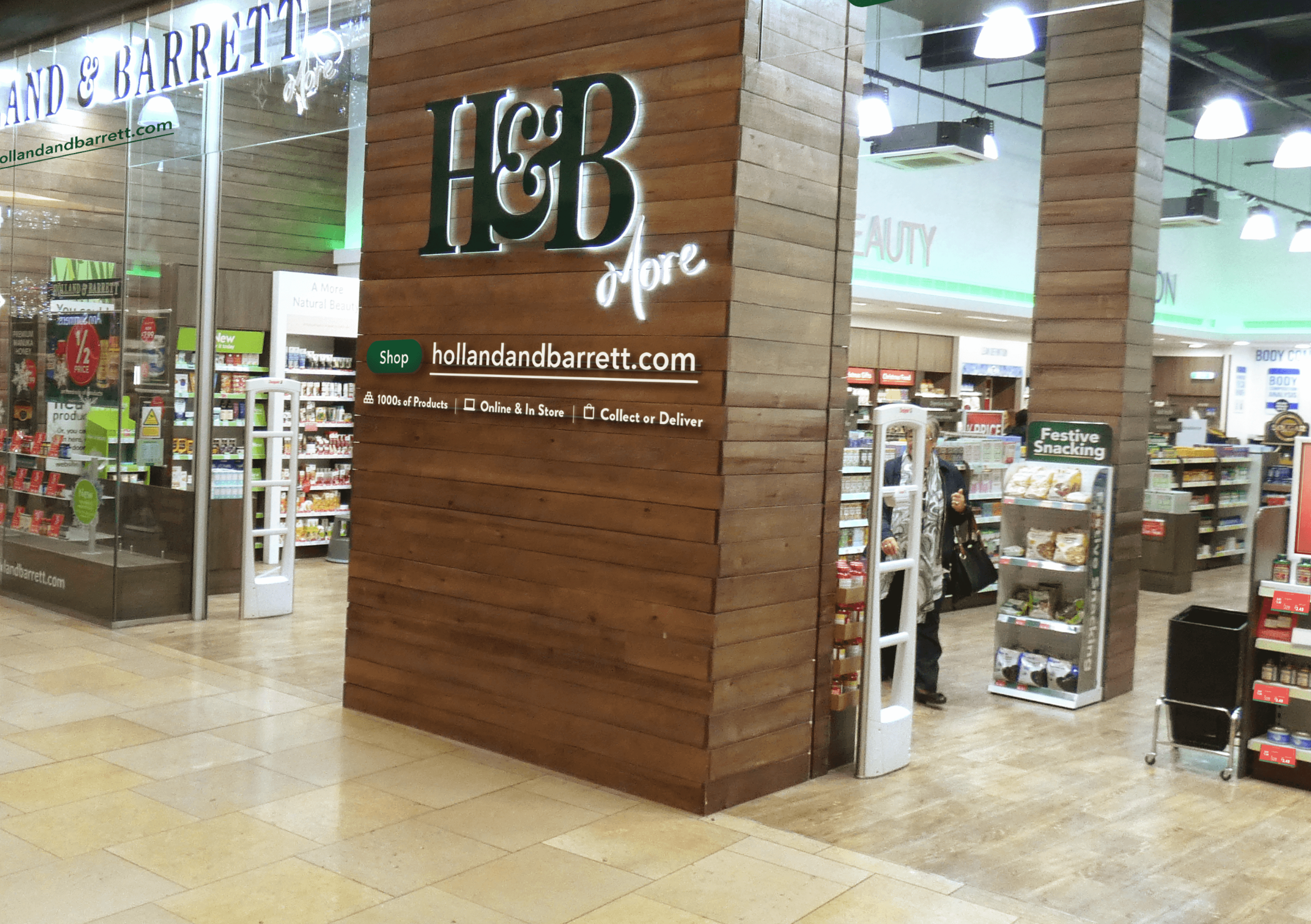
Surfacing digital proposition in-store achieved website adoption rate of 17.4%.
A new proposition for cholesterol setup, tested and validated in 90 days.
Details
Holland & Barrett is a leading health and wellness retailer, widely known for its wide range of products that cater to diverse health needs. As the digital age continues to evolve, Holland & Barrett aimed to integrate their physical and digital presence to provide a seamless omnichannel experience to its customers.
The challenge
To enhance customer experience and meet the changing needs of consumers, Holland & Barrett sought to develop several key projects. These included creating a compelling digital proposition in the retail environment, launching a cholesterol kit, and expanding the product description page (PDP) content. Each project was aimed at a specific business objective and needed to be feasible within their existing framework.
Our approach
We worked closely with Holland & Barrett's internal teams, understanding their current operations and the vision they had for each project. We ensured that our solutions remained sensitive to cost implications and the business functions that would be impacted.
Defining and surfacing digital
propositions in the retail environment
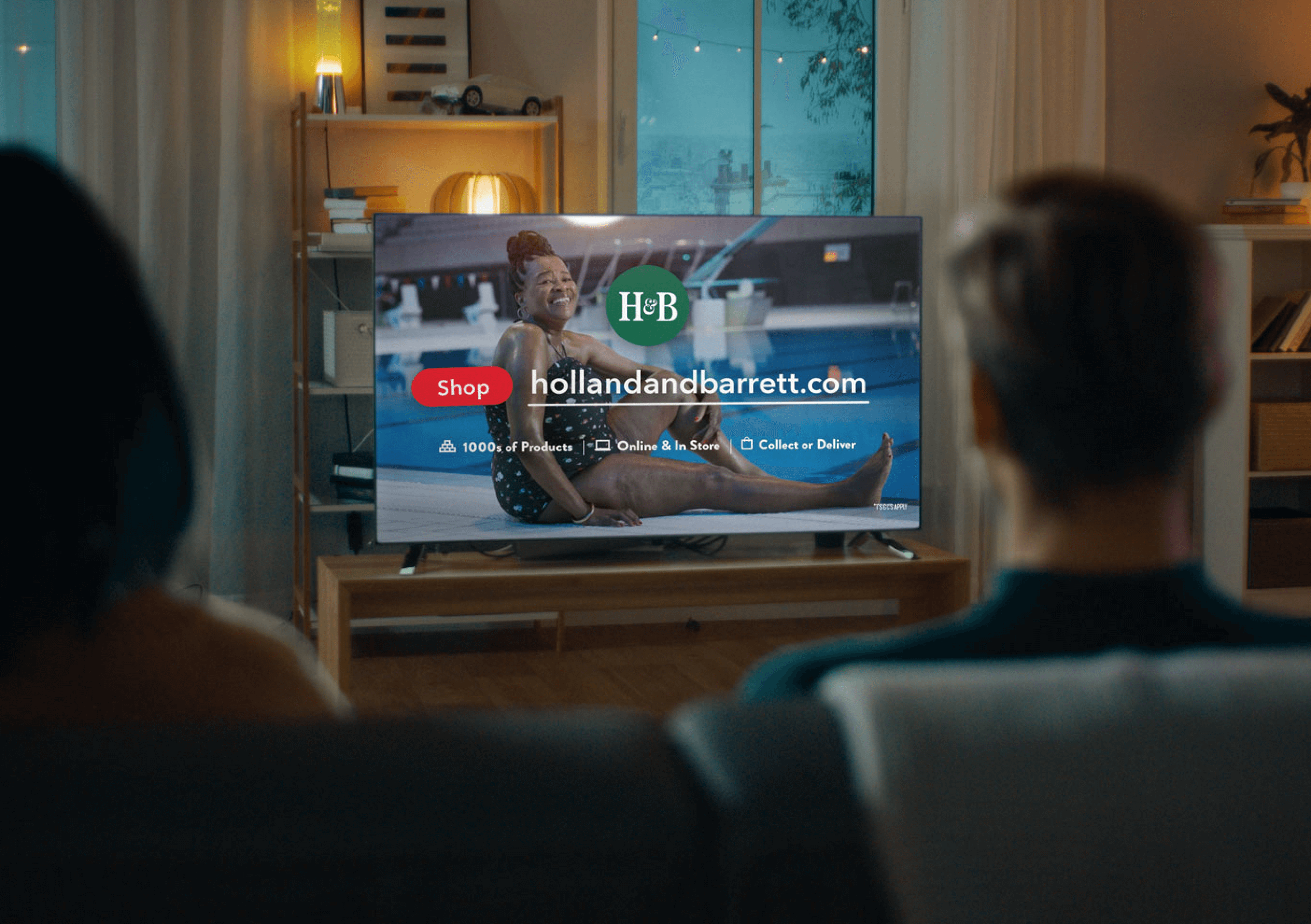
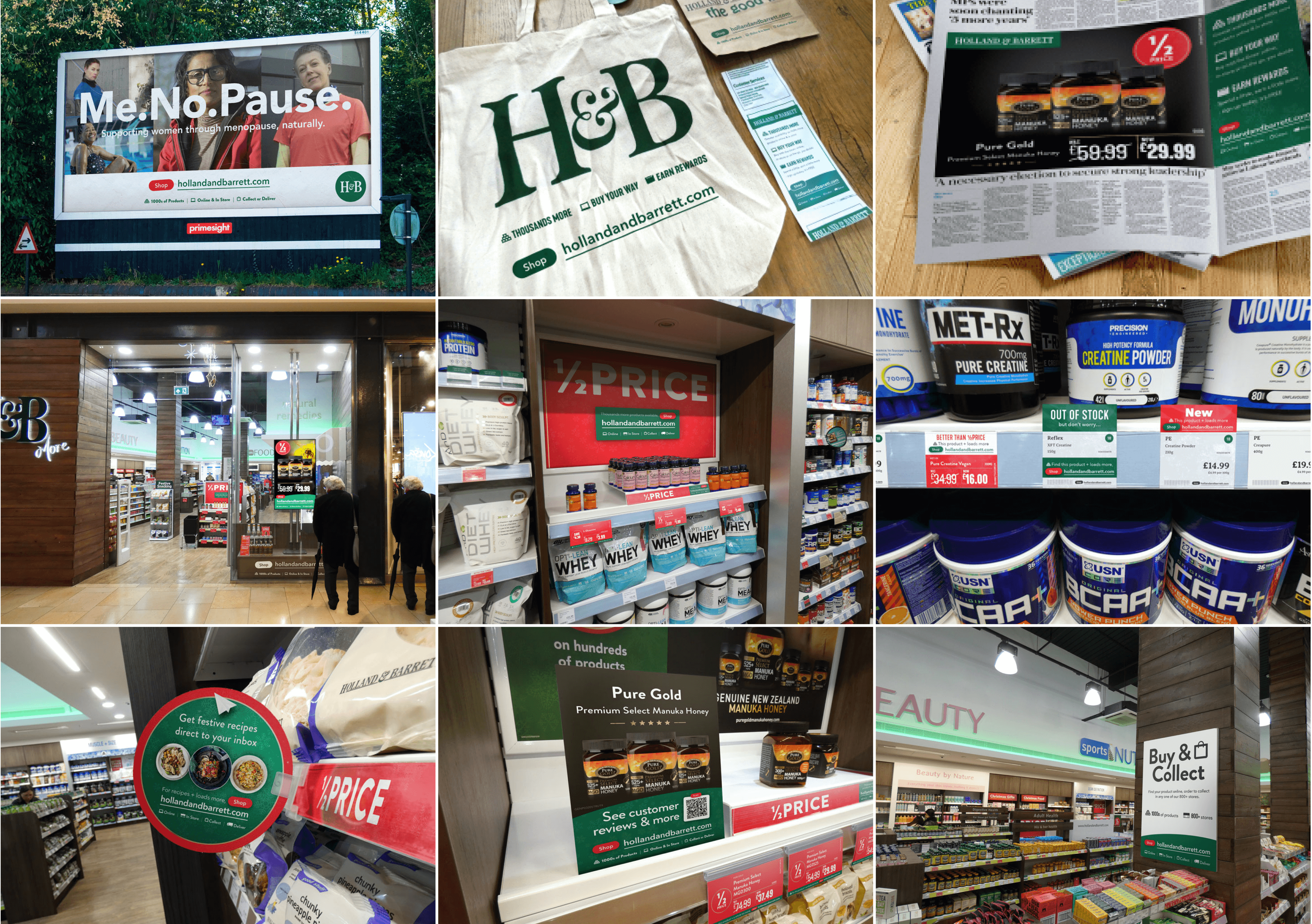
The goal was to bring the online value proposition into the physical retail environment, enhancing the end-to-end customer journey.
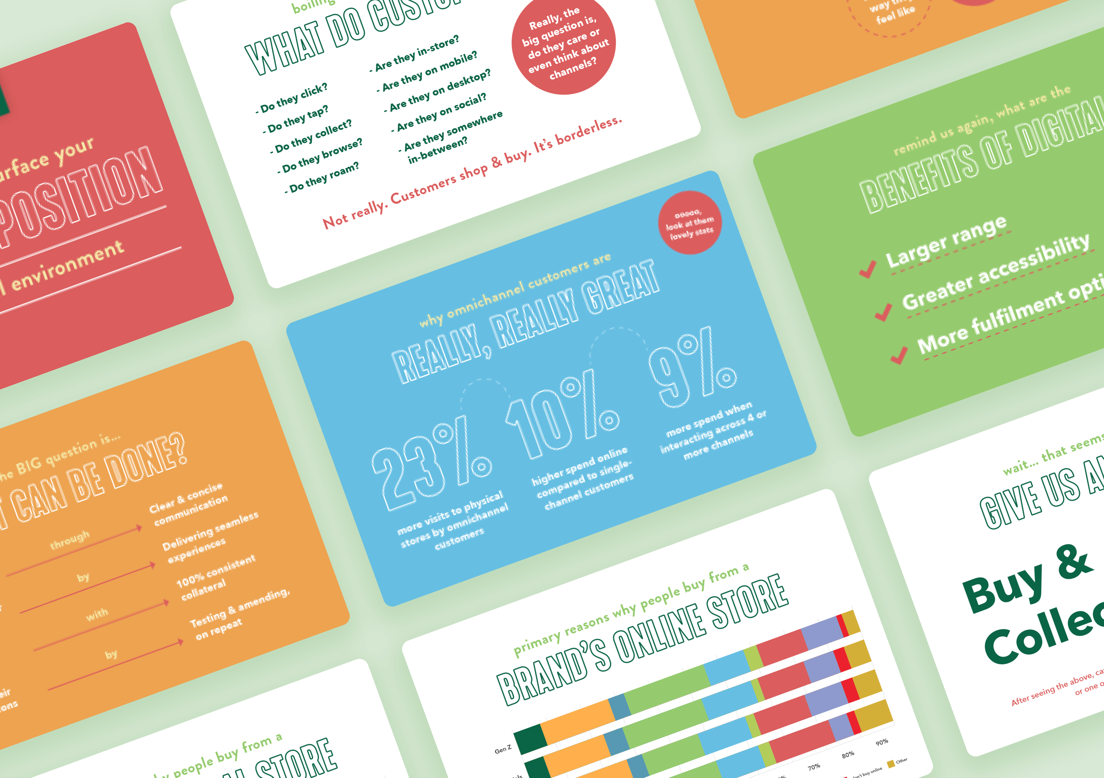
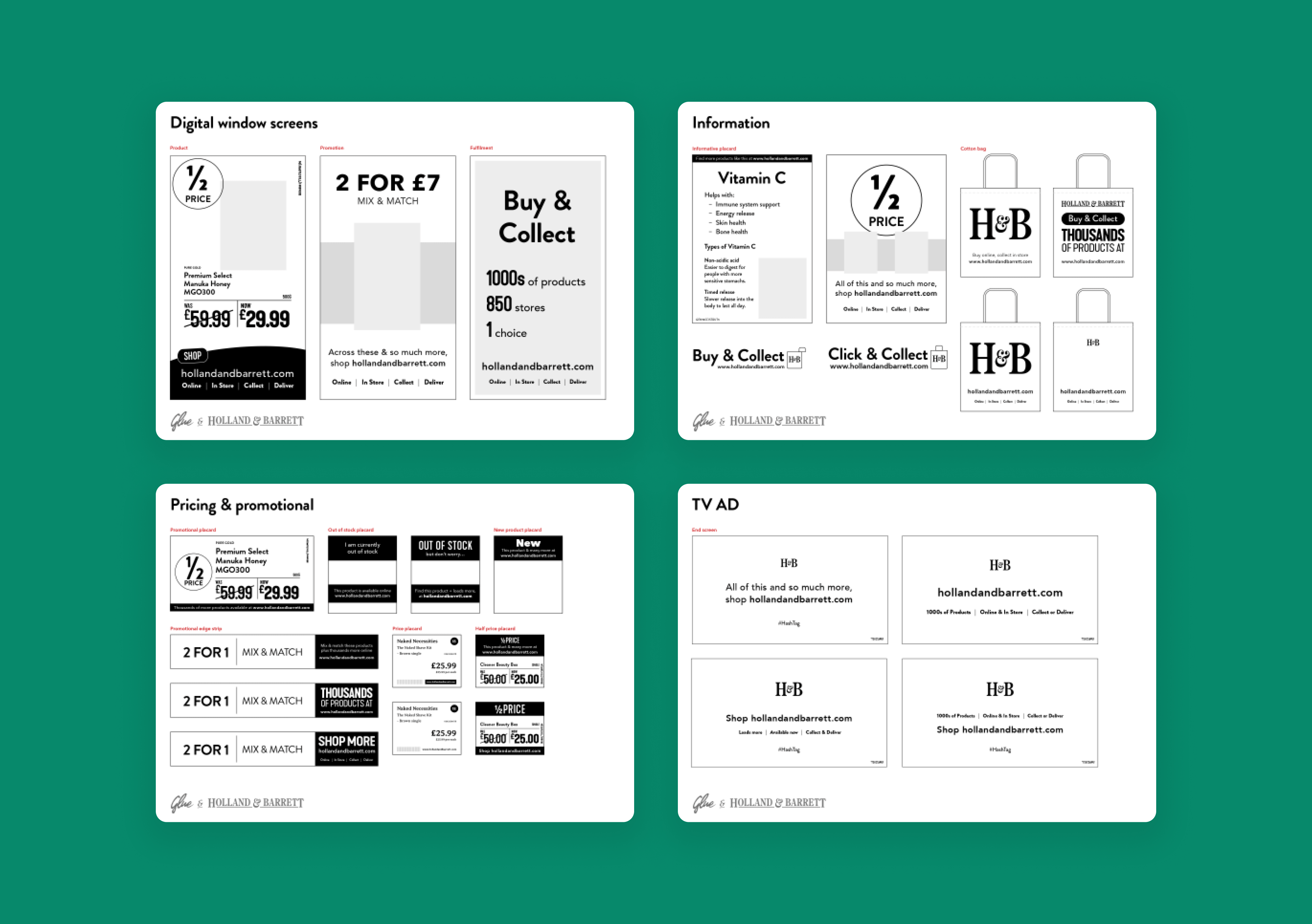
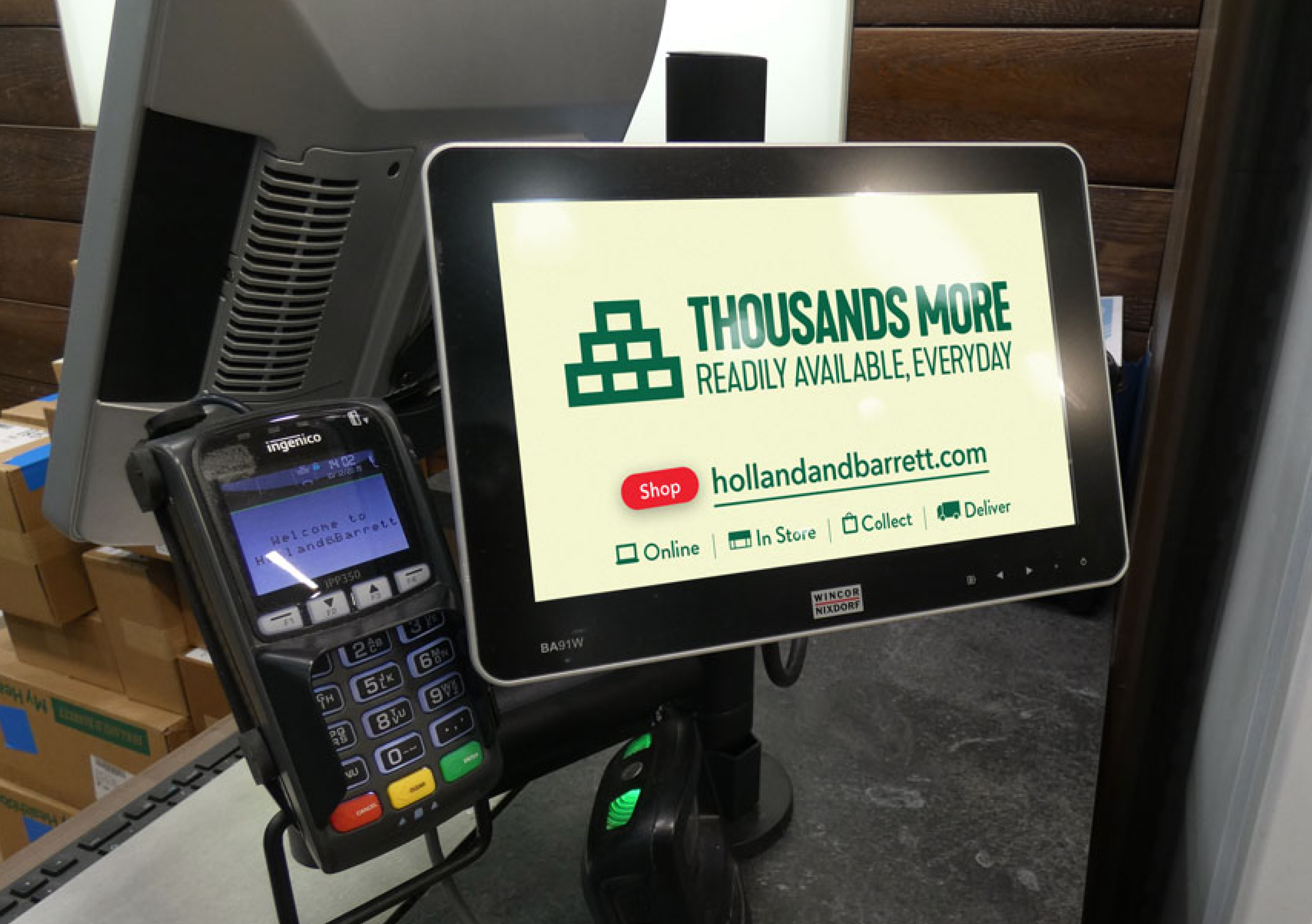
We devised a strategy that implemented the digital proposition in various stages: Attract, Engage, Delight, and Retain. This included creating high-fidelity visuals, conceptualising TV ad frames, in-store communication material, promotional identity, retargeting ads, email newsletters, YouTube product videos, and more.
This project significantly enhanced Holland & Barrett's omnichannel presence, ensuring a seamless customer journey and strengthening brand loyalty.
Testing and validating
CholestoKit in 100-days
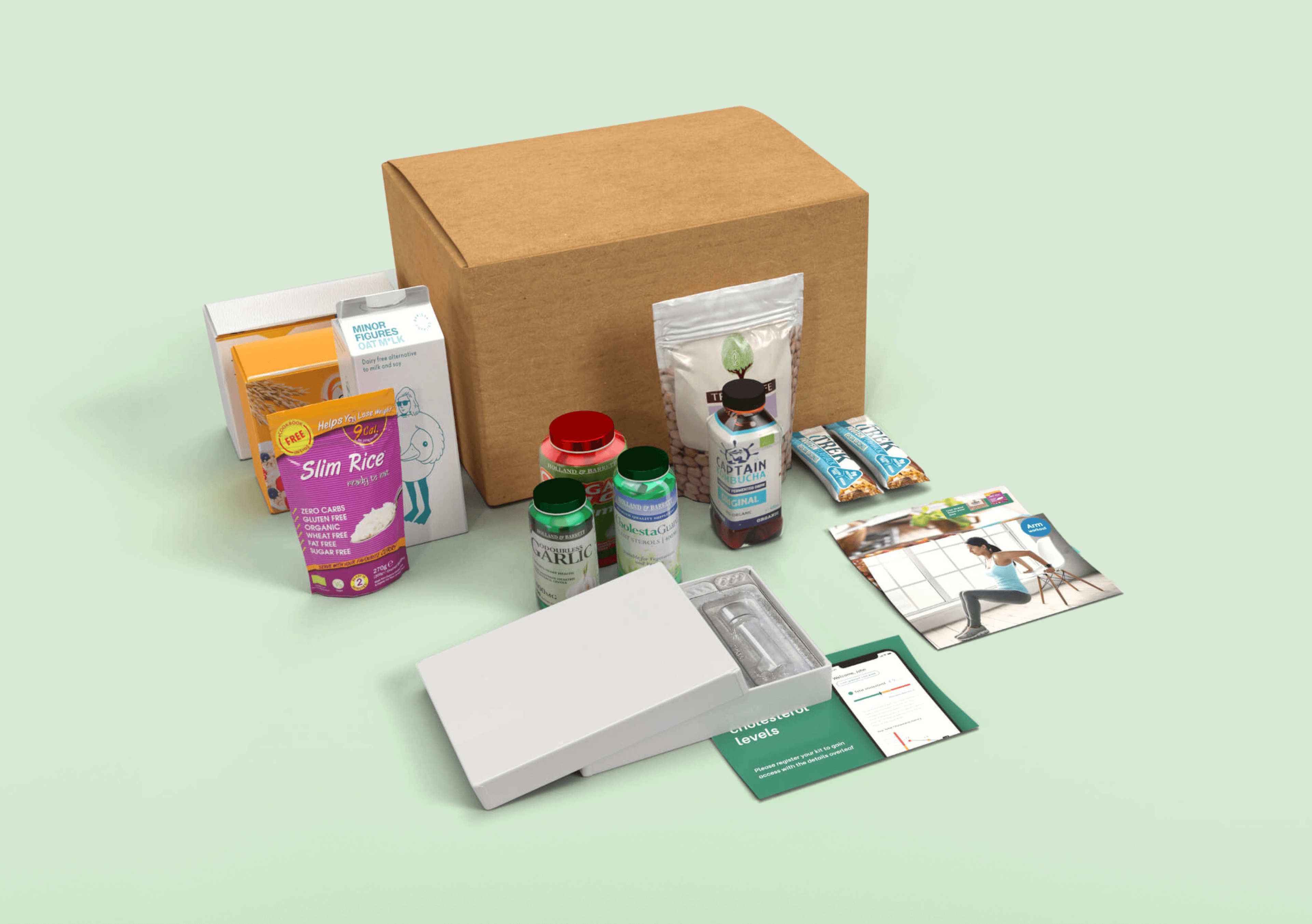
The objective was to create a viable and marketable CholestoKit - a subscription testing kit to help manage cholesterol levels.
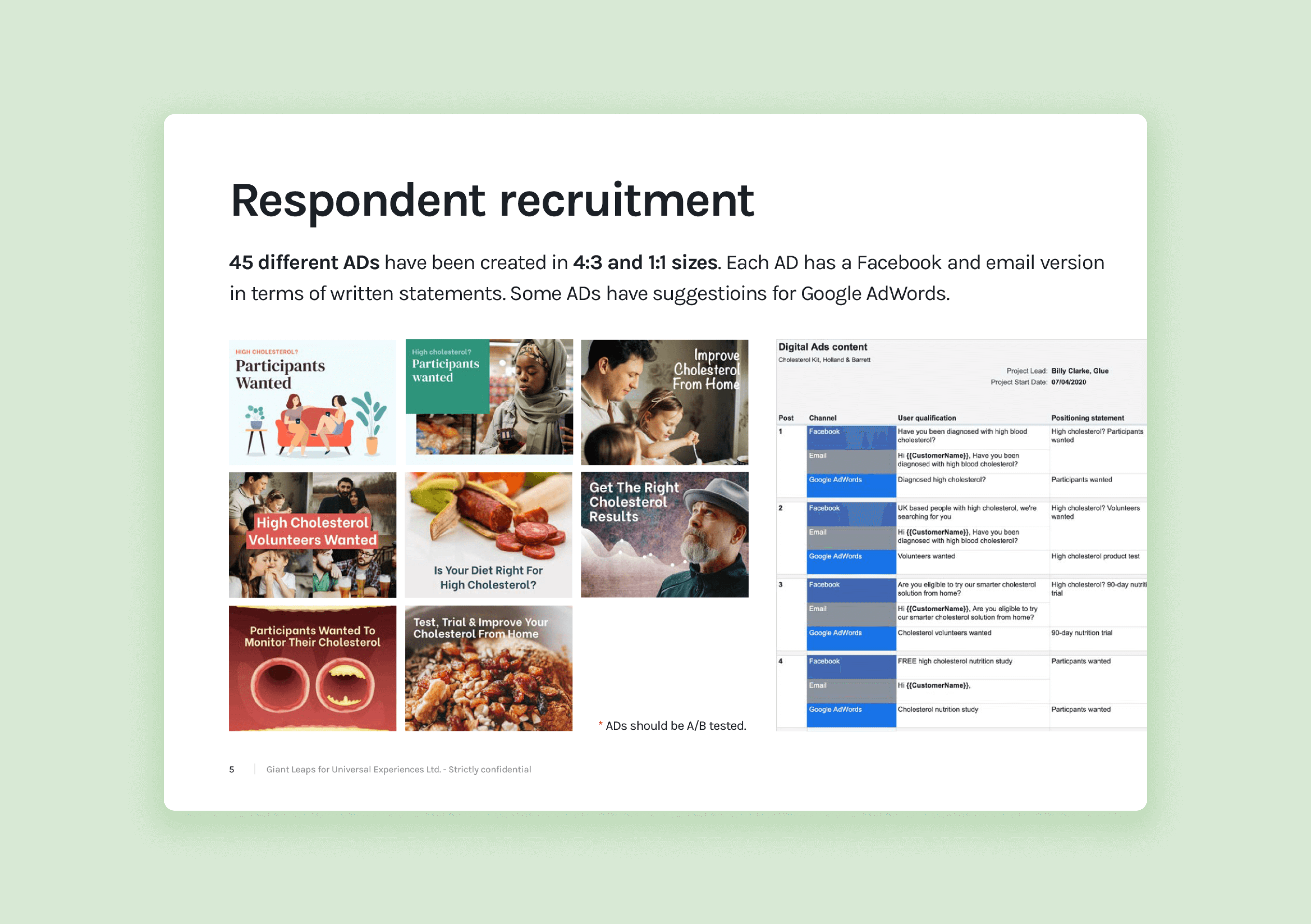
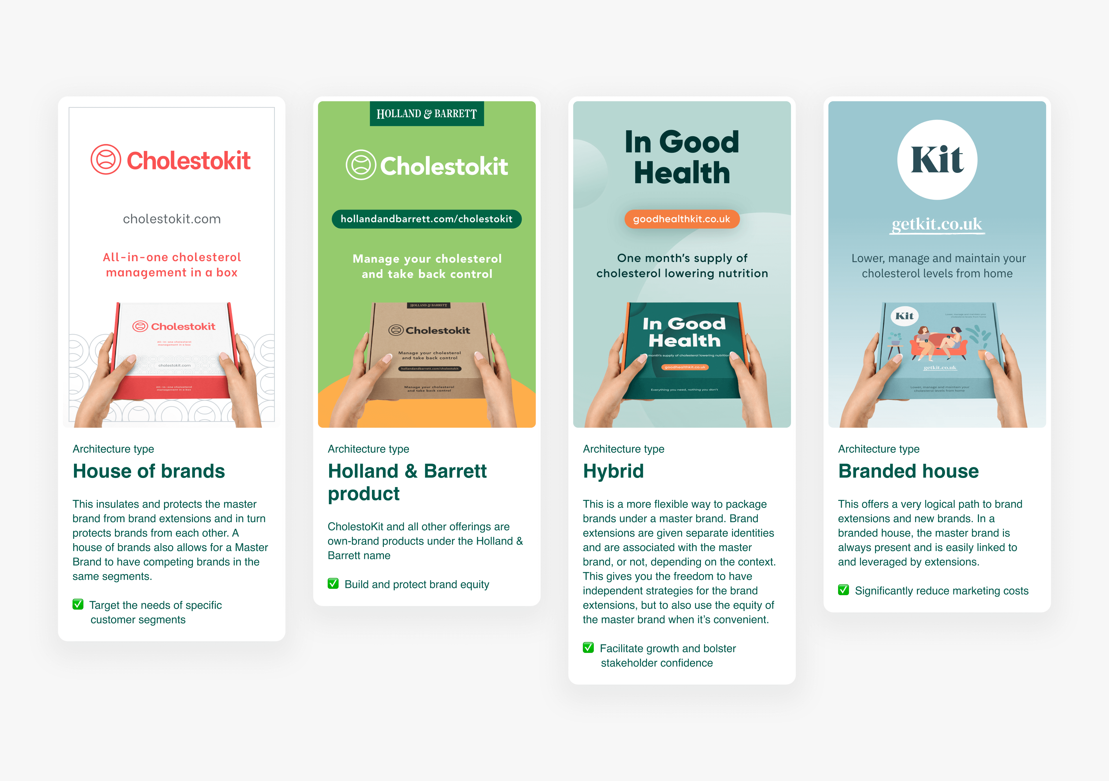
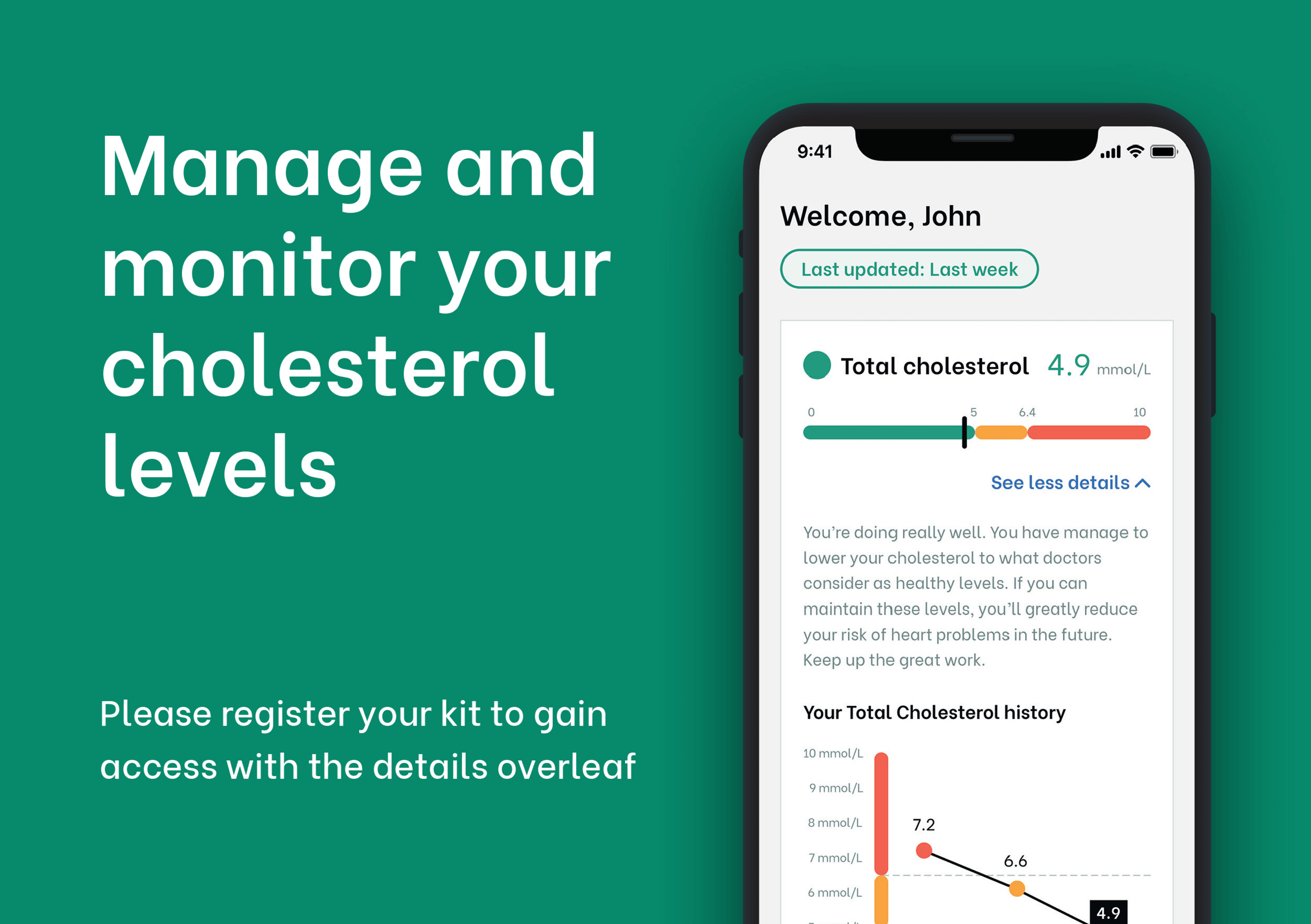
We defined a 3-month programme and designed a cohesive brand and customer journey, setting up supply chain relationships for medical equipment and with pathologists. We also developed a proof of concept platform to report on participant lipid levels, managed all product logistics, and tested desirability through various channels.
After testing with 20 participants over 90-days, the programme established itself as a viable health management solution. It paved the way for Holland & Barrett to further develop superior health management subscription packages.
Building a better framework
for PDP content
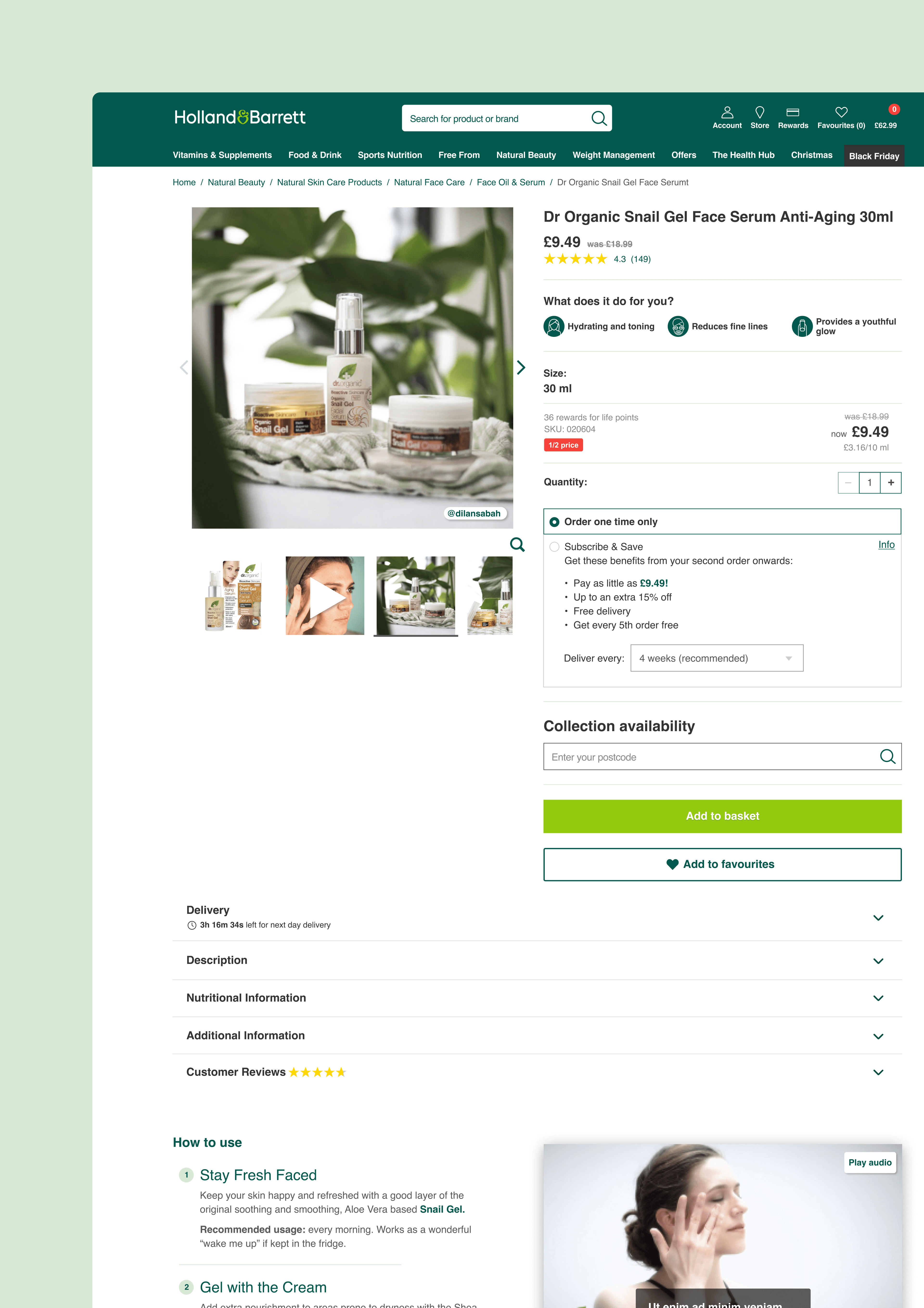
The aim was to expand the content on the Product Description Pages (PDPs) by creating and testing 21 new formats of content.
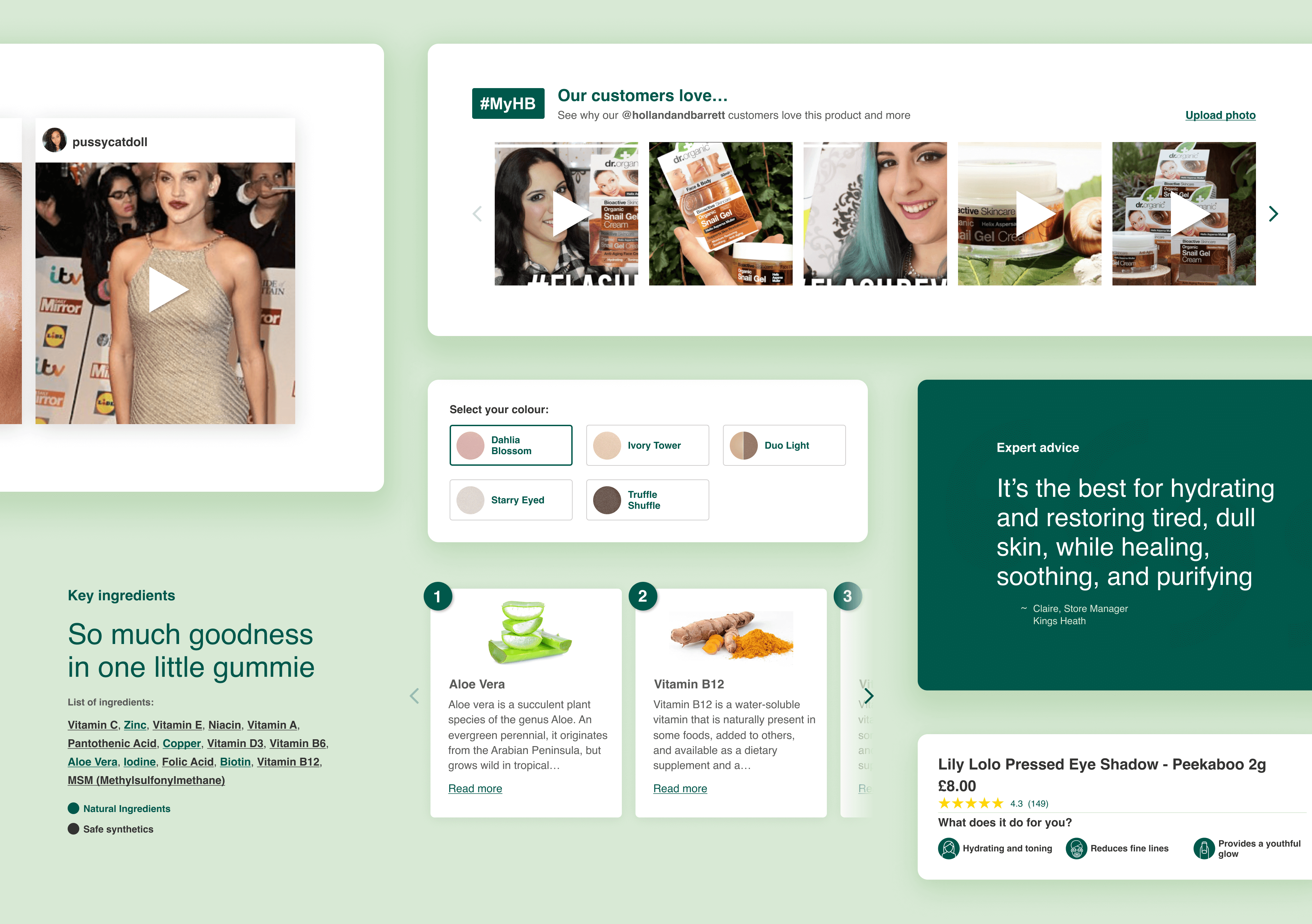
Using our Product Sprints framework, we developed content that enhanced the customer's product understanding and interaction. This included:
- Optimised titles and descriptions
- Ingredient lists
- Customer Q&A and FAQs
- Product and bundle recommendations
- Product allergen and benefit icons
- How-to videos
- Live chat support
- And much more…
The expanded PDP content significantly improved Holland & Barrett's online customer experience, providing detailed information and enhancing customer engagement with the products.
Continuous engagement
Throughout the engagement, we ensured that our solutions were cost-effective, feasible within the current framework, and aligned with Holland & Barrett's business objectives. We continuously engaged with various business functions to avoid any disruption and gain valuable input for our projects.
The results
The successful execution of these projects greatly enhanced Holland & Barrett's omnichannel customer experience and brought a new product offering to the market. The expanded PDP content provided customers with an enriched and comprehensive understanding of the products, significantly enhancing their online shopping experience.
You may also like…
- 2.3% in-store conversion rate increase
- 31 screens designed and delivered
- Delivered in 2 sprints
- 2.3% in-store conversion rate increase
- 31 screens designed and delivered
- Delivered in 2 sprints
- 2.3% in-store conversion rate increase
- 31 screens designed and delivered
- Delivered in 2 sprints
- 2.3% in-store conversion rate increase
- 31 screens designed and delivered
- Delivered in 2 sprints
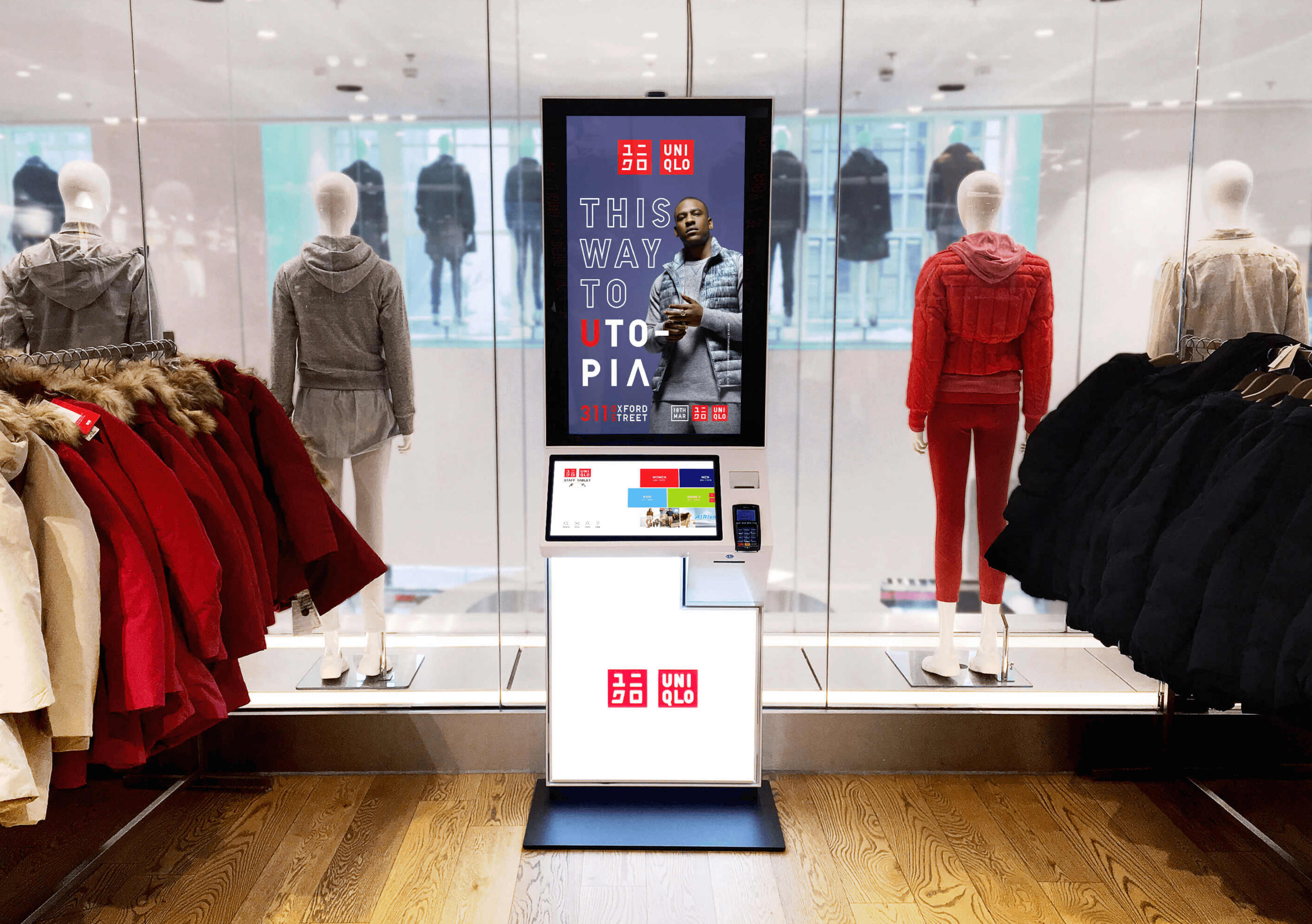
Uniqlo
Making kiosks the go-to tool for shoppers
- Validated with 4,499 travellers
- 7 critical categories for improvement
- Delivered over 3 sprints
- Validated with 4,499 travellers
- 7 critical categories for improvement
- Delivered over 3 sprints
- Validated with 4,499 travellers
- 7 critical categories for improvement
- Delivered over 3 sprints
- Validated with 4,499 travellers
- 7 critical categories for improvement
- Delivered over 3 sprints
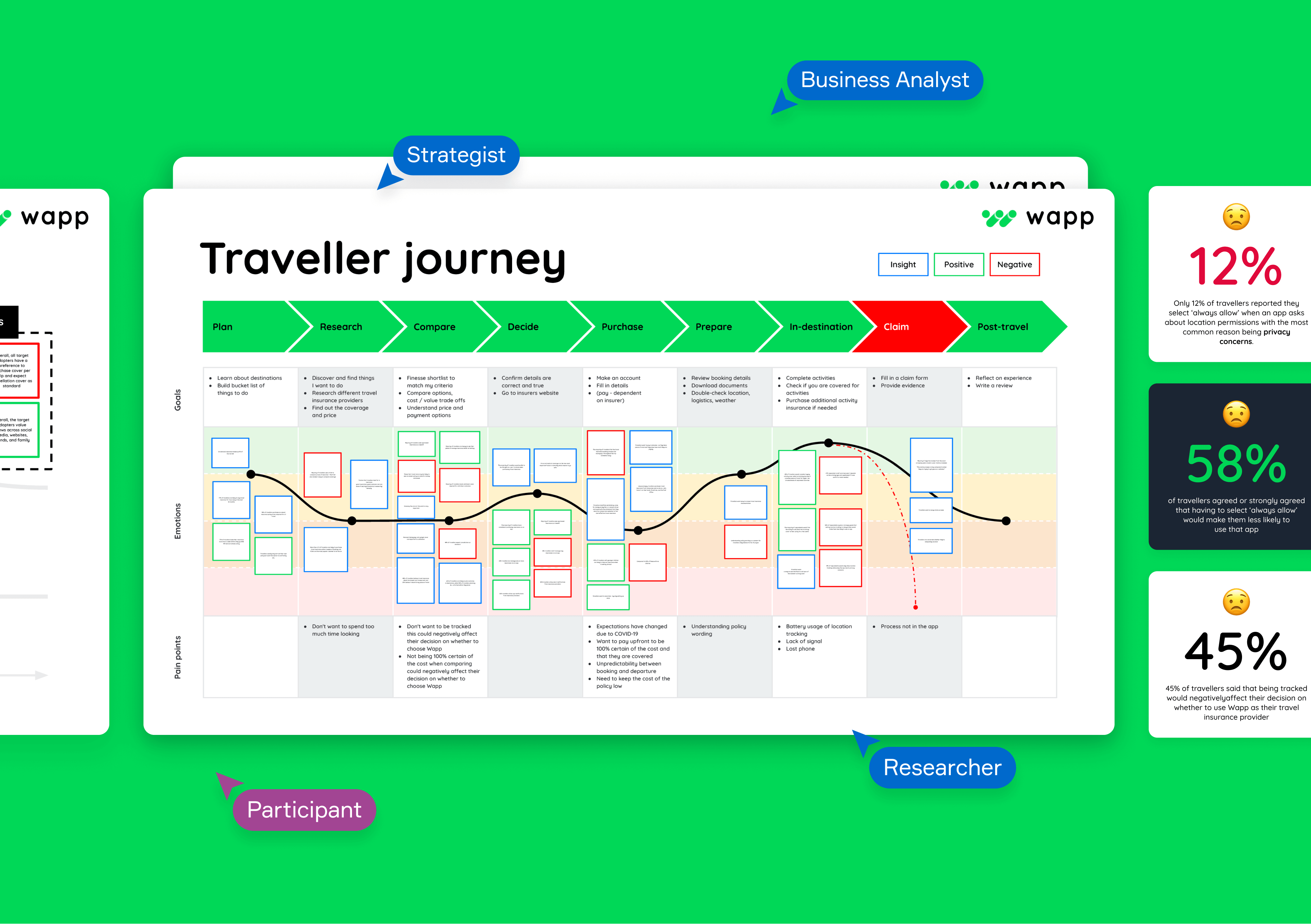
Wapp
Validating a new travel insurance proposition
- Growing worldwide market share by 27.3%
- Achieving user growth of 1.1m in 6-months
- 37 critical UX recommendations identified
- Growing worldwide market share by 27.3%
- Achieving user growth of 1.1m in 6-months
- 37 critical UX recommendations identified
- Growing worldwide market share by 27.3%
- Achieving user growth of 1.1m in 6-months
- 37 critical UX recommendations identified
- Growing worldwide market share by 27.3%
- Achieving user growth of 1.1m in 6-months
- 37 critical UX recommendations identified
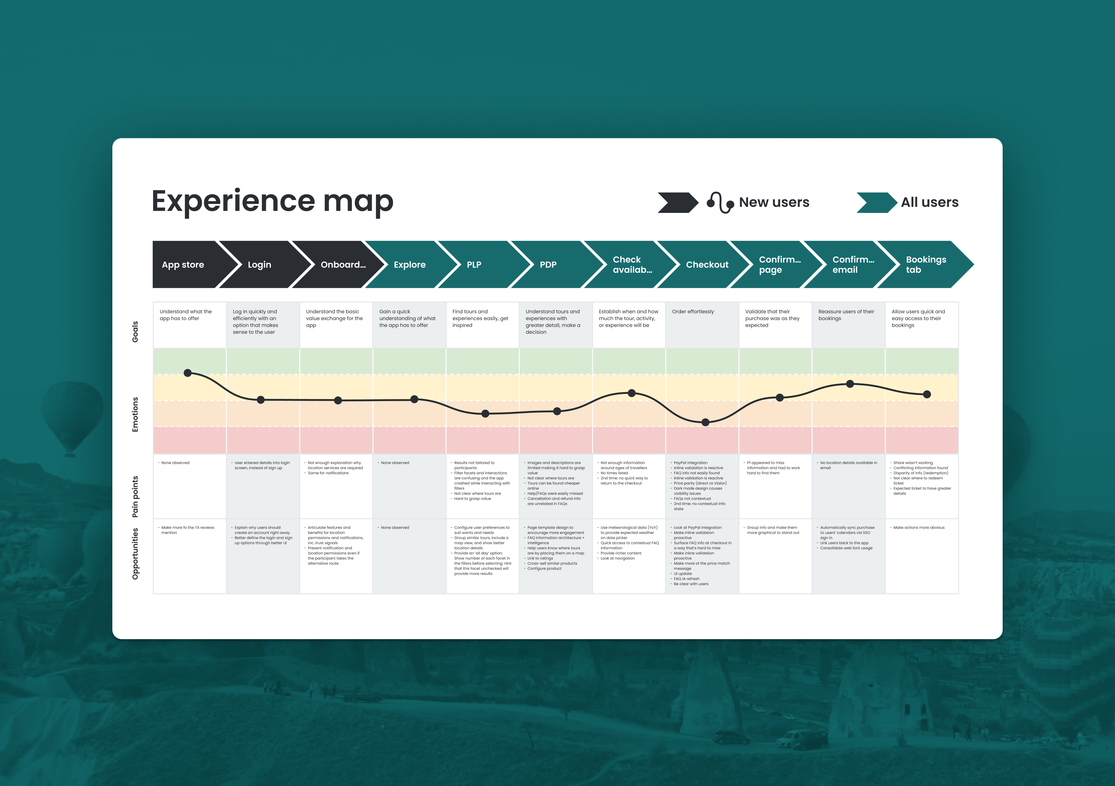
Viator
Research and validation for a leading travel app
