Hastings Direct
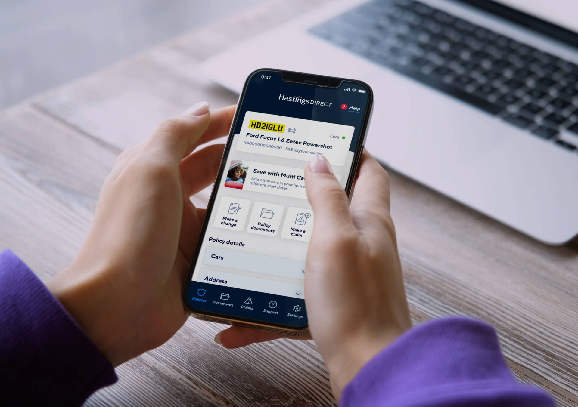
Digital transformation for the UK’s biggest digital insurer
Overview
Hastings Direct is a multi-award-winning business and one of the UK's leading insurance providers. Established in 1997 and built on legacy systems, digital transformation became a key focus of their forward-looking strategy. We joined the project after a detailed RFP process alongside several other notable agencies. Our objectives were to enhance conversion for their new business acquisition journey from price comparison websites, improve income per policy through ancillary sales, support the launch of their Multi Car digital proposition online, and revamp the mobile app further to solidify their position in the digital insurance market.
The challenge
Hastings Direct sought to improve its digital presence and customer experience across multiple channels. Specific focus on enhancing their mobile app experience to reduce call centre contacts, accelerate digital adoption, and increase lifetime customer value.
Our approach
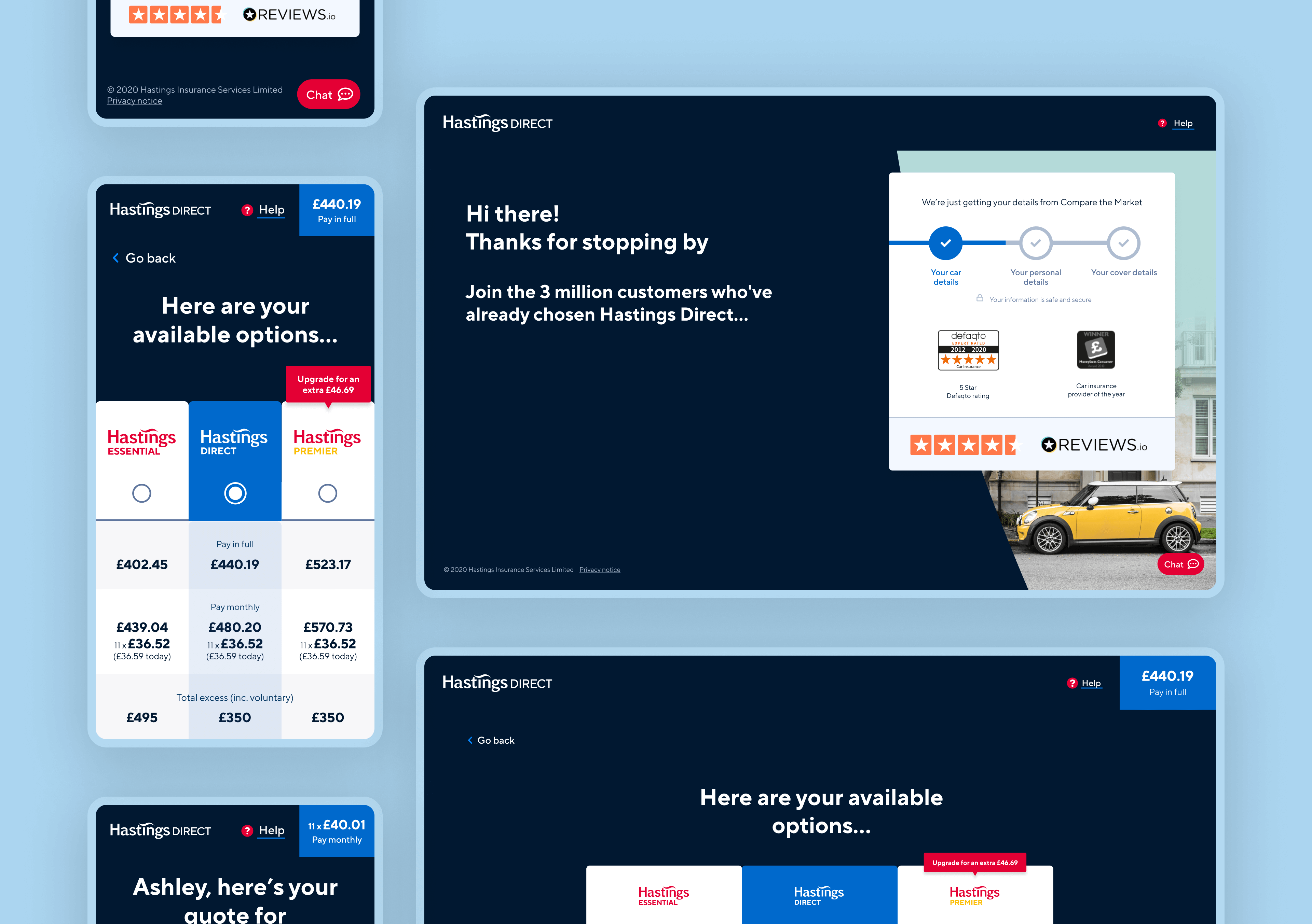
After a thorough selection process, we were chosen as one of four agencies to partner with Hastings Direct in their digital transformation journey. Our engagement began by focusing on customer acquisition through price comparison websites, followed by a revamp of their mobile app to enhance user experience and provide additional services.
New customer
acquisition journey
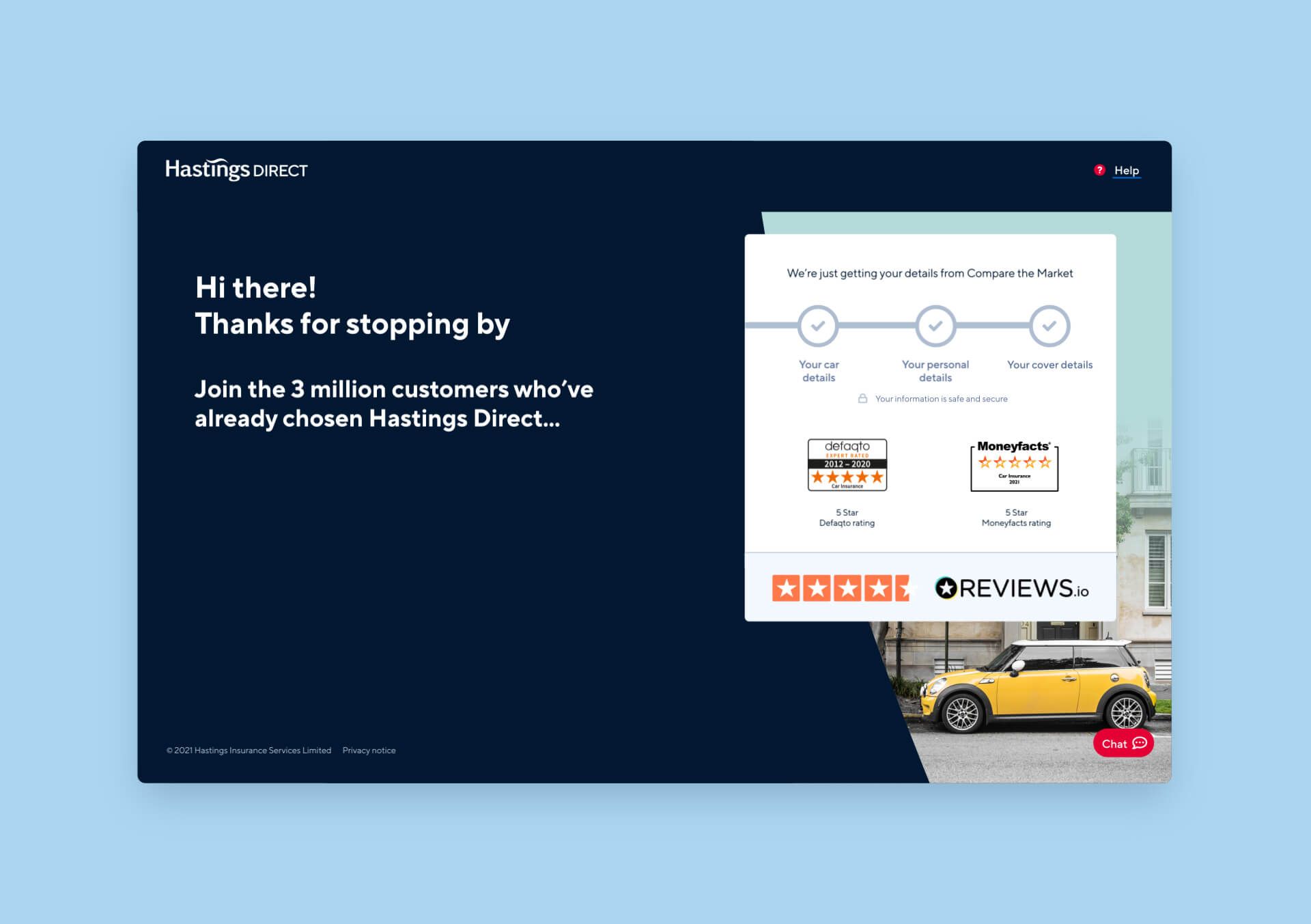
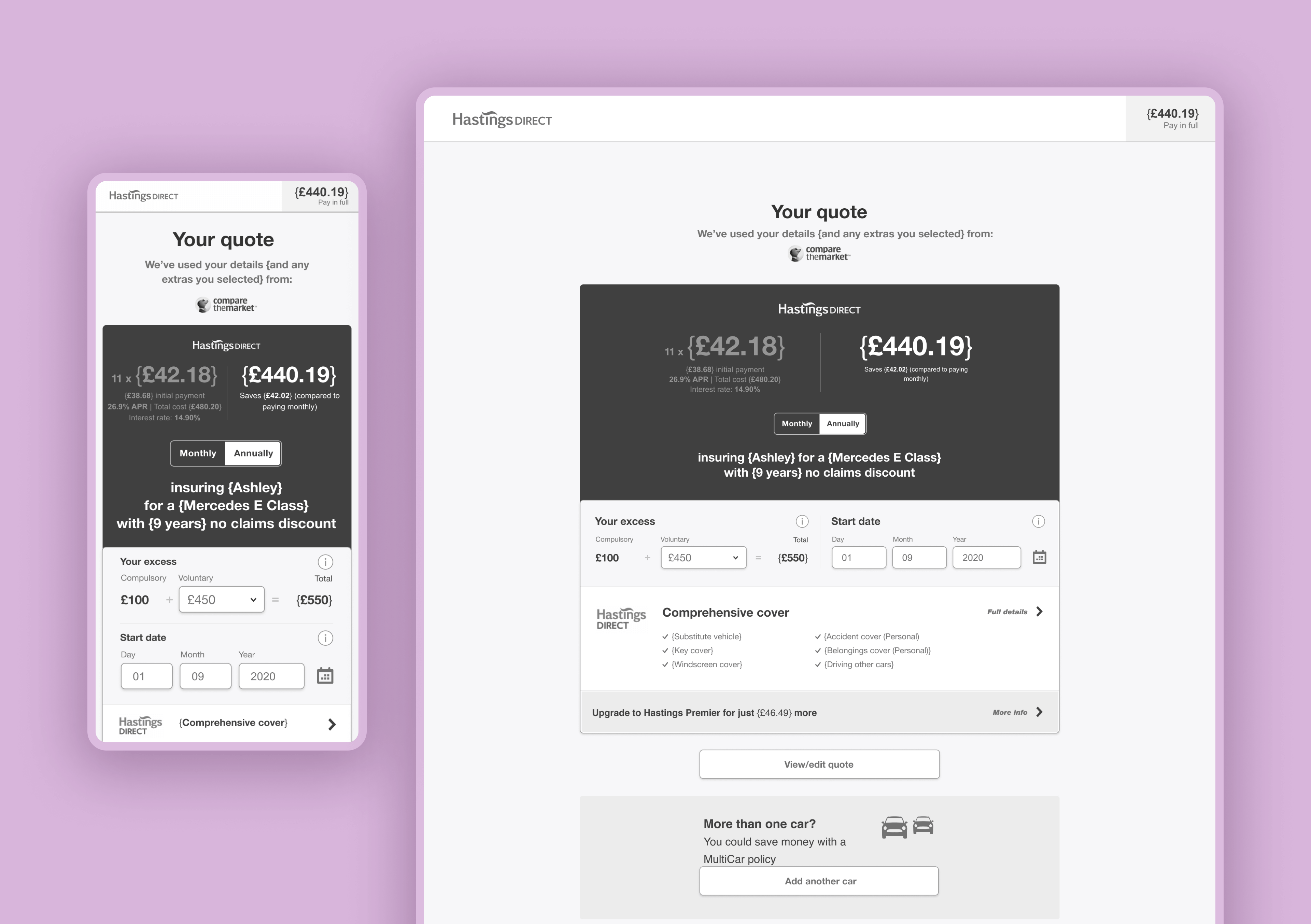
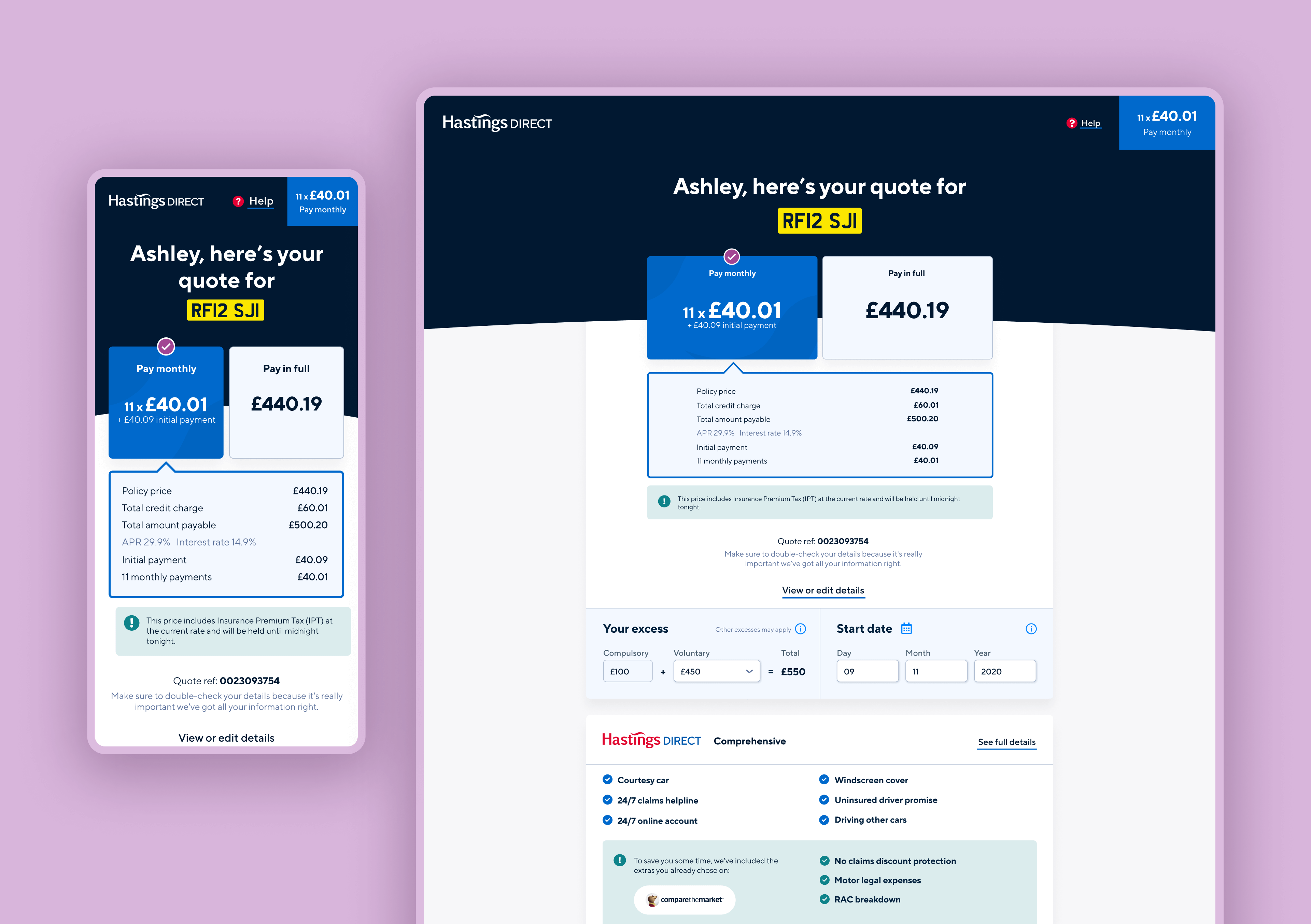
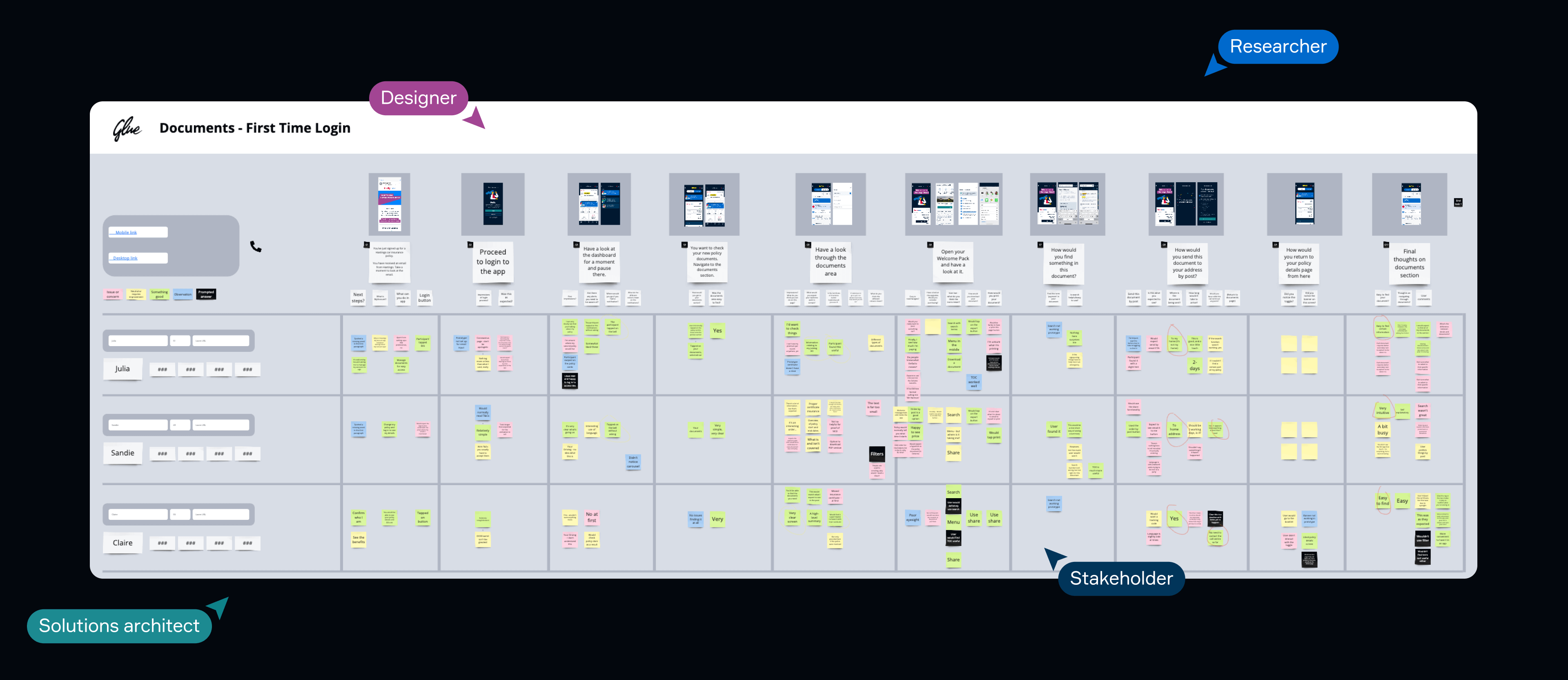
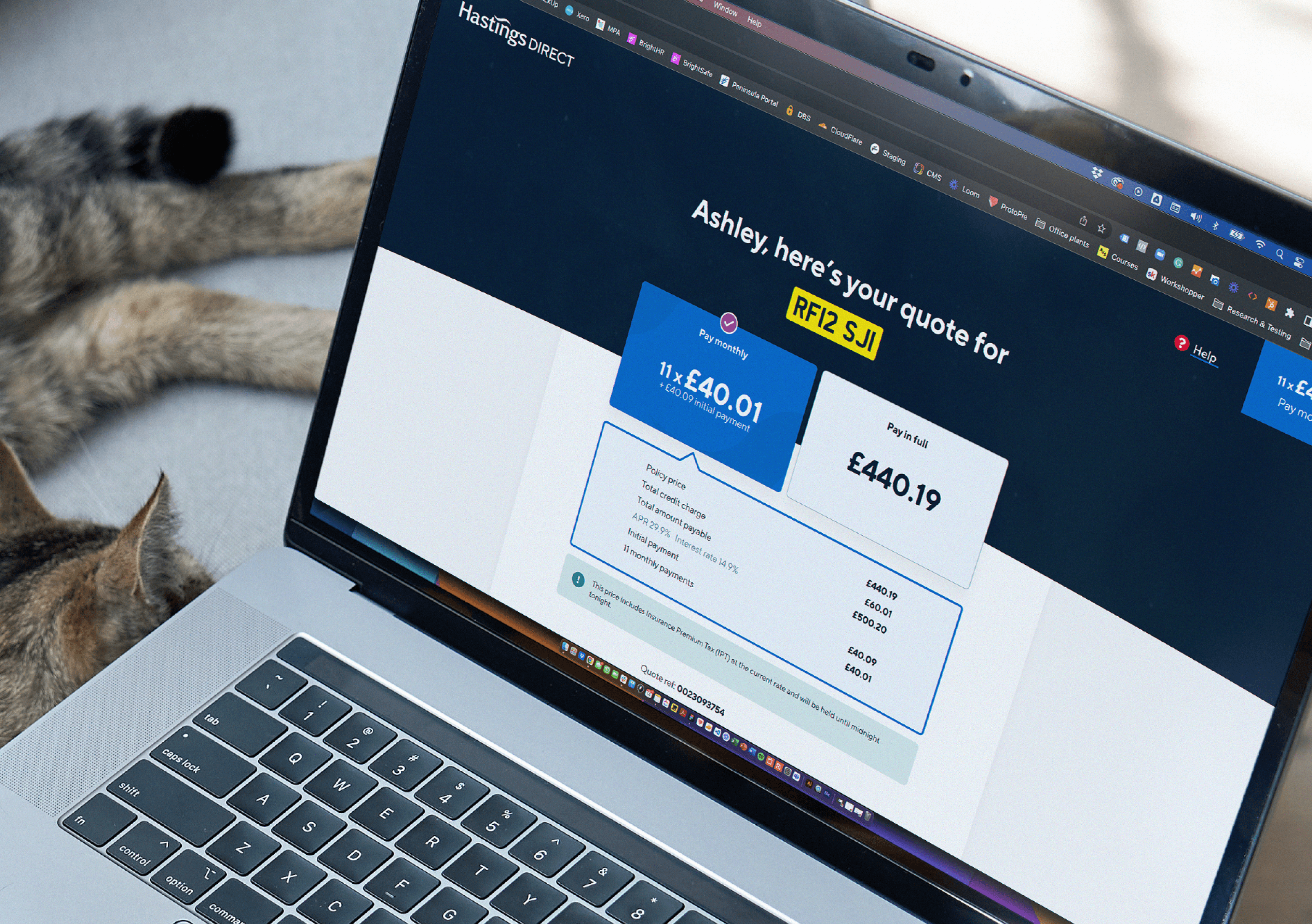
We utilised our Product Sprint to identify, validate, and build features for the new business acquisition journey. This involved conducting discovery workshops, SWOT analysis, and prototype strategies.
Multi Car digital
proposition
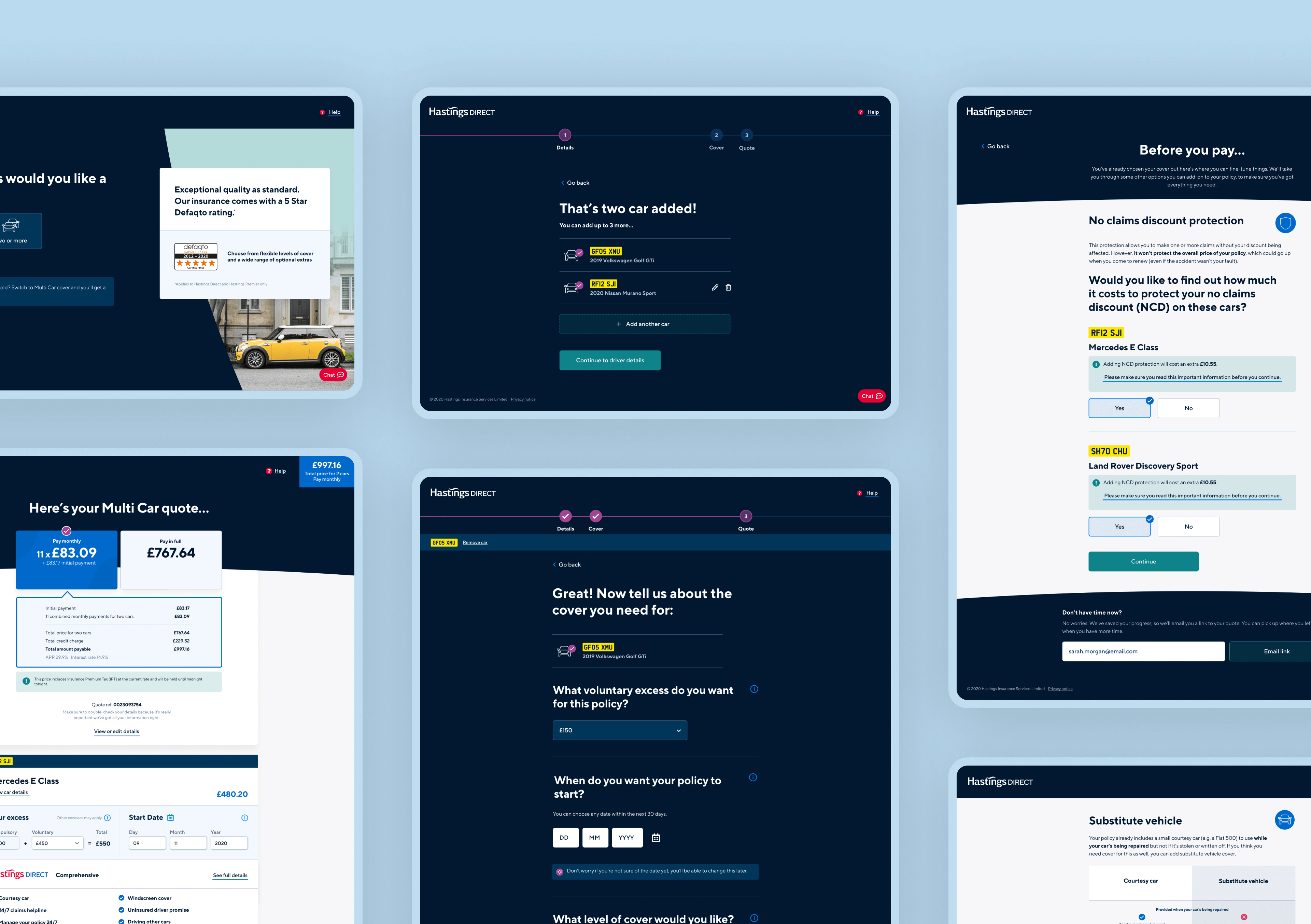
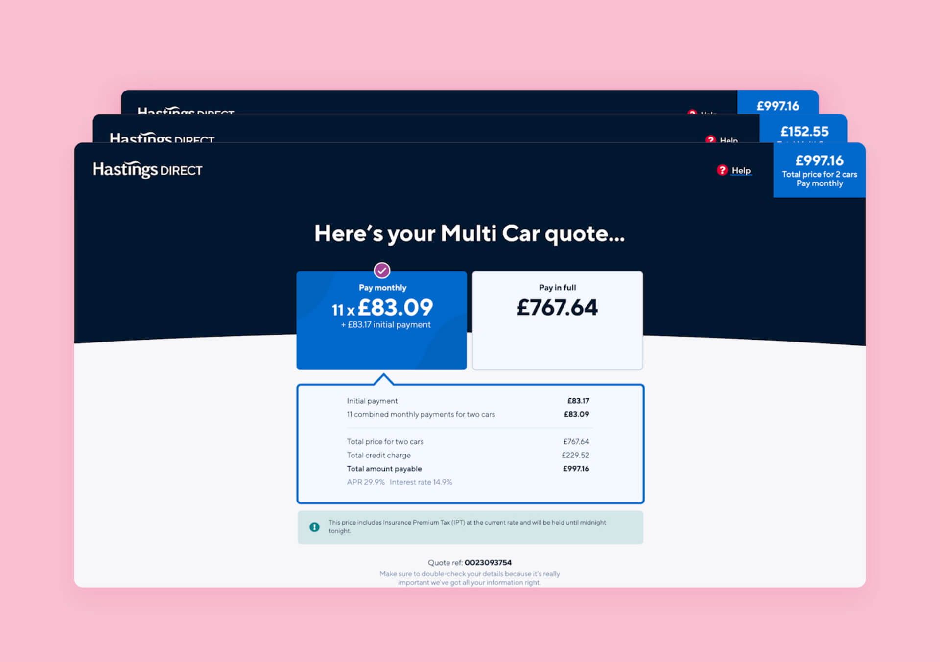
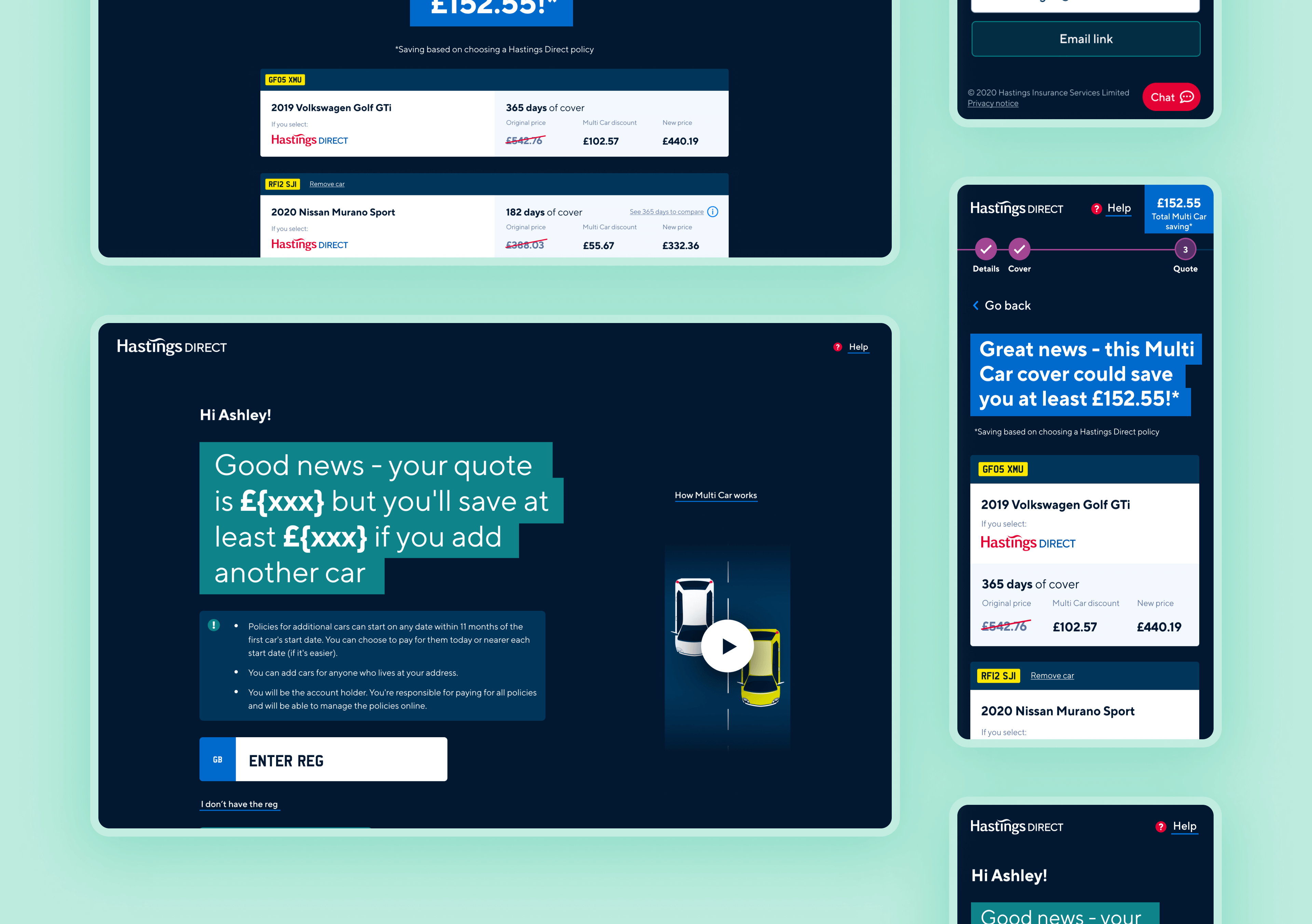
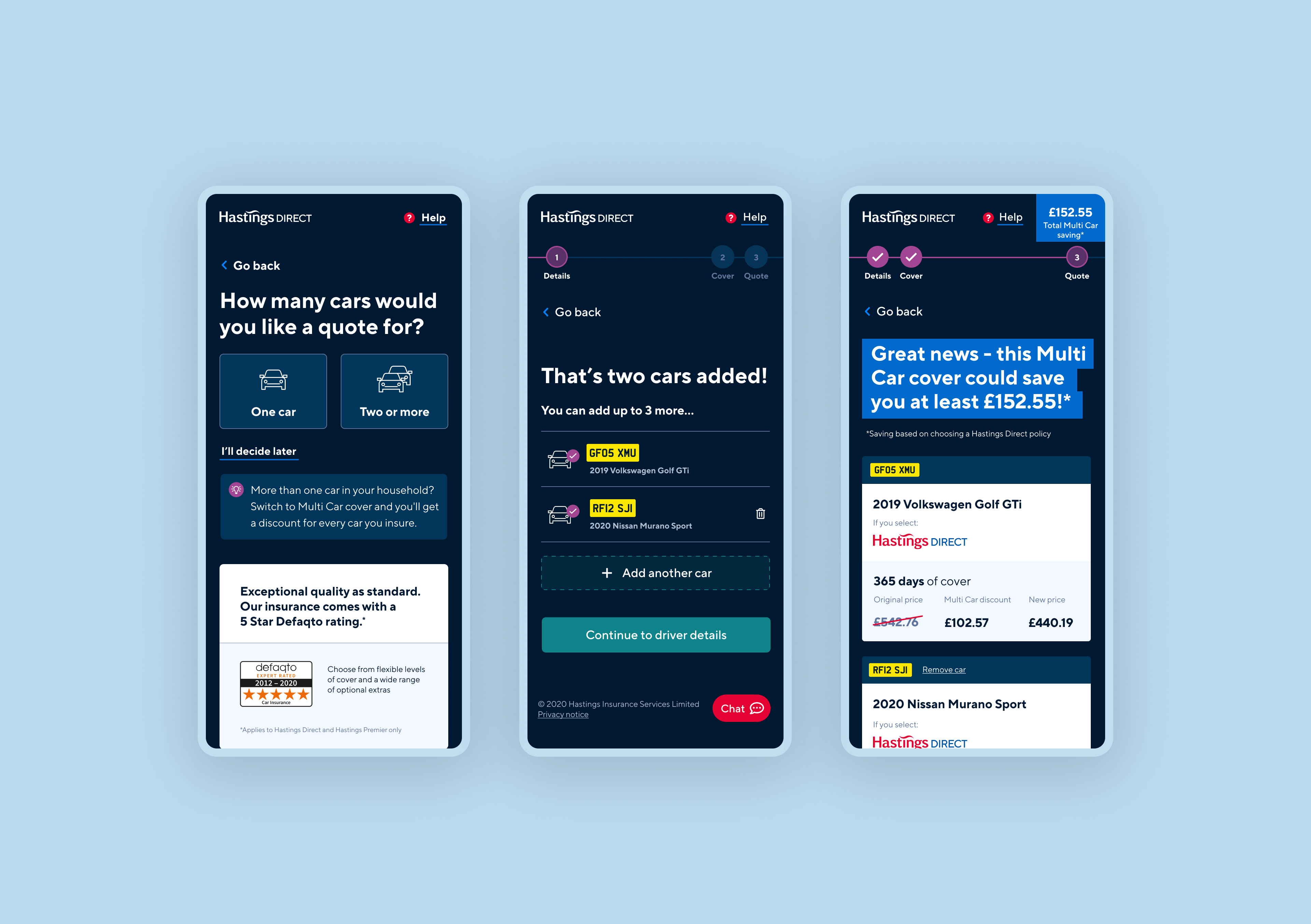
The project aimed to launch an industry-first digital multi-car proposition, a part of the larger digital transformation strategy.
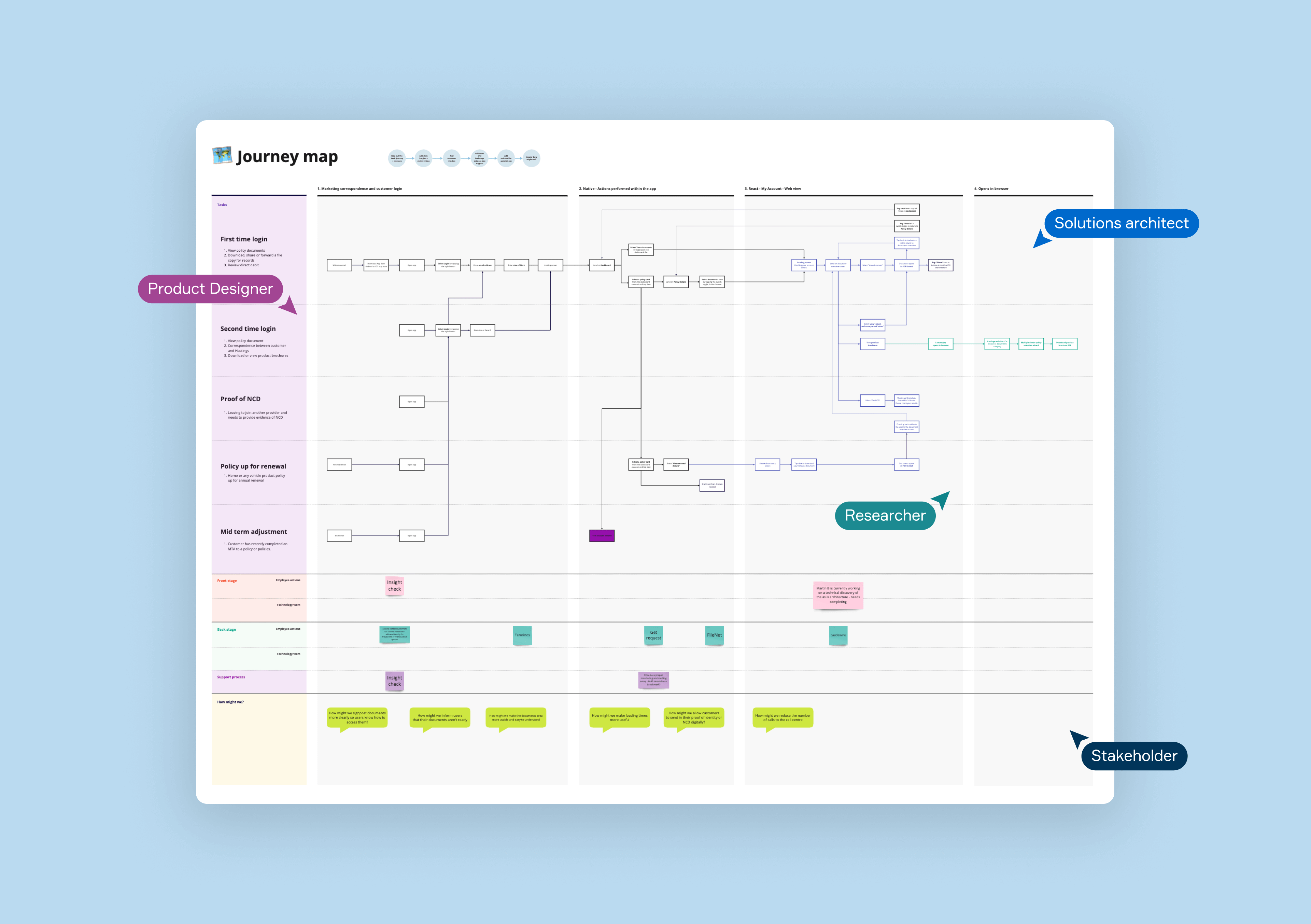
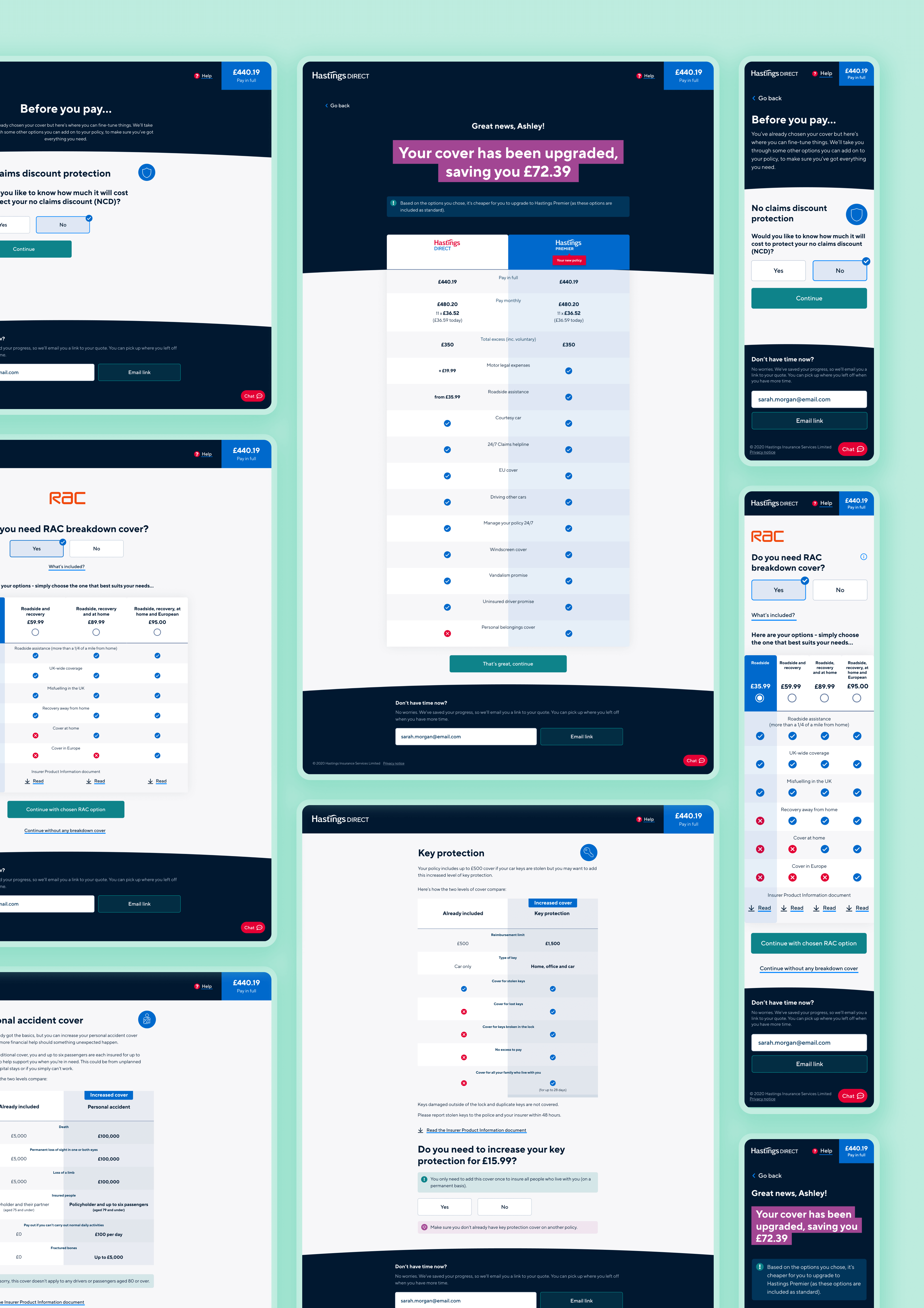
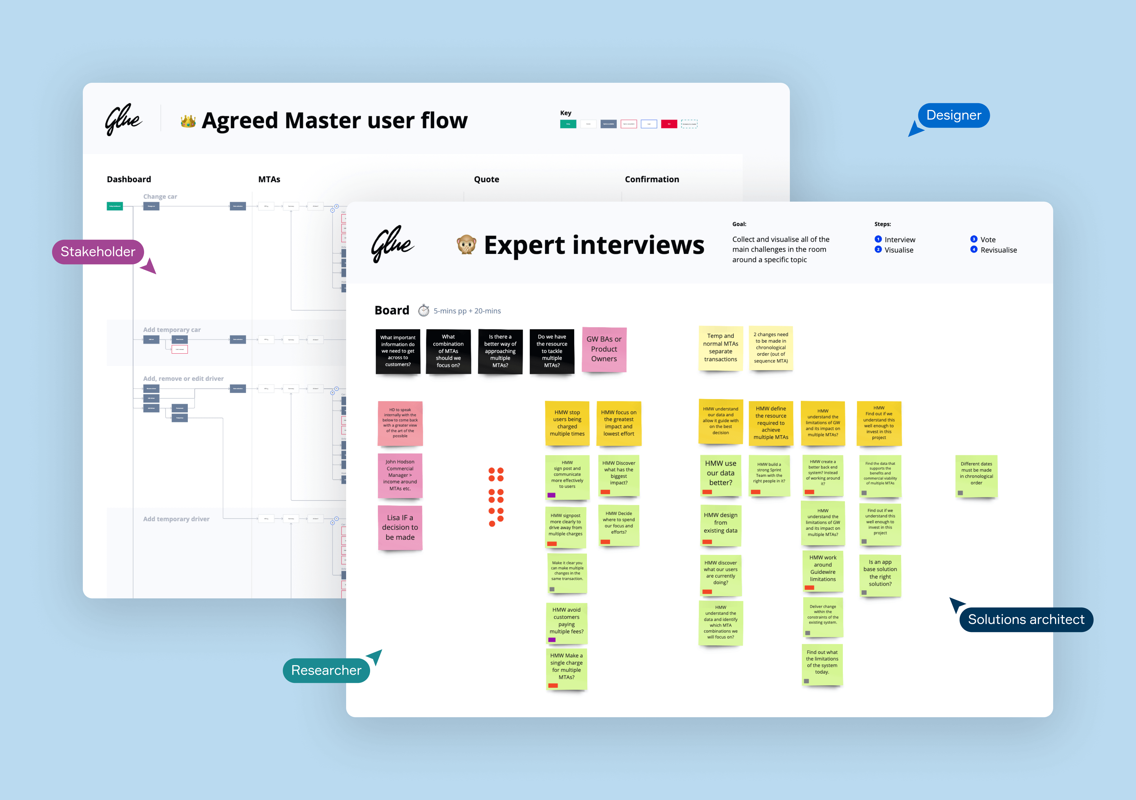
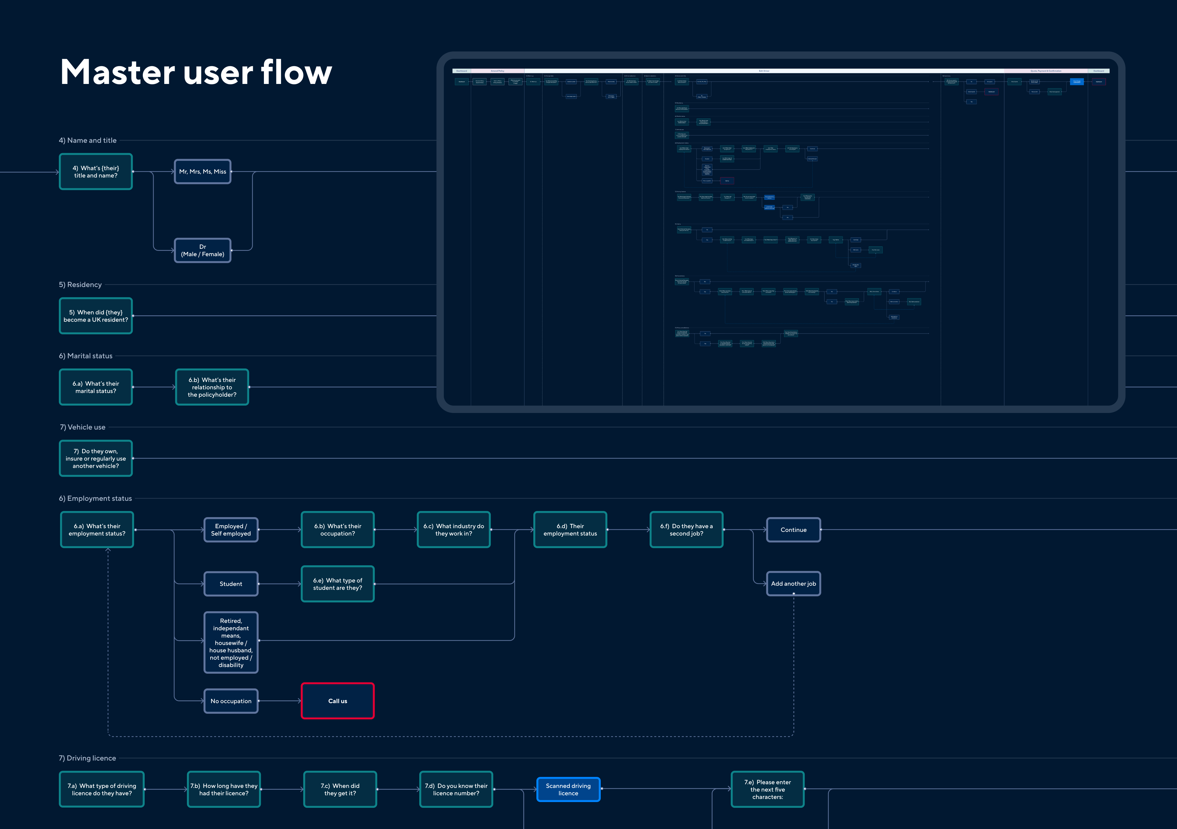
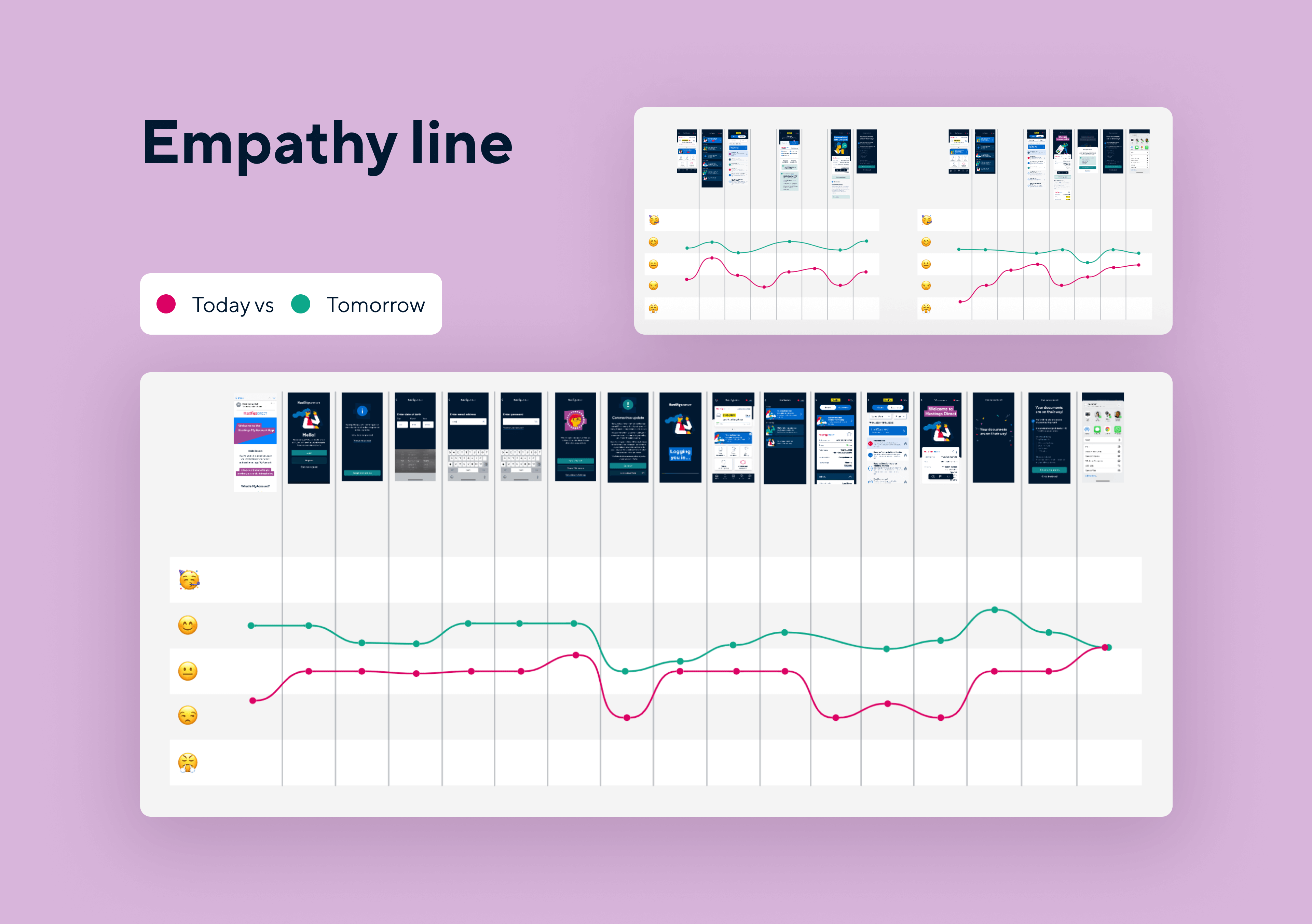
We utilised our Product Sprint methodology to design and implement this digital proposition. This involved intensive discovery and ideation workshops, intent study, risk analysis, and journey mapping, among other methods.
Mobile app transformation
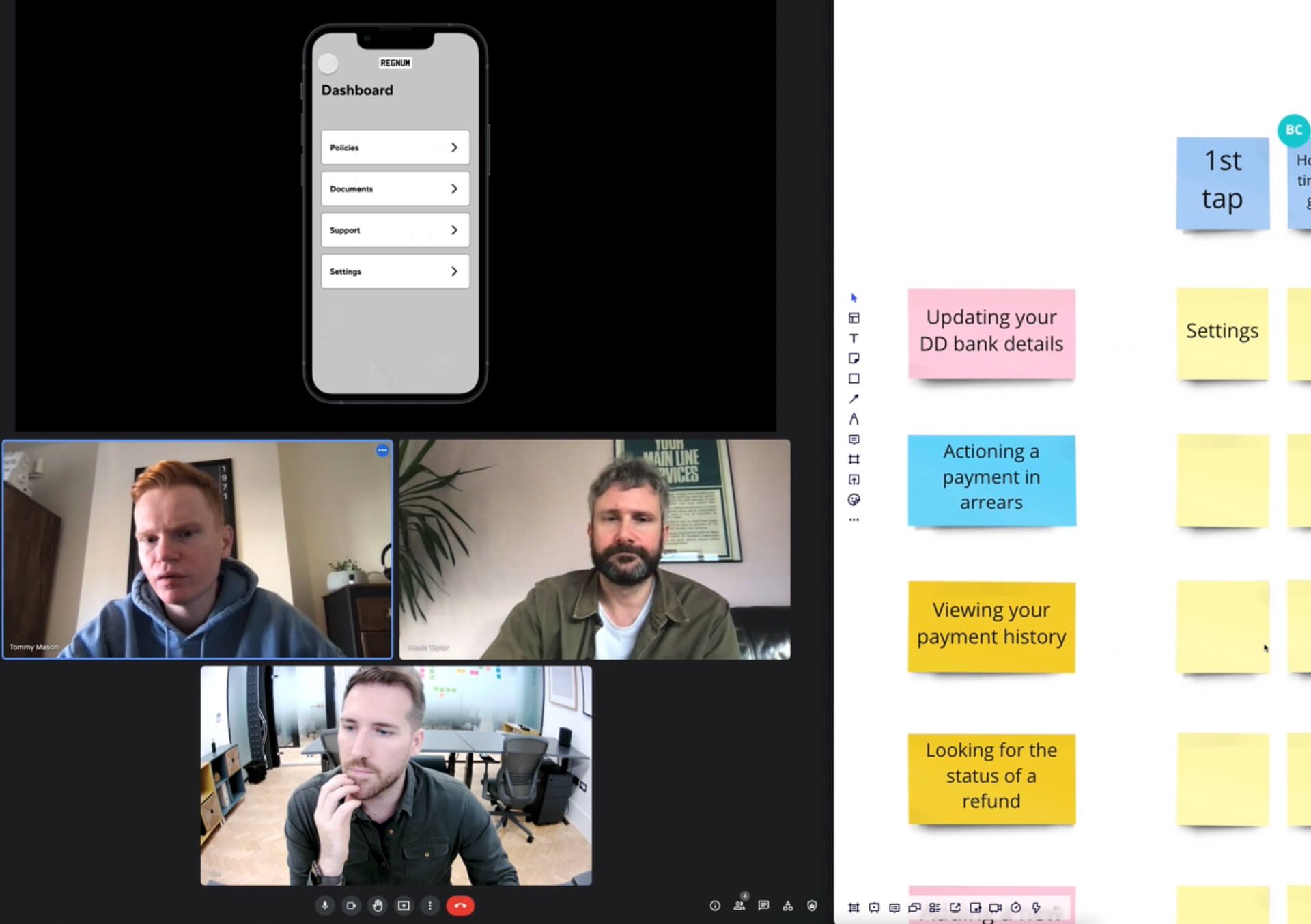
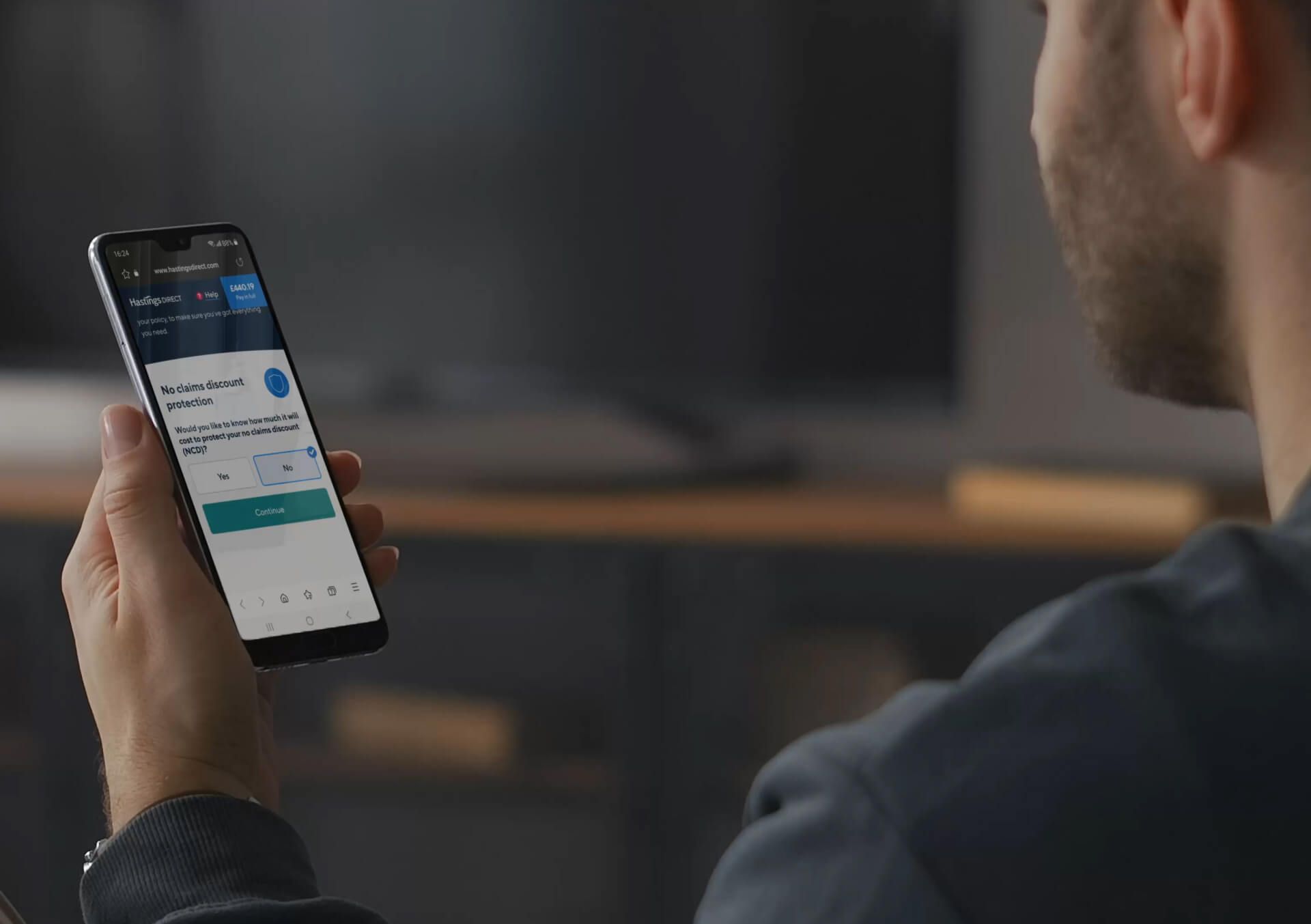
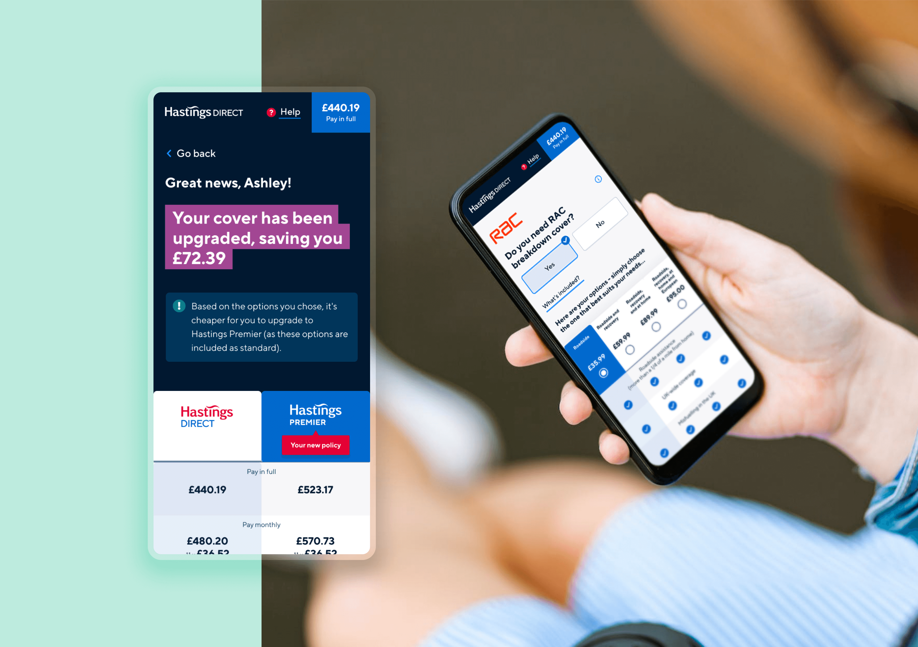
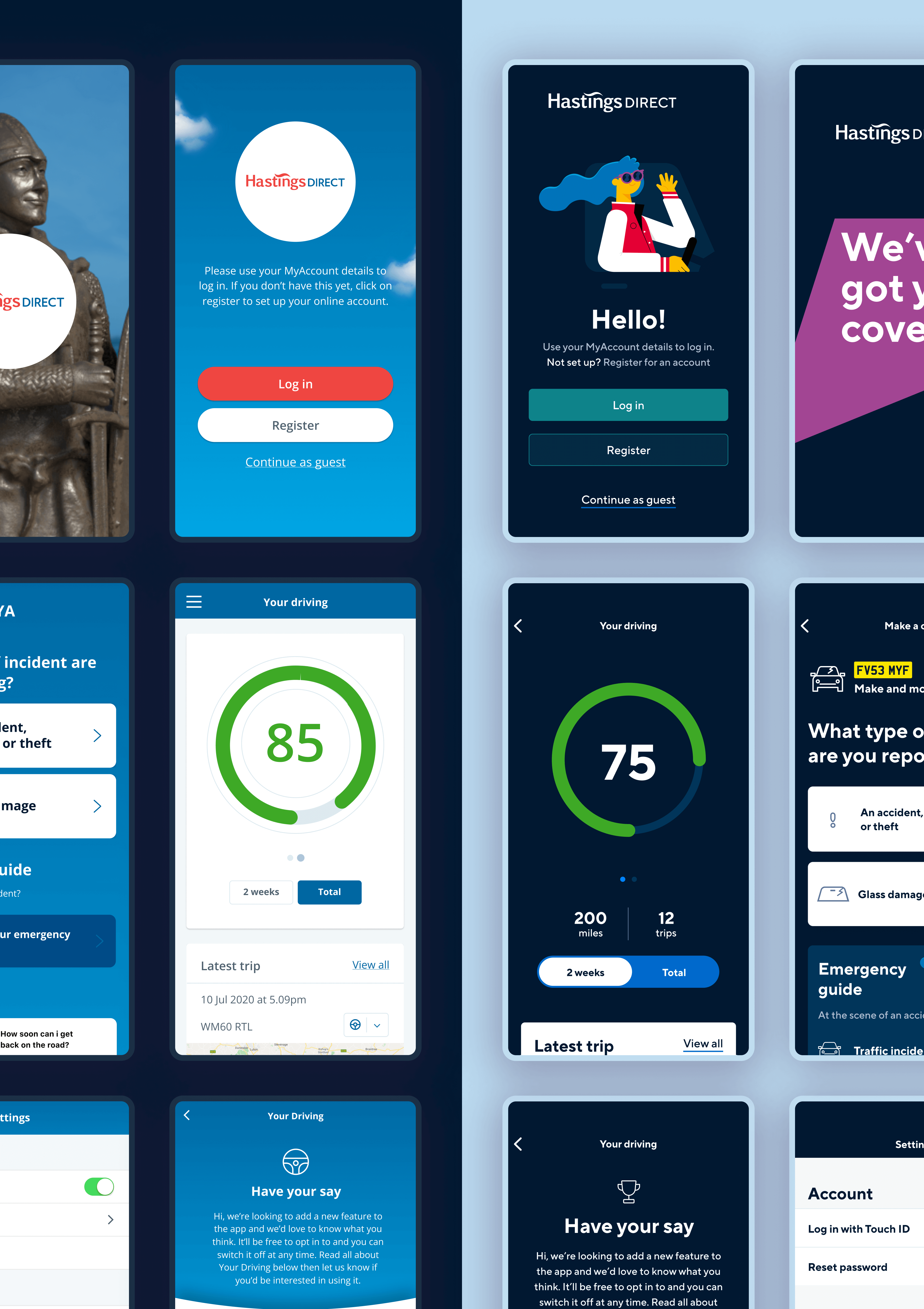
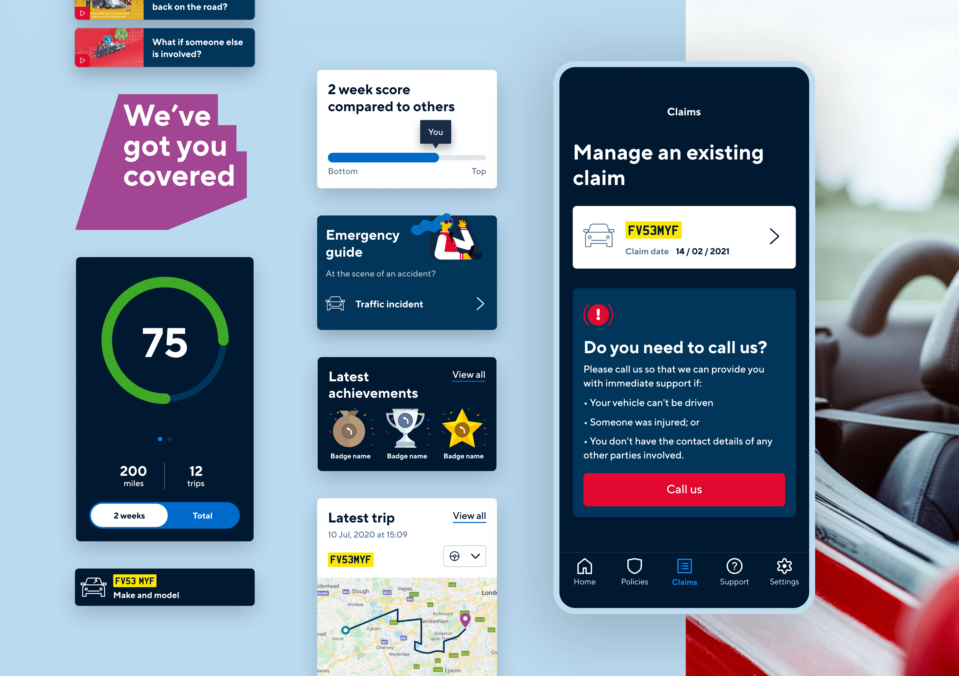
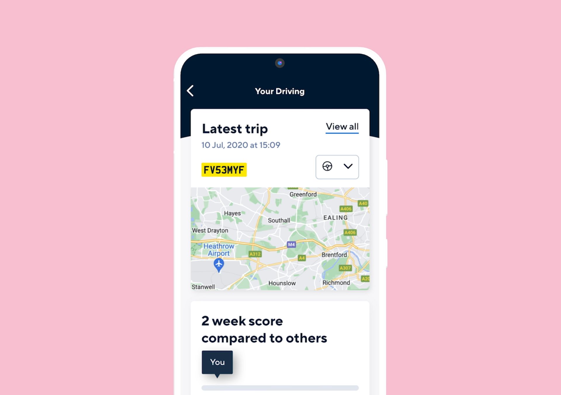
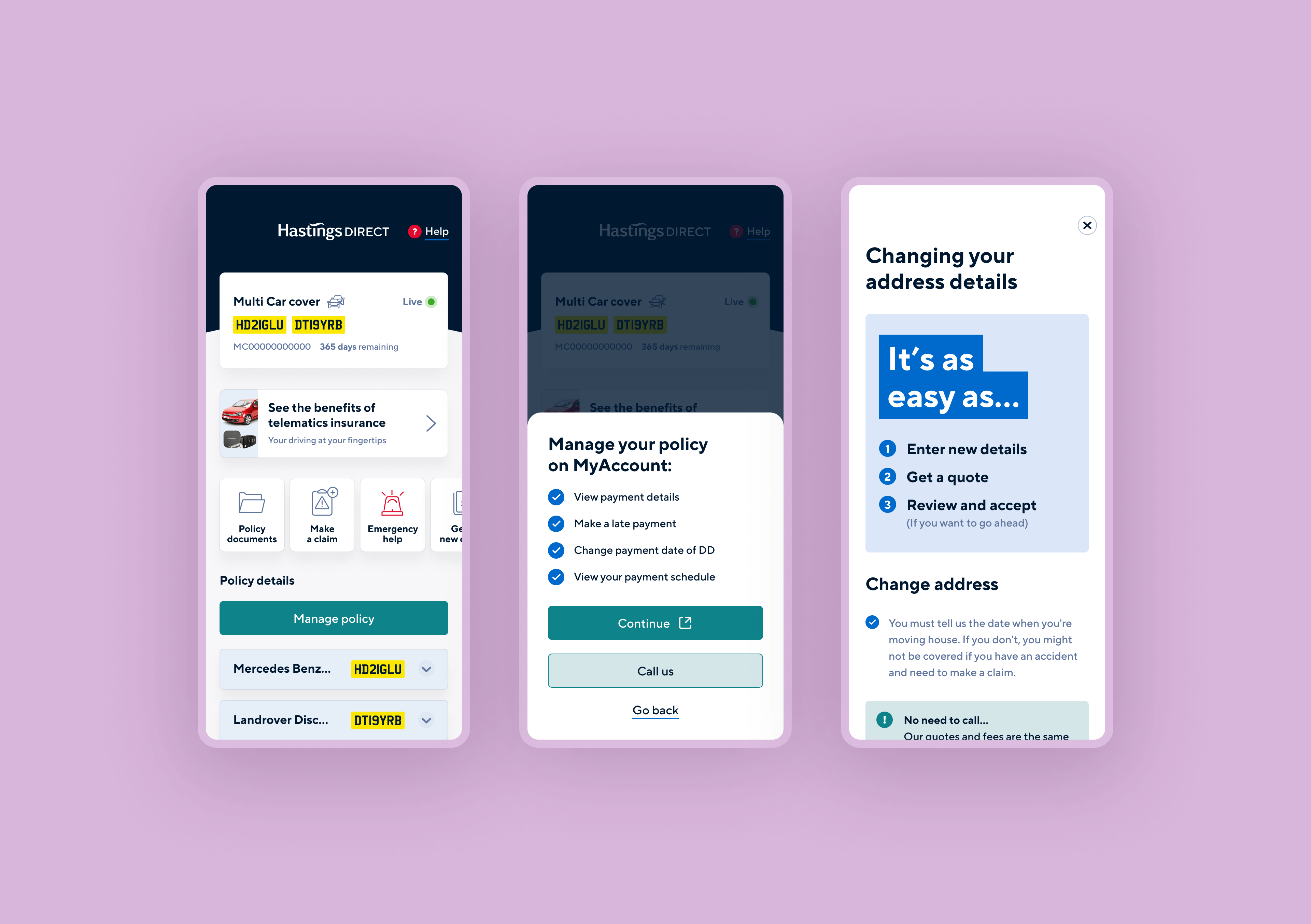
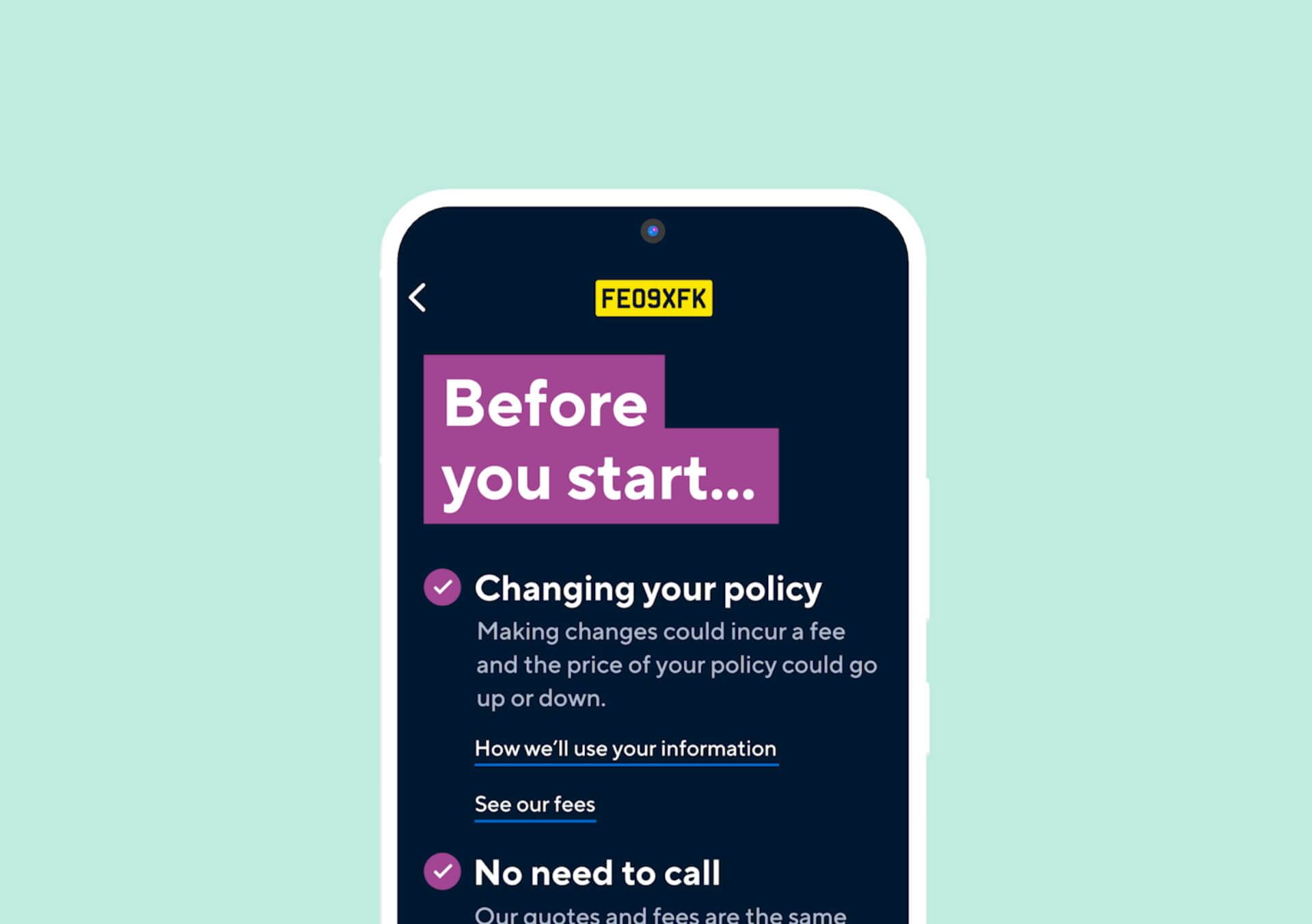
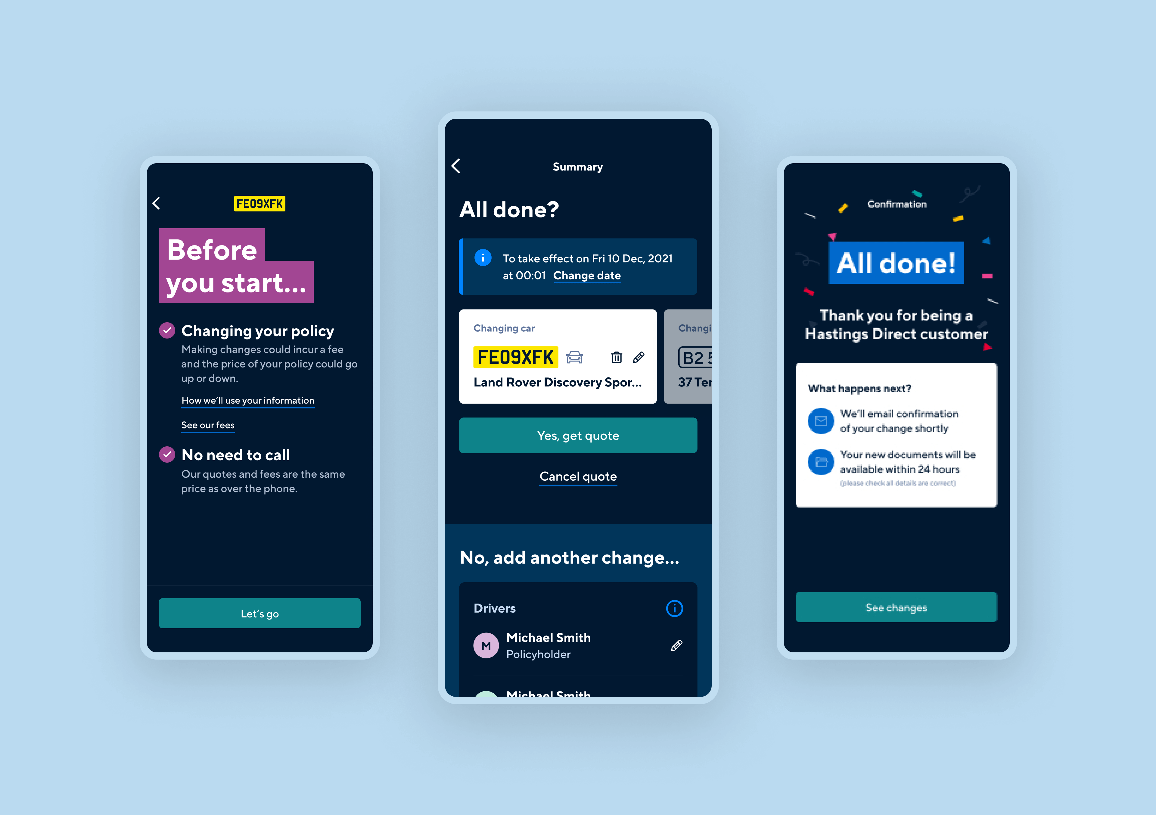
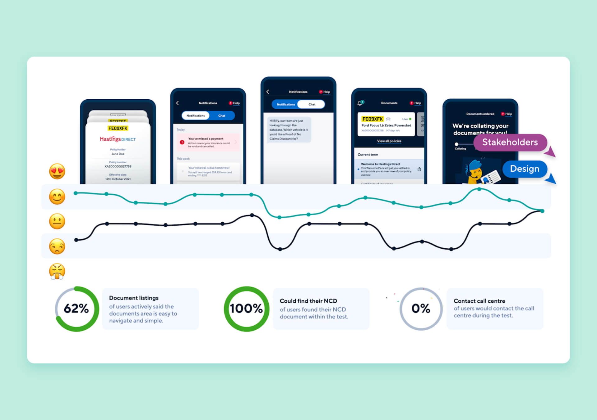
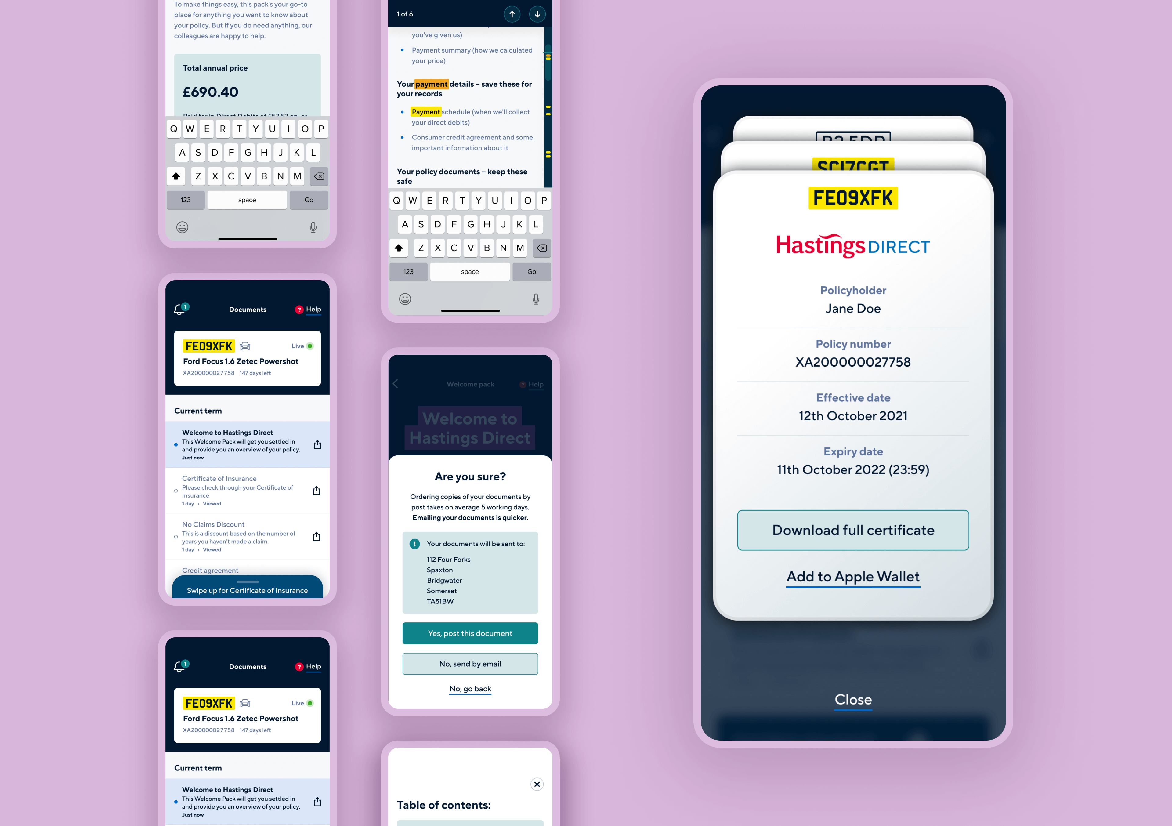
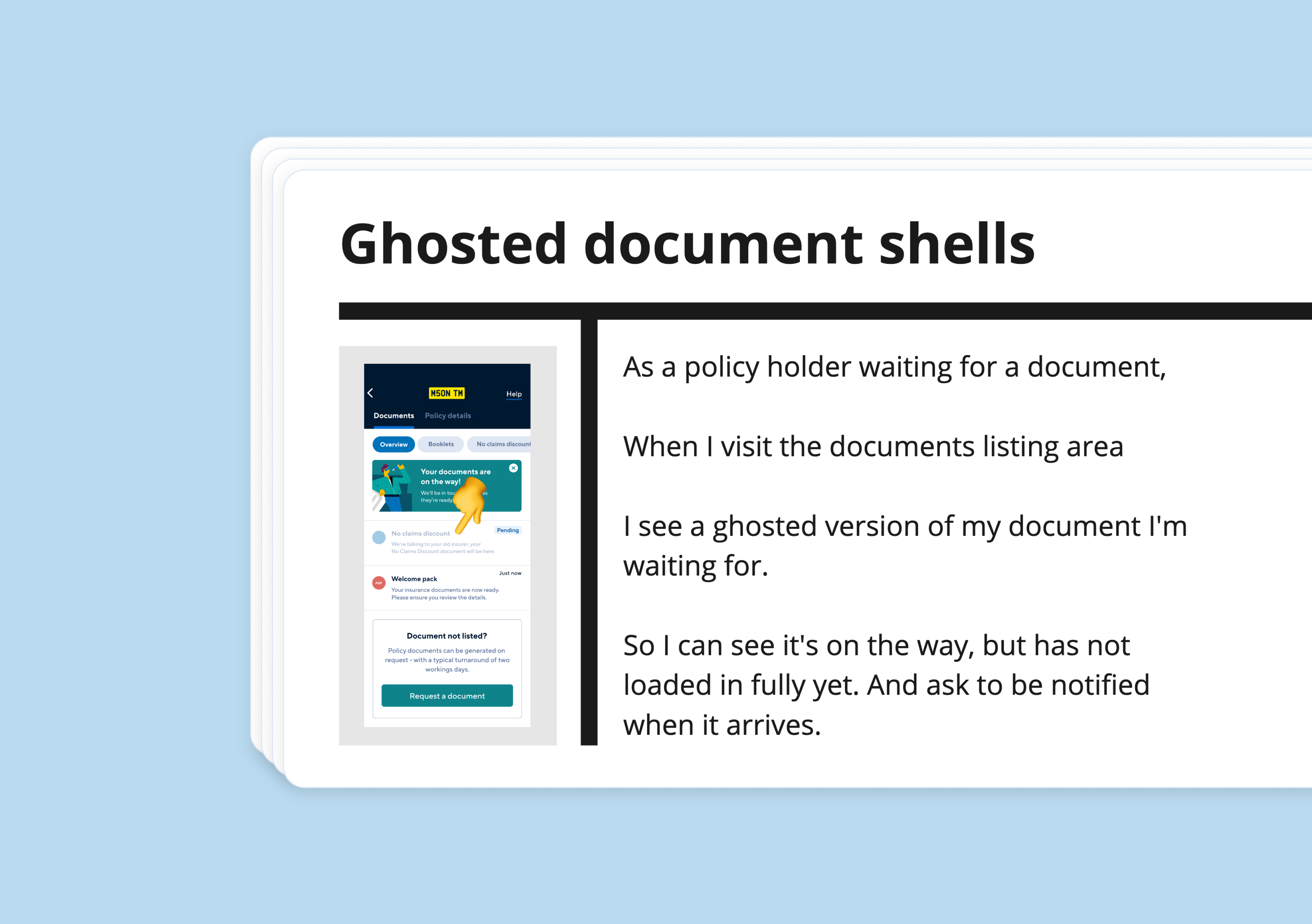
We worked with a great focus on mid-term adjustment (MTA) telephony service digitisation. Particular attention was spent on customer segments and how they interact with the app. This meant the dashboard, documents section, and quote journey were all made fit for the app. At the same time, with the new digital brand coming to light and the introduction of the time-saving design system, we were able to complete a whole app redesign.
Continual improvement
Our engagement with Hastings Direct was a testament to the power of innovation, agility, and creative thinking. Not only did we help them adapt to the digital landscape, but, also deliver high-quality, rapid releases that have greatly improved their user experience.
Other engagements
with Hastings Direct
- 1-month to deliver
- Built for optimisation
- 1-month to deliver
- Built for optimisation
- 1-month to deliver
- Built for optimisation
- 1-month to deliver
- Built for optimisation
Hastings Direct
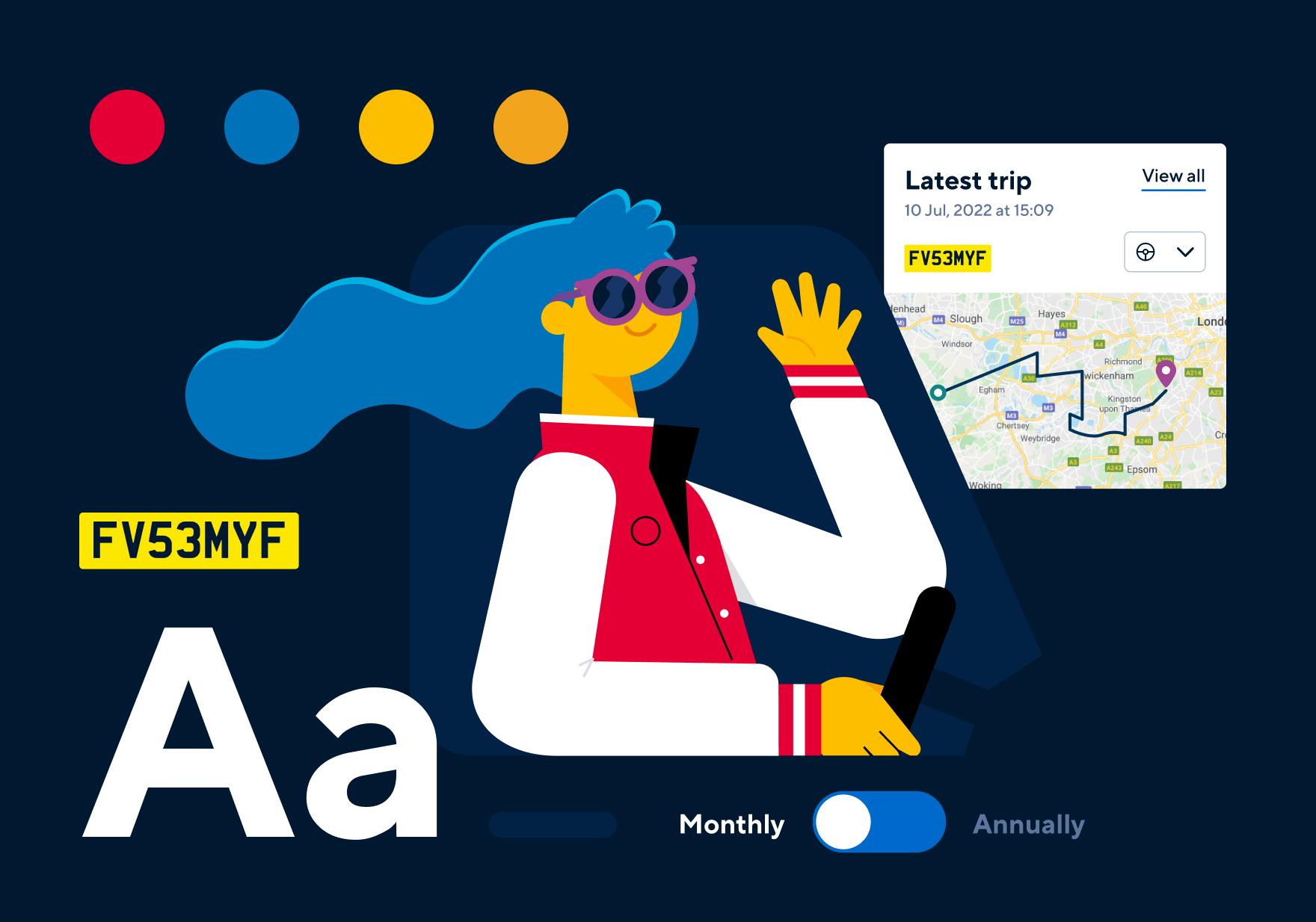
Delivering a scalable digital design system
- 57 opportunities identified
- Average 12 users participating every sprint
- 57 opportunities identified
- Average 12 users participating every sprint
- 57 opportunities identified
- Average 12 users participating every sprint
- 57 opportunities identified
- Average 12 users participating every sprint
Hastings Direct
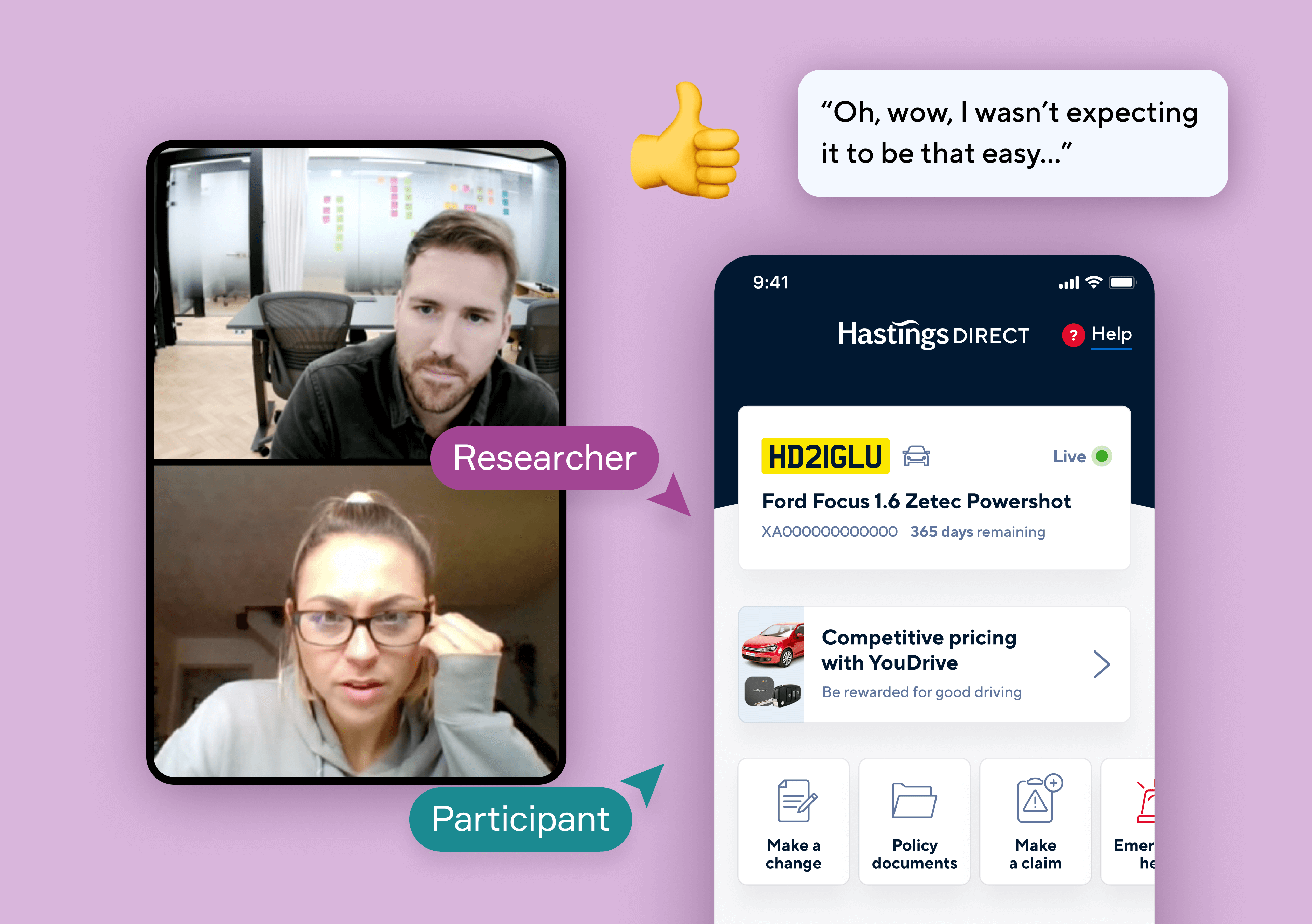
Research that identifies critical user insights
- Validated with 947 participants
- 8 quantitative and qualitative methods
- 59 core journey changes recommended
- Validated with 947 participants
- 8 quantitative and qualitative methods
- 59 core journey changes recommended
- Validated with 947 participants
- 8 quantitative and qualitative methods
- 59 core journey changes recommended
- Validated with 947 participants
- 8 quantitative and qualitative methods
- 59 core journey changes recommended

Hastings Direct
Making a telephony proposition digital
You may also like
- 11 experiments executed
- Conducted over 12 sprints
- Measurement period of 6 sprints
- 11 experiments executed
- Conducted over 12 sprints
- Measurement period of 6 sprints
- 11 experiments executed
- Conducted over 12 sprints
- Measurement period of 6 sprints
- 11 experiments executed
- Conducted over 12 sprints
- Measurement period of 6 sprints
Blinds2Go
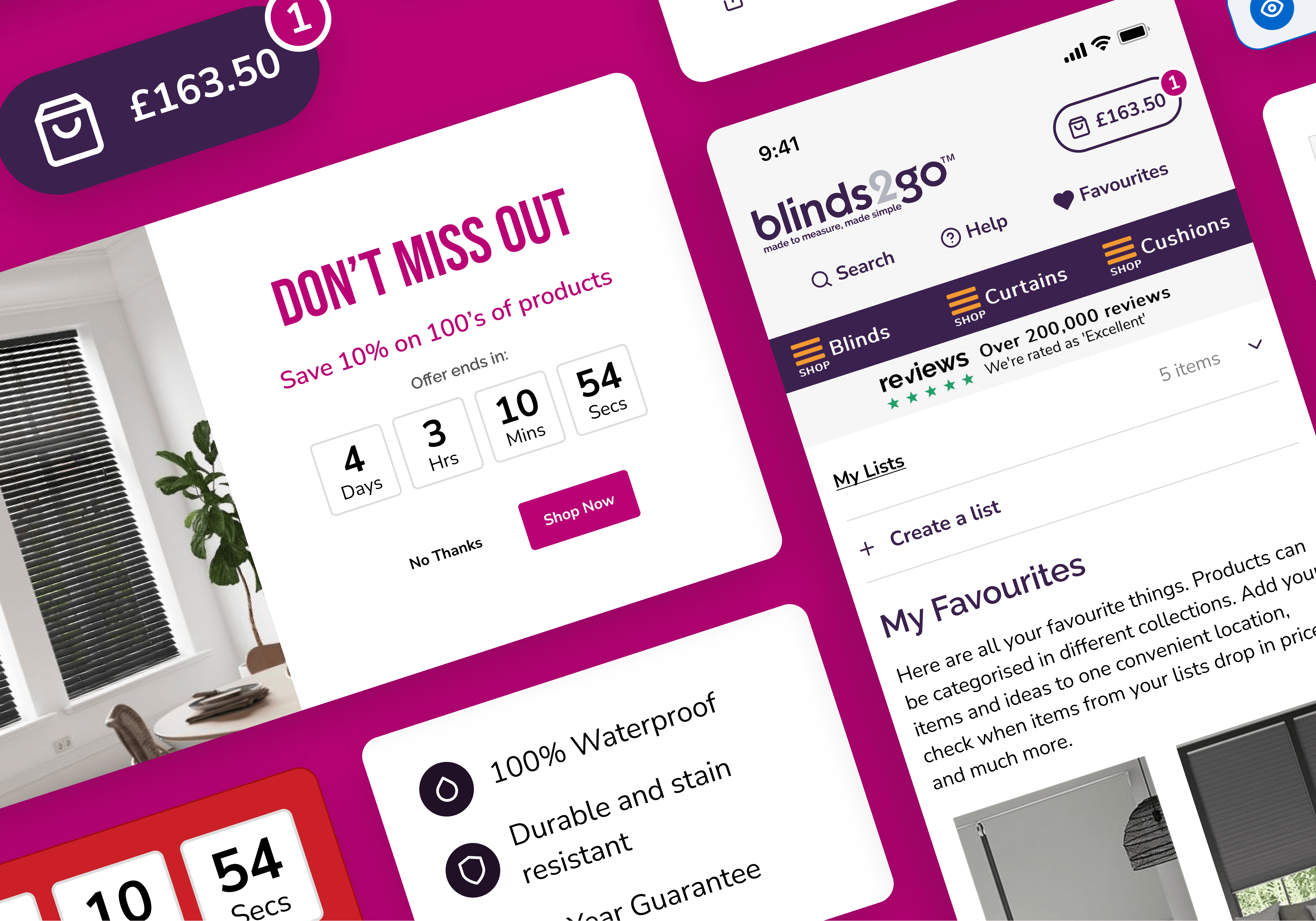
Multi-site experiments for a category leader
- 4% channel revenue share for 9 consecutive months
- YoY growth performance
- 36% LFL, 37% LFL and 30% LFL growth
- 4% channel revenue share for 9 consecutive months
- YoY growth performance
- 36% LFL, 37% LFL and 30% LFL growth
- 4% channel revenue share for 9 consecutive months
- YoY growth performance
- 36% LFL, 37% LFL and 30% LFL growth
- 4% channel revenue share for 9 consecutive months
- YoY growth performance
- 36% LFL, 37% LFL and 30% LFL growth
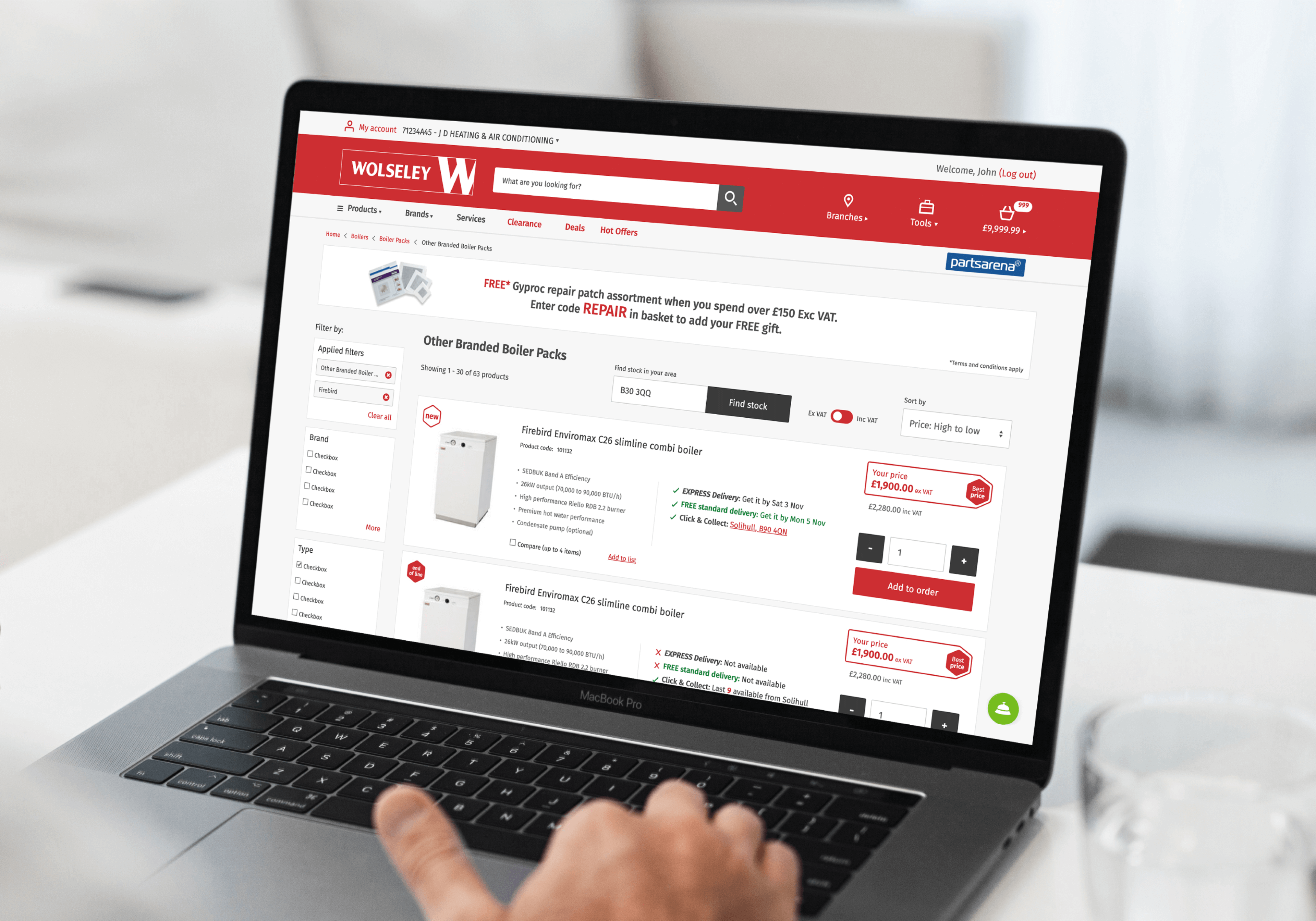
Wolseley UK
Progressive thinking for a digital future
- Growing worldwide market share by 27.3%
- Achieving user growth of 1.1m in 6-months
- 37 critical UX recommendations identified
- Growing worldwide market share by 27.3%
- Achieving user growth of 1.1m in 6-months
- 37 critical UX recommendations identified
- Growing worldwide market share by 27.3%
- Achieving user growth of 1.1m in 6-months
- 37 critical UX recommendations identified
- Growing worldwide market share by 27.3%
- Achieving user growth of 1.1m in 6-months
- 37 critical UX recommendations identified
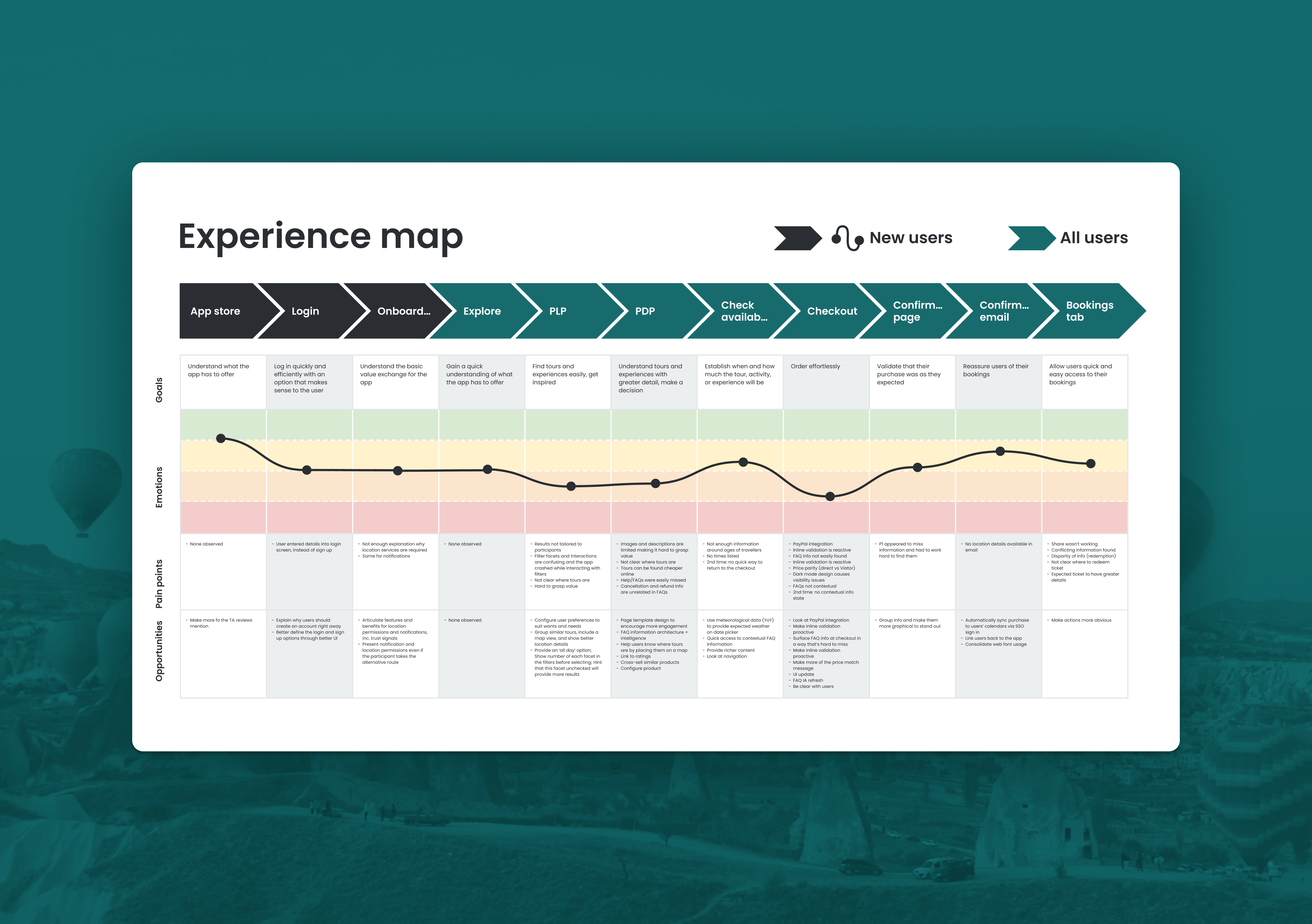
Viator
Research and validation for a leading travel app
- 15-days turnaround
- 29 screens designed
- Validated 2 prototypes with 12 participants
- 15-days turnaround
- 29 screens designed
- Validated 2 prototypes with 12 participants
- 15-days turnaround
- 29 screens designed
- Validated 2 prototypes with 12 participants
- 15-days turnaround
- 29 screens designed
- Validated 2 prototypes with 12 participants
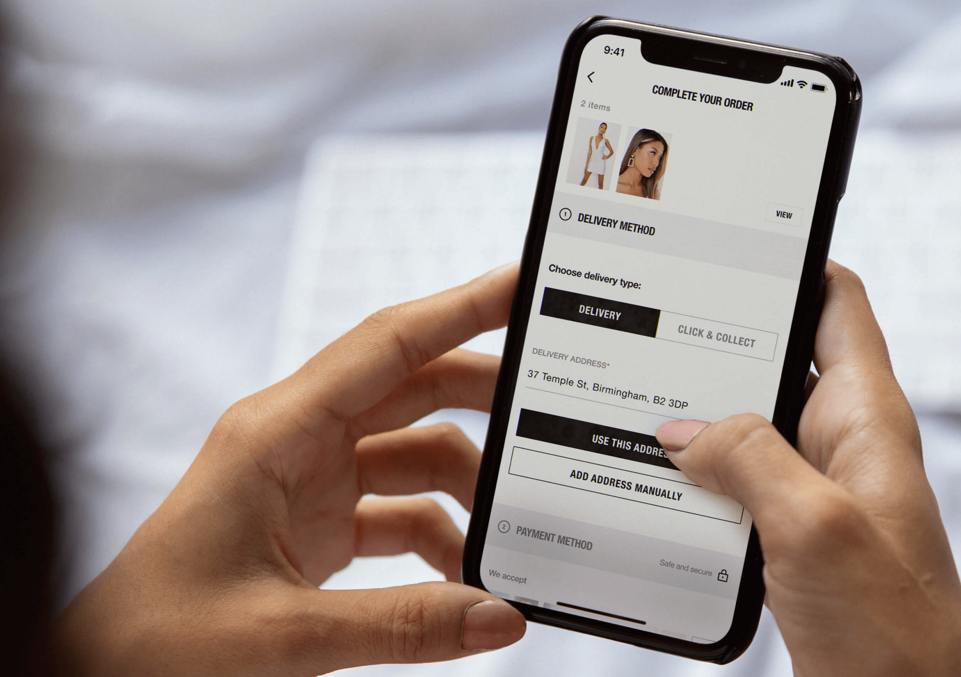
Missguided
App checkout design and validation at speed
