Making kiosks the go-to tool for shoppers
Increased conversion rates by 2.3% compared to the previous design at the same location.
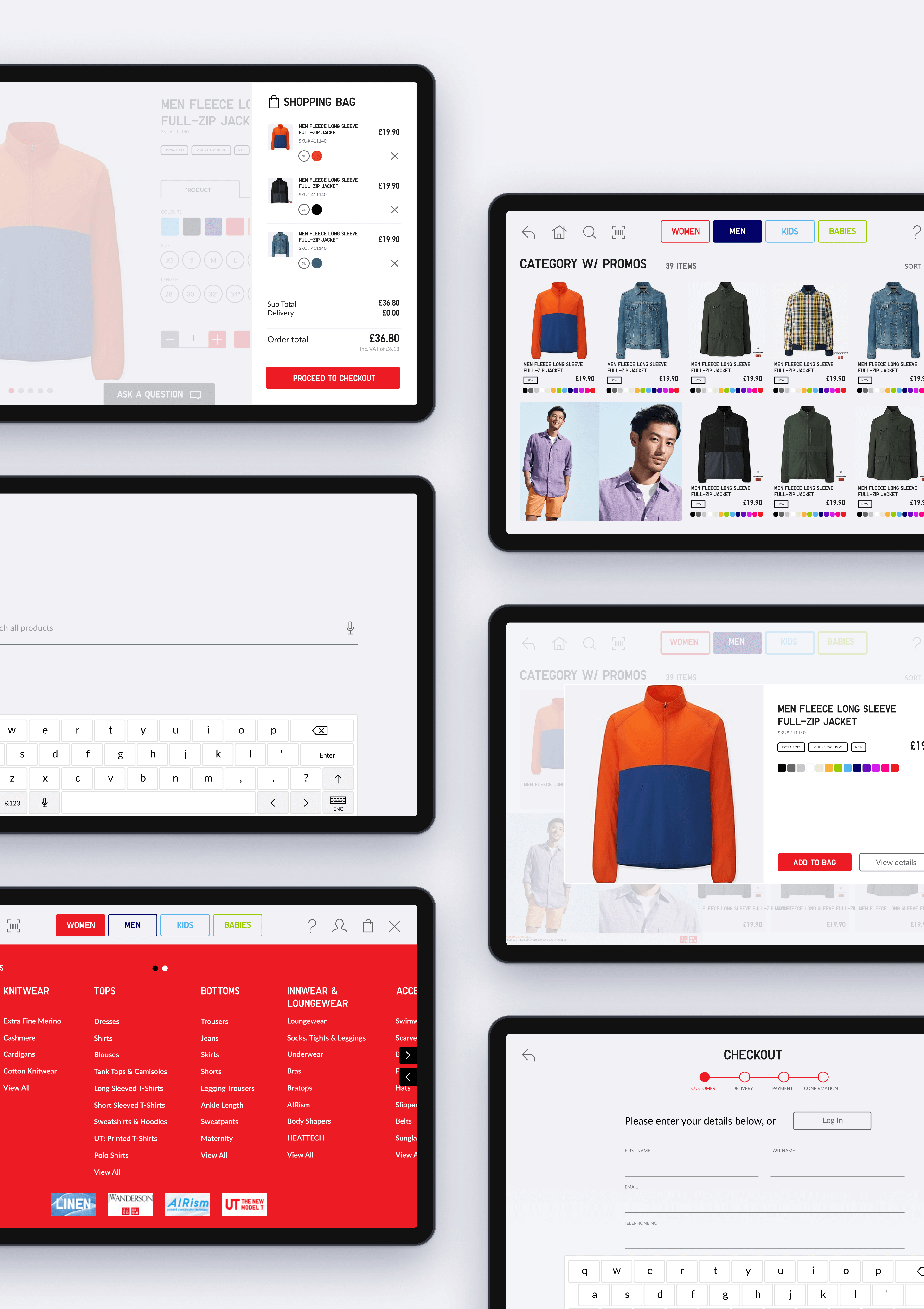
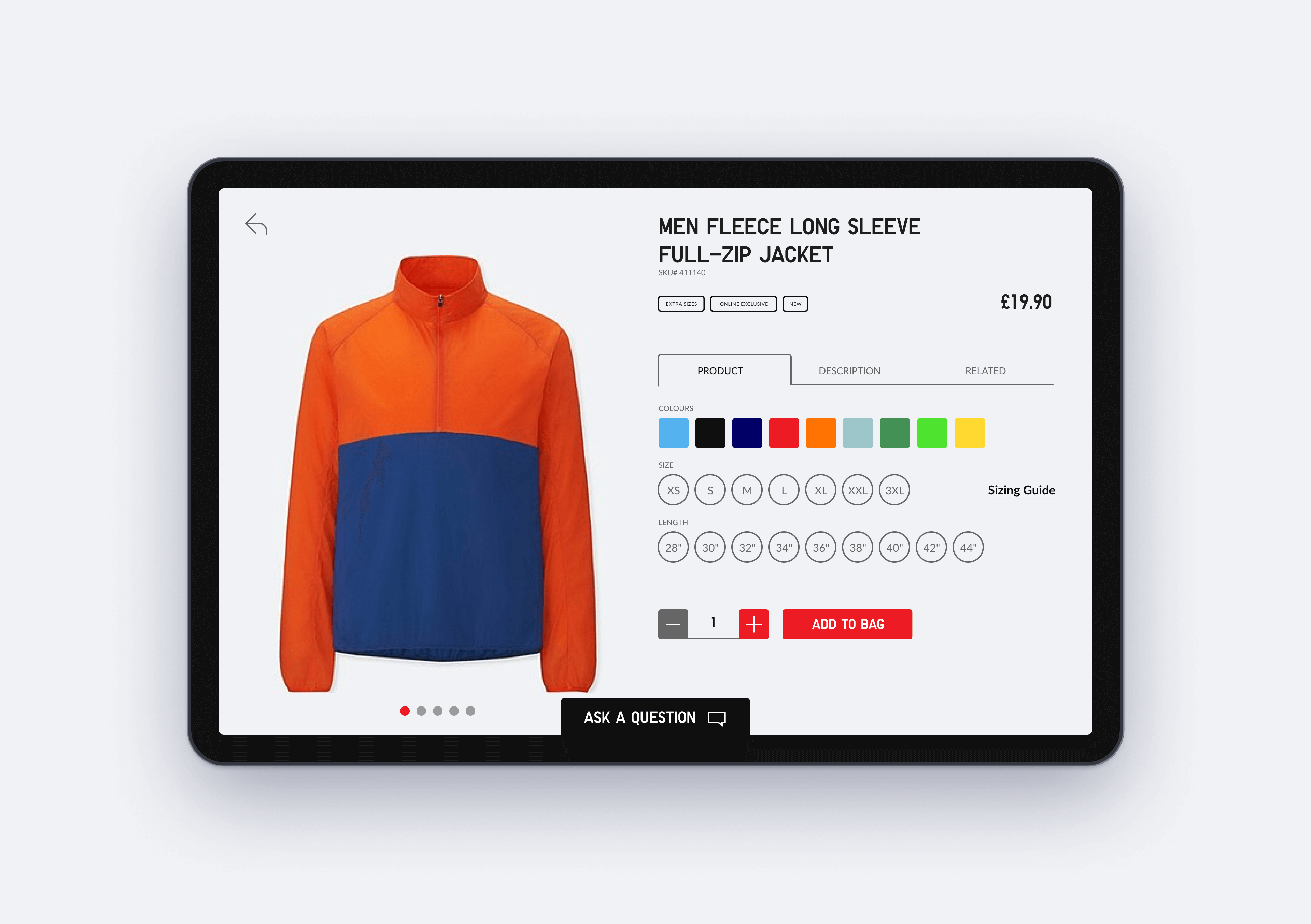
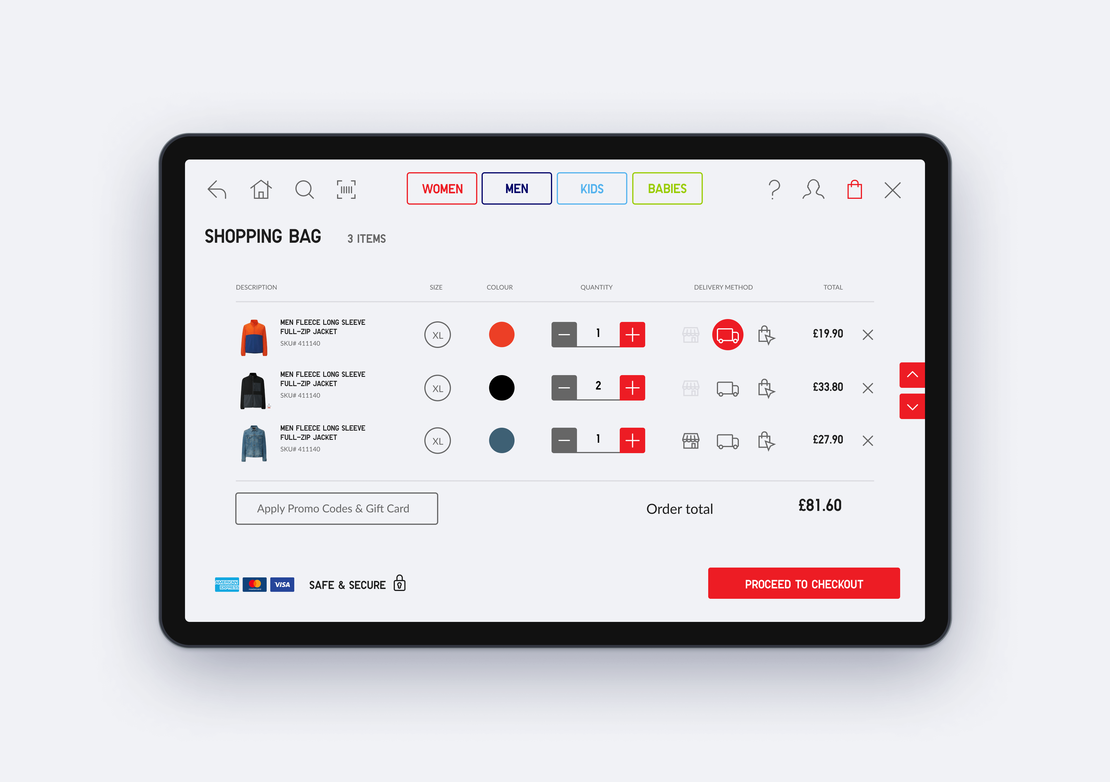
31 screens were designed and delivered for the redesign, including multi-step sequences.
Researched, designed, and delivered at lightning speed, spanning only 2 sprints.
Details
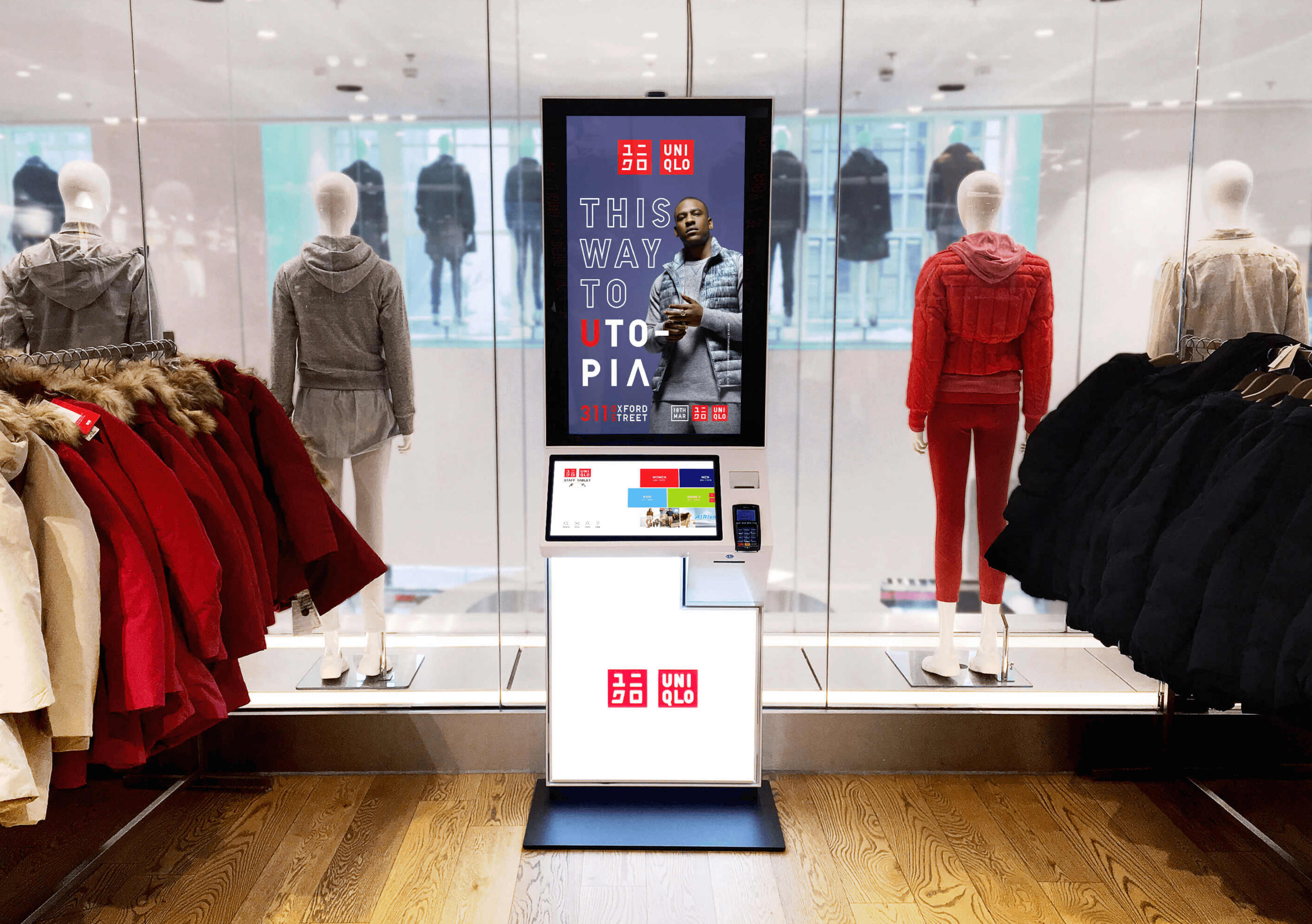
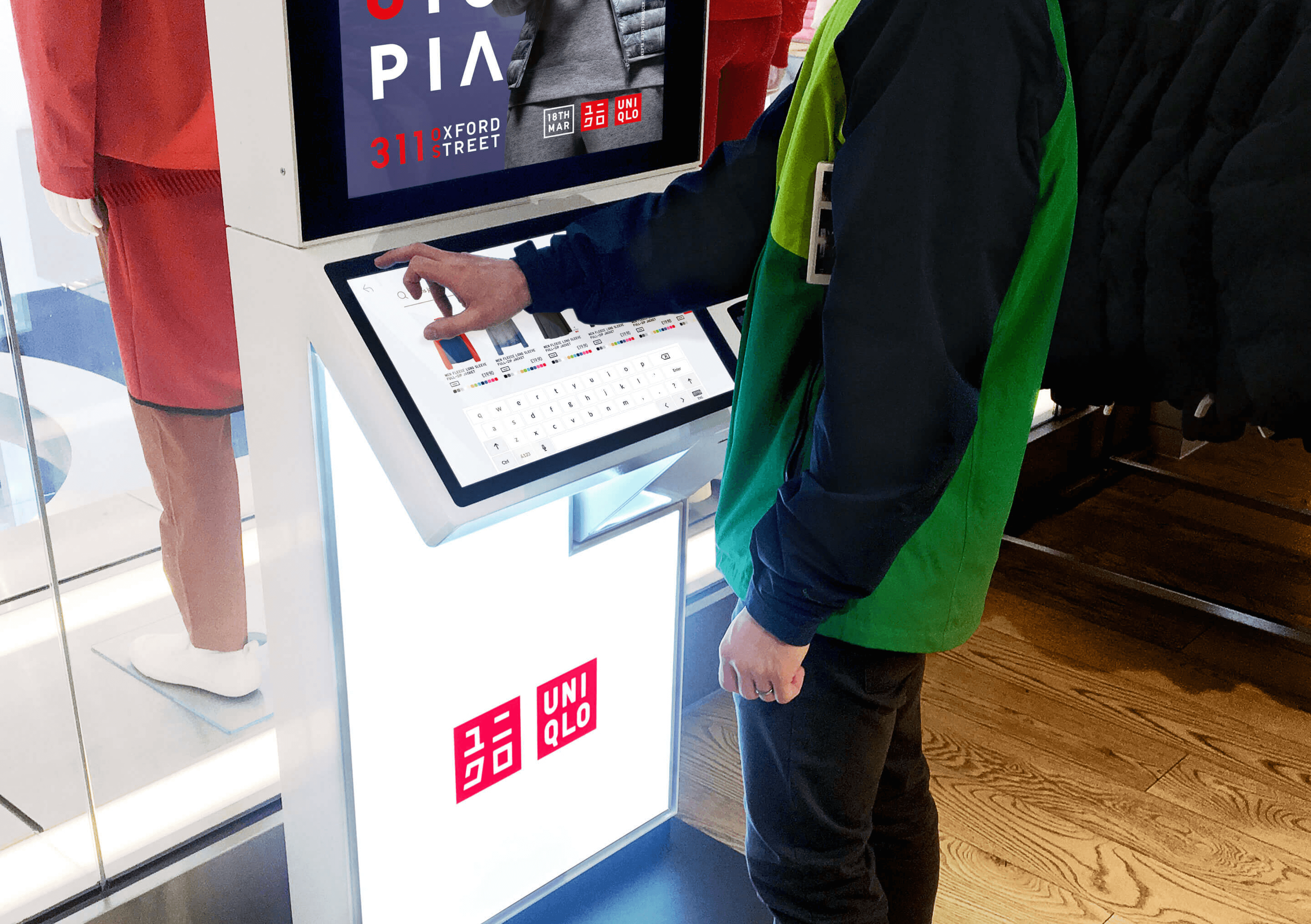
Our collaboration with Uniqlo marked an exciting chapter in product design innovation. Harnessing the power of Product Sprints, we revolutionised the in-store kiosk experience for this global fast-fashion giant. As a result, we distilled complex tasks into intuitive, swift user journeys and addressed the UX/CX pain points with strategic design solutions and data-driven decision-making.
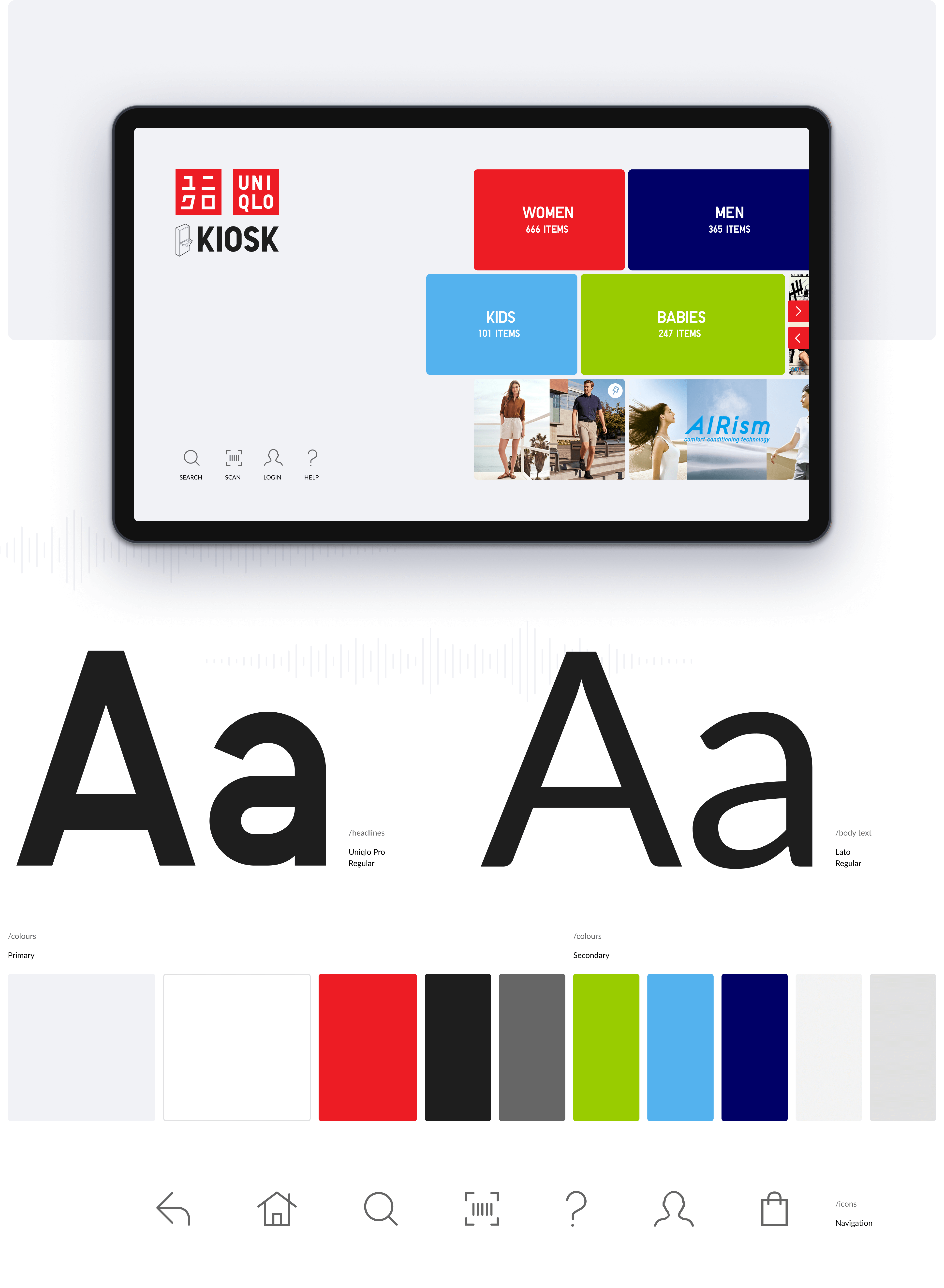
The heart of our strategy was the simplification and modernisation of Uniqlo's kiosk user experience. From the welcome screen to checkout, we optimised every touchpoint. A newly introduced tile system on the start screen enriches user engagement, empowering them to explore deeper into Uniqlo's vibrant catalogue. To ensure users stayed focused, we utilised overlay techniques, enabling seamless navigation using simple taps and swipes. Our approach not only amplified the agility and innovation in the kiosk's operation, but it also reinforced Uniqlo's branding consistency, thanks to the judicious use of colour to highlight primary and secondary functions.
The transformation didn't stop at functionality; we also refined the kiosk's aesthetics. Streamlined typography, layout, and iconography contributed to a simplified yet engaging user interface. Furthermore, custom animated illustrations guided users through various tasks, creating an interactive and enjoyable user experience. The careful implementation of transitions and micro-animations completed our holistic approach, adding a final touch to the elevated retail experience that Uniqlo customers now enjoy. By prioritising rapid prototyping and frequent high-quality releases, we delivered an innovative solution that not only enhanced the shopping experience but also increased brand engagement and customer satisfaction.
You may also like…
- Increased conversion rates by 1.62%
- Achieved a 215% in-store adoption uplift
- Delivered in 2 sprints
- Increased conversion rates by 1.62%
- Achieved a 215% in-store adoption uplift
- Delivered in 2 sprints
- Increased conversion rates by 1.62%
- Achieved a 215% in-store adoption uplift
- Delivered in 2 sprints
- Increased conversion rates by 1.62%
- Achieved a 215% in-store adoption uplift
- Delivered in 2 sprints
Three
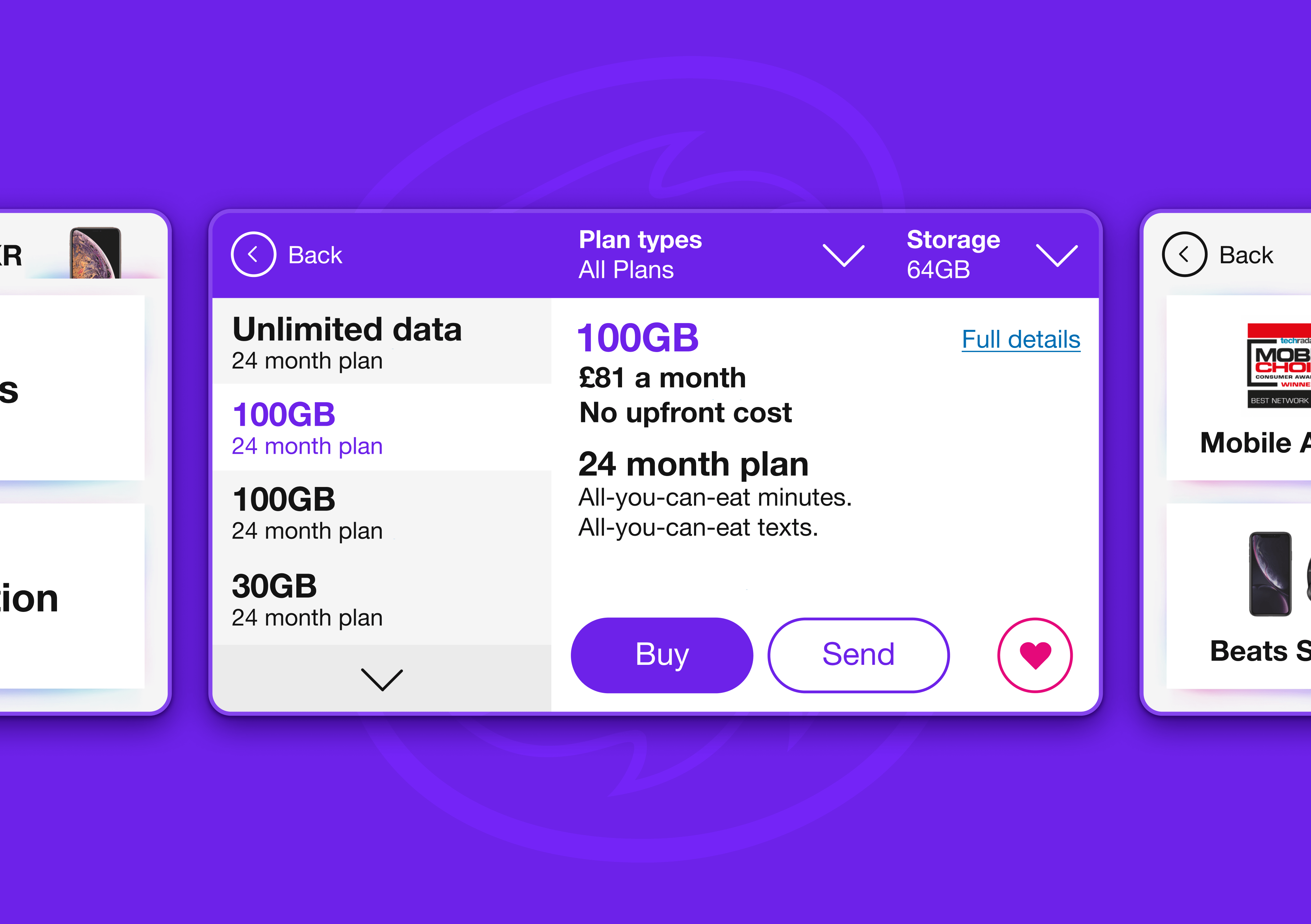
Selling more phone tariffs through digital
- 17 core screens designed across core journey
- Delivered across four sprints
- 17 core screens designed across core journey
- Delivered across four sprints
- 17 core screens designed across core journey
- Delivered across four sprints
- 17 core screens designed across core journey
- Delivered across four sprints
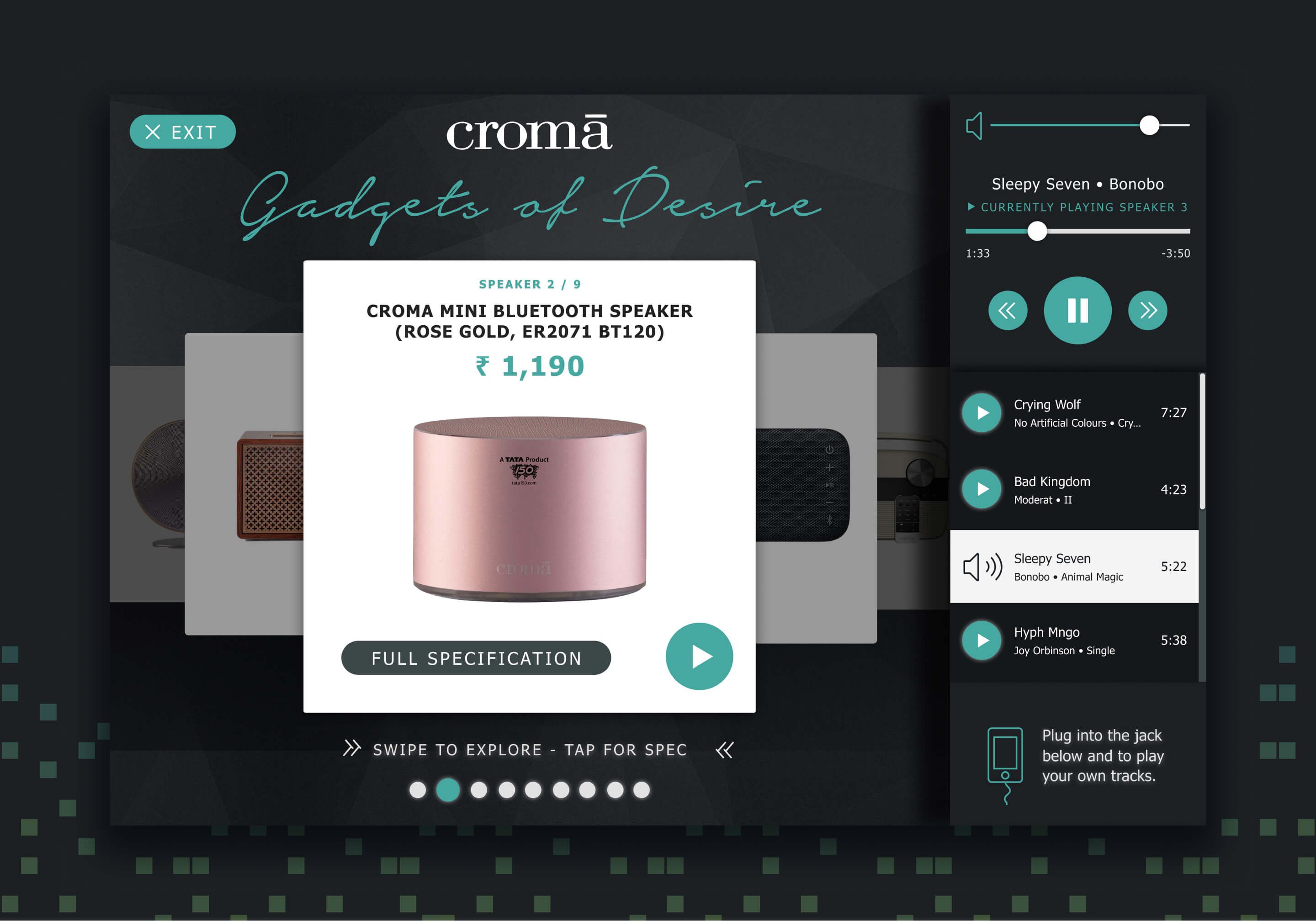
Croma
In-store digital kiosk experiences
