App checkout design and validation at speed
15-days turnaround from completing the experience review to delivering high-fidelity, validated designs.
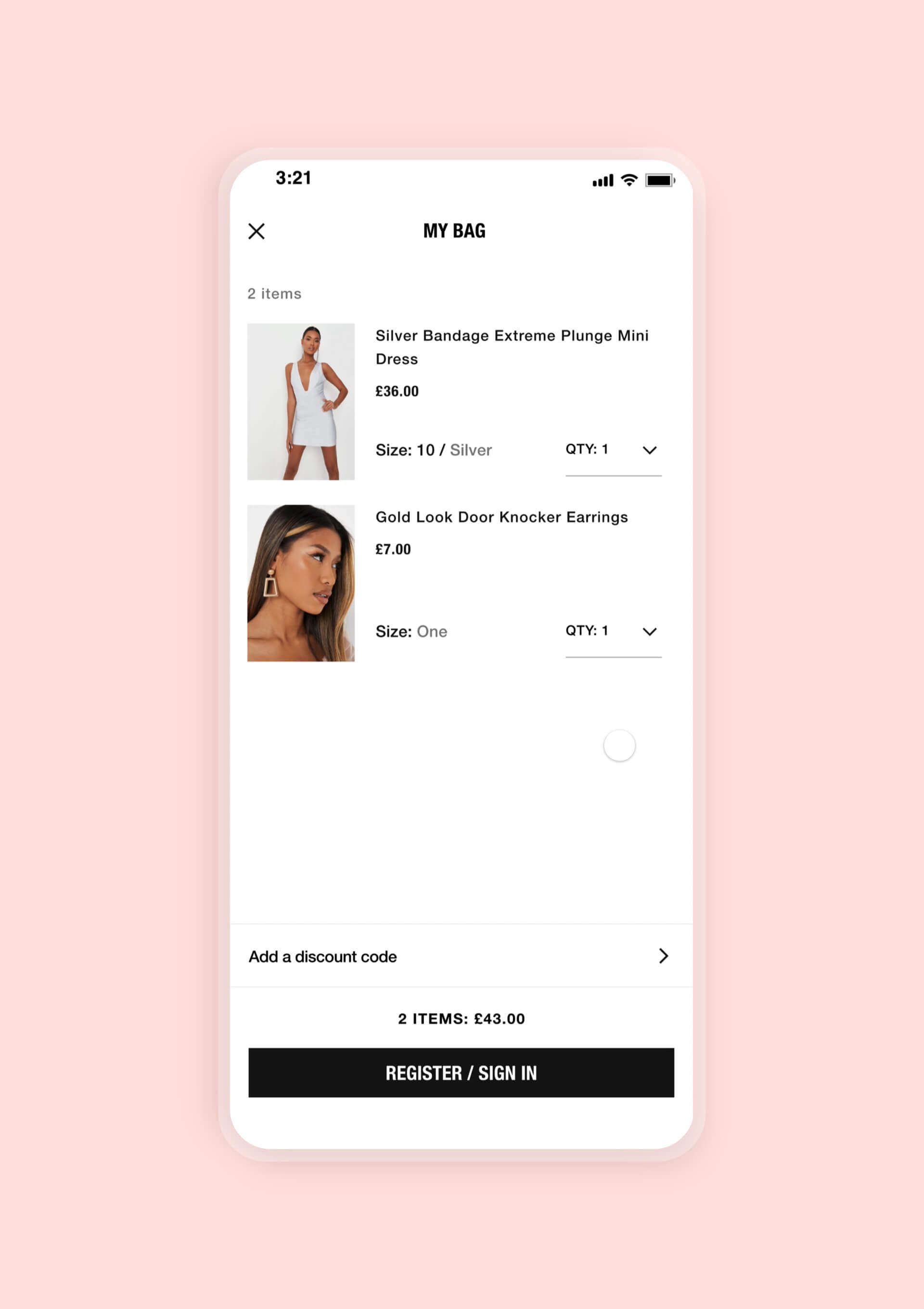
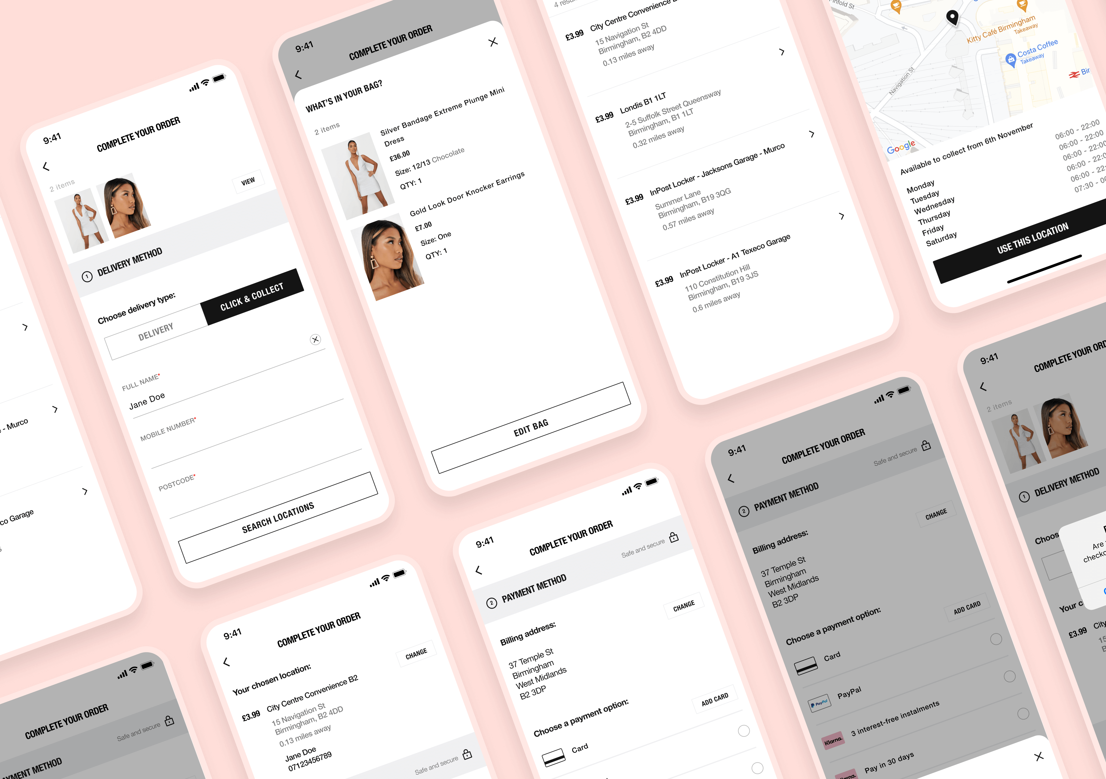
29 screens designed for iOS and Android platforms, including nuances and edge case scenarios.
Validated 2 high-fidelity prototypes with 12 users across 2-days of usability testing.
Details
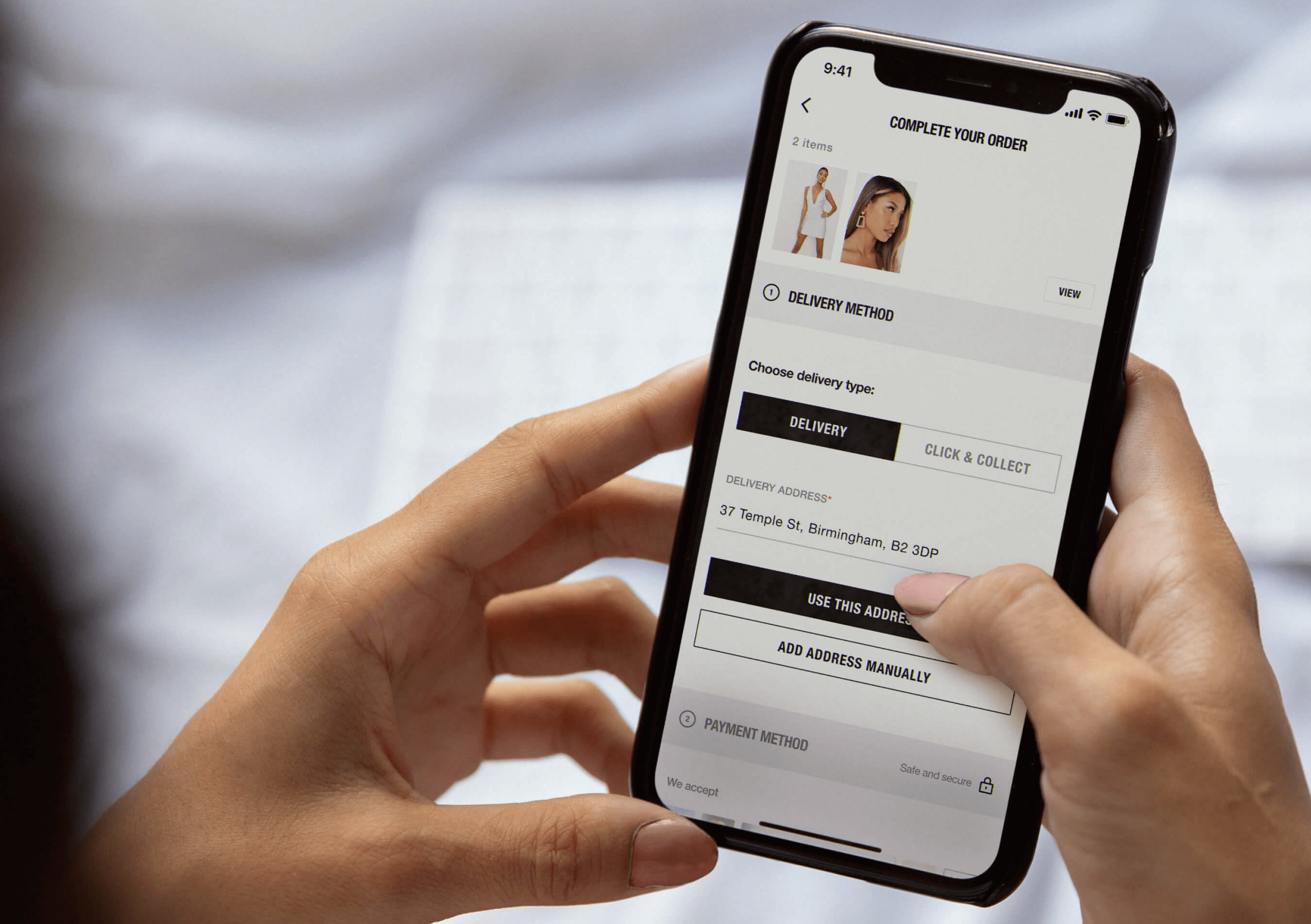
We collaborated with Missguided, a leading women's clothing brand, to optimise their new app's checkout flow. Recognising the potential of the digital realm, Missguided sought to enrich its user experience, providing the freshest fashion threads at the tap of a button. Leveraging our Product Sprints framework, we performed a comprehensive analysis and then proposed validated designs, mitigating risk to Missguided's investment.
Our high-velocity approach to problem-solving allowed us to deliver within a swift 15-day turnaround period. We capitalised on Missguided's trust in our autonomy, accountability, and authority, identifying 41 potential defects swiftly via our rigorous Experience Review framework. Our team, committed to leaving no stone unturned, delivered 29 redesigned screen layouts for the enhanced checkout experience, each intricately prototyped to guide development.
The results exceeded expectations. By addressing previously unnoticed user anxieties around the click-and-collect proposition, we managed to add significant value to the Missguided app's checkout experience. Our engagement with Missguided demonstrates our commitment to improving UX/CX while rapidly validating hypotheses and concepts, further emphasising our role as a critical partner for businesses looking to optimise their digital offerings.
You may also like…
- 24 core screens designed across core journey
- Delivered across two sprints
- 24 core screens designed across core journey
- Delivered across two sprints
- 24 core screens designed across core journey
- Delivered across two sprints
- 24 core screens designed across core journey
- Delivered across two sprints
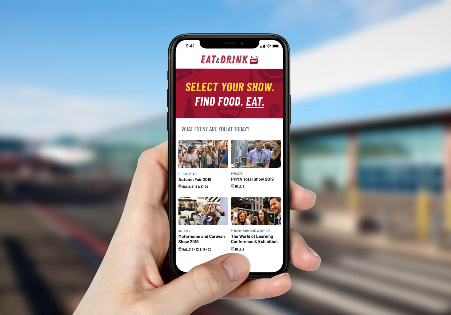
NEC
In-destination food and drink finder
- 2.3% in-store conversion rate increase
- 31 screens designed and delivered
- Delivered in 2 sprints
- 2.3% in-store conversion rate increase
- 31 screens designed and delivered
- Delivered in 2 sprints
- 2.3% in-store conversion rate increase
- 31 screens designed and delivered
- Delivered in 2 sprints
- 2.3% in-store conversion rate increase
- 31 screens designed and delivered
- Delivered in 2 sprints
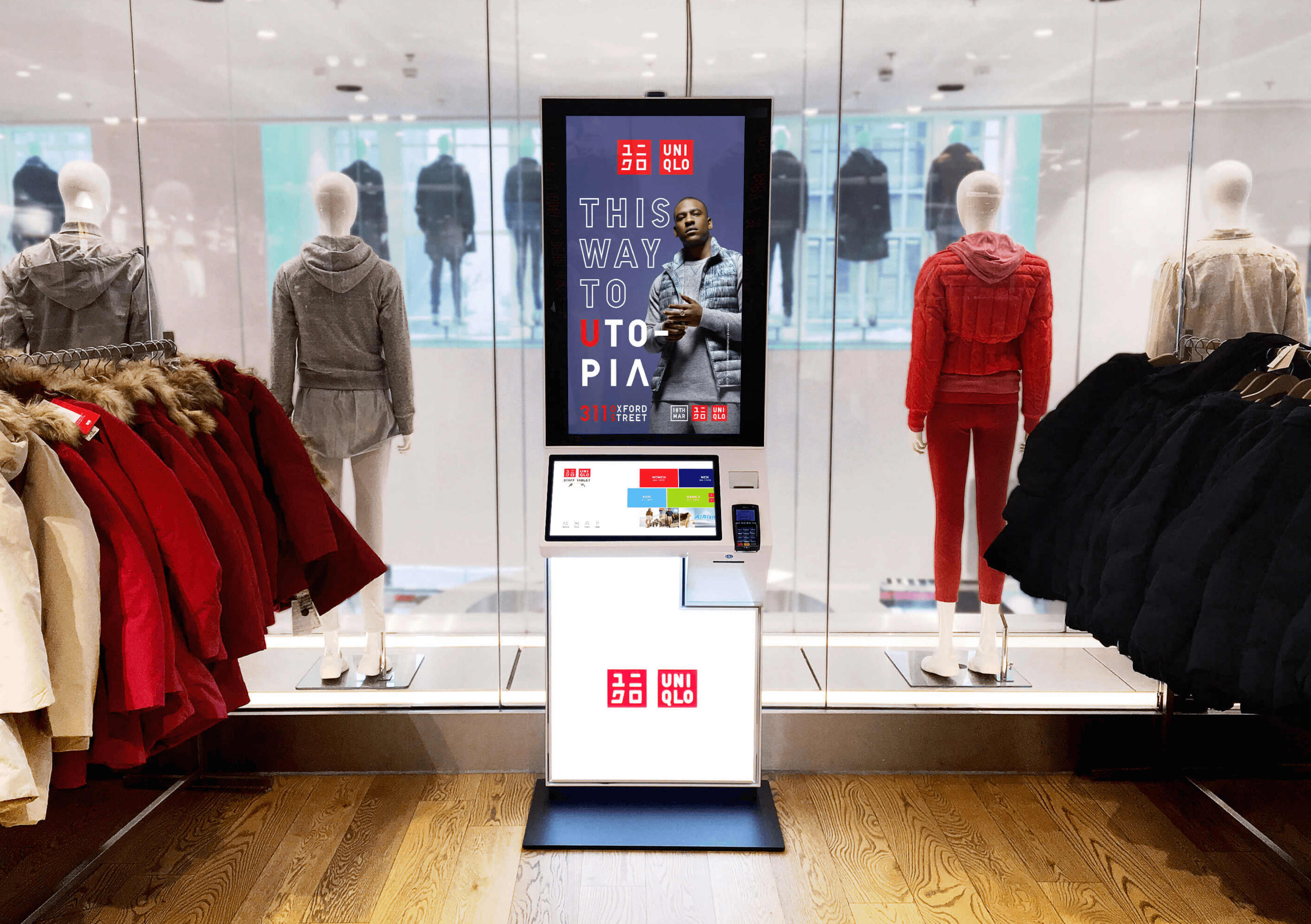
Uniqlo
Making kiosks the go-to tool for shoppers
