Qualifying a product backlog for action
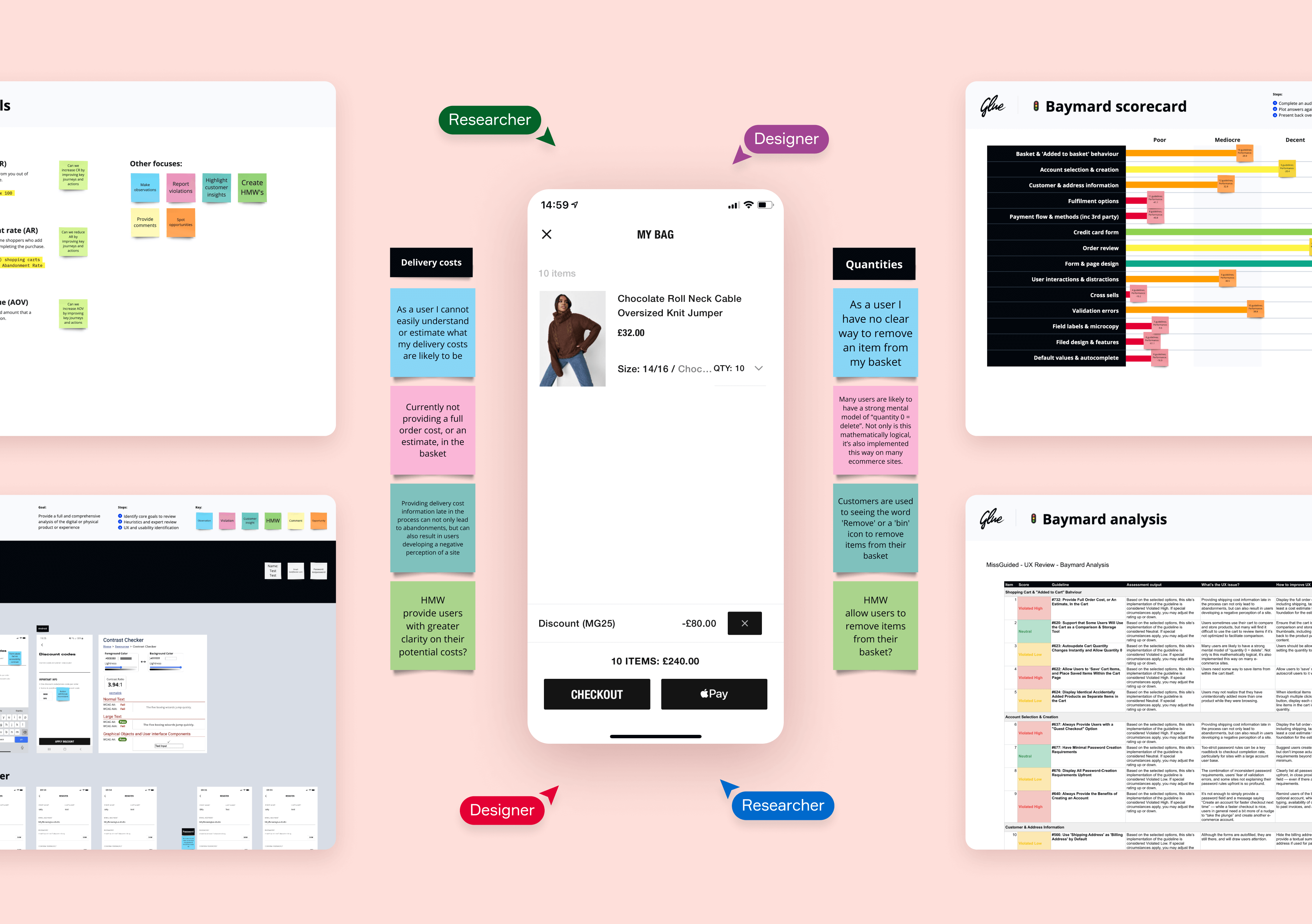
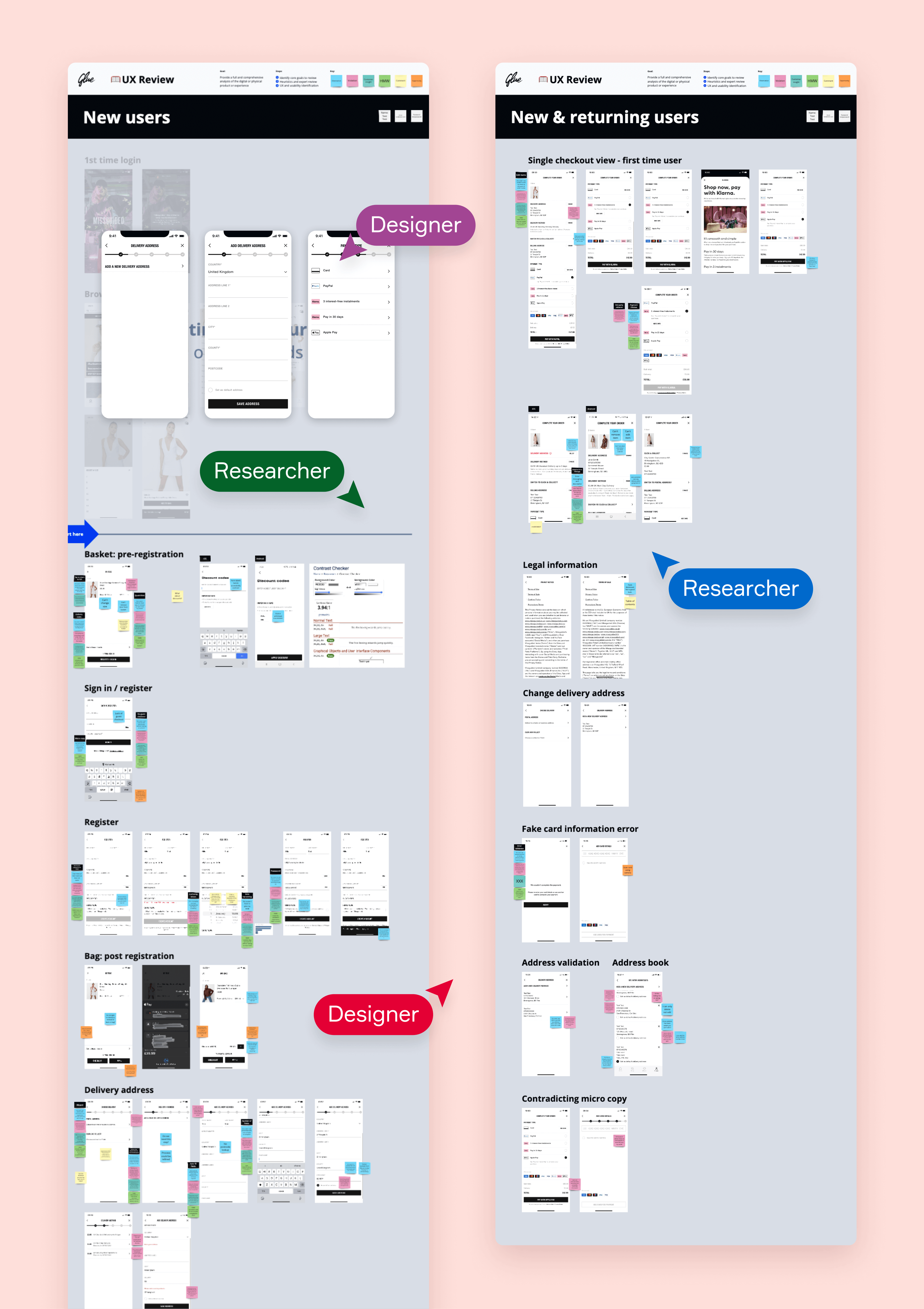
Our hardened approach to research enabled us to identify 41 defects in Missguided's app checkout experience. This approach allowed us to quickly pull together a highly qualified sprint backlog.
Experience reviews look to identify violations and issues in the user experience of a digital product or service. However, often, we spot opportunities to improve the experience.
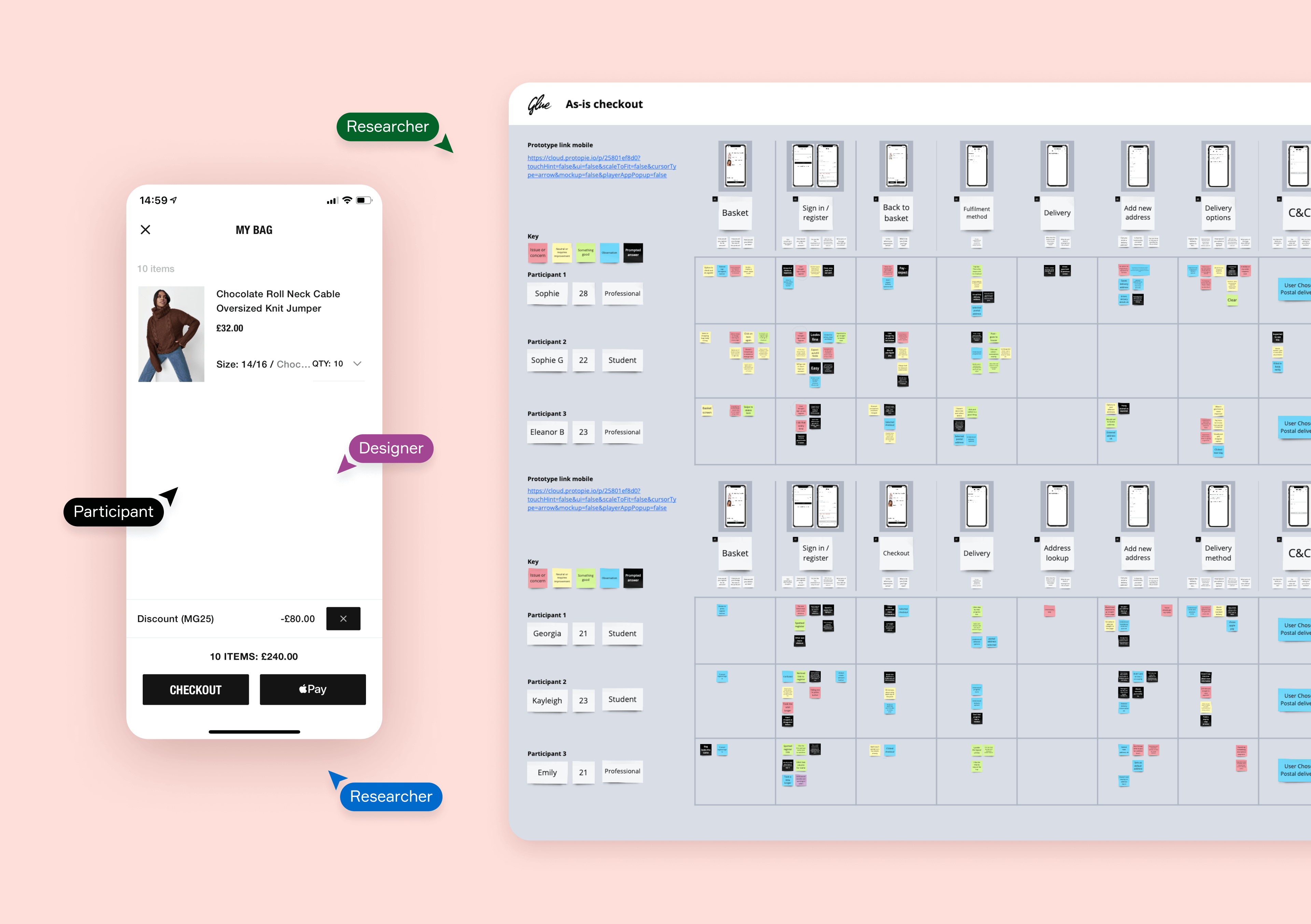
The experience review was conducted and delivered in a single 2-week sprint. With methods such as heuristic evaluation, expert analysis, Baymard audit, and usability test.
Details
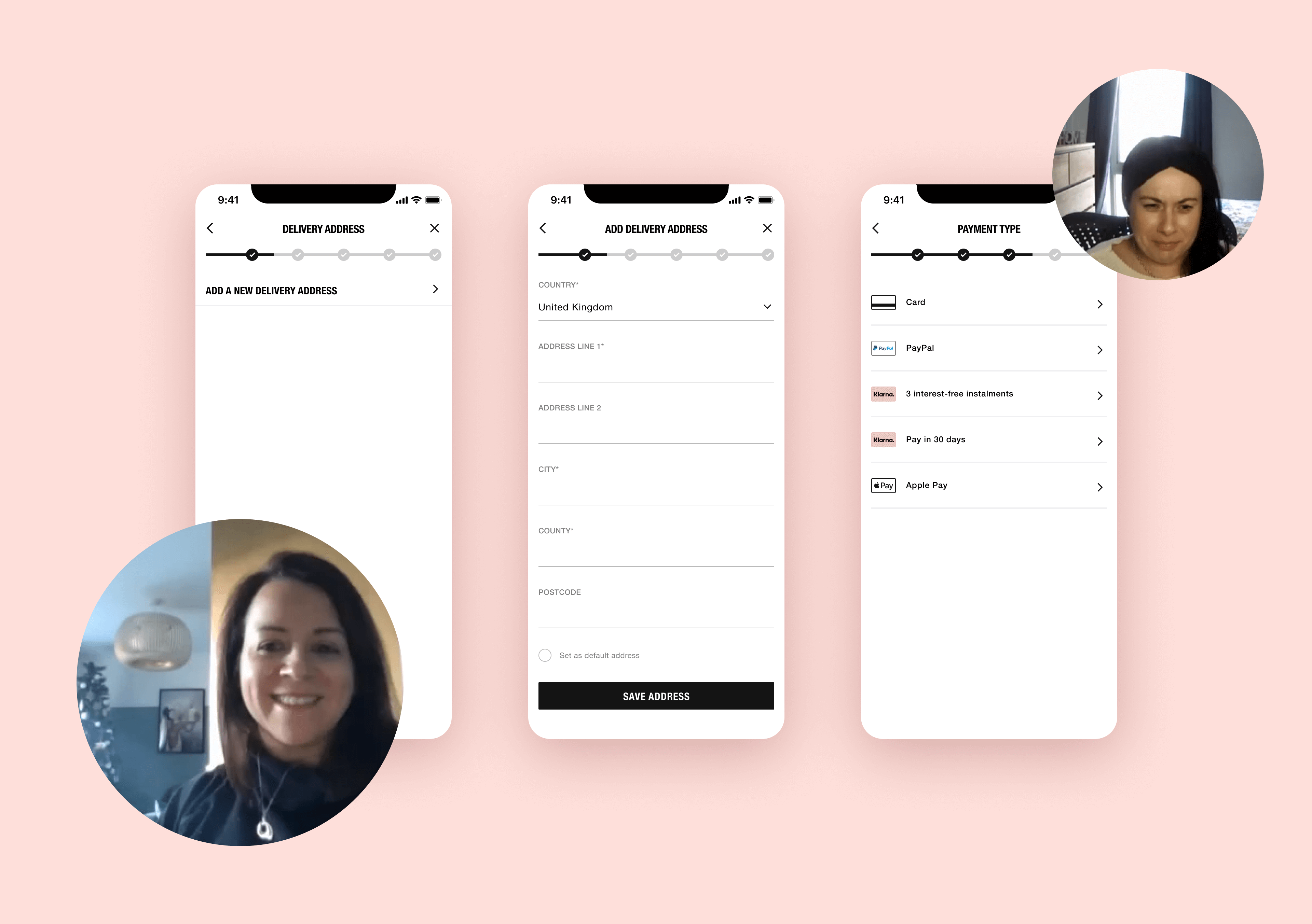
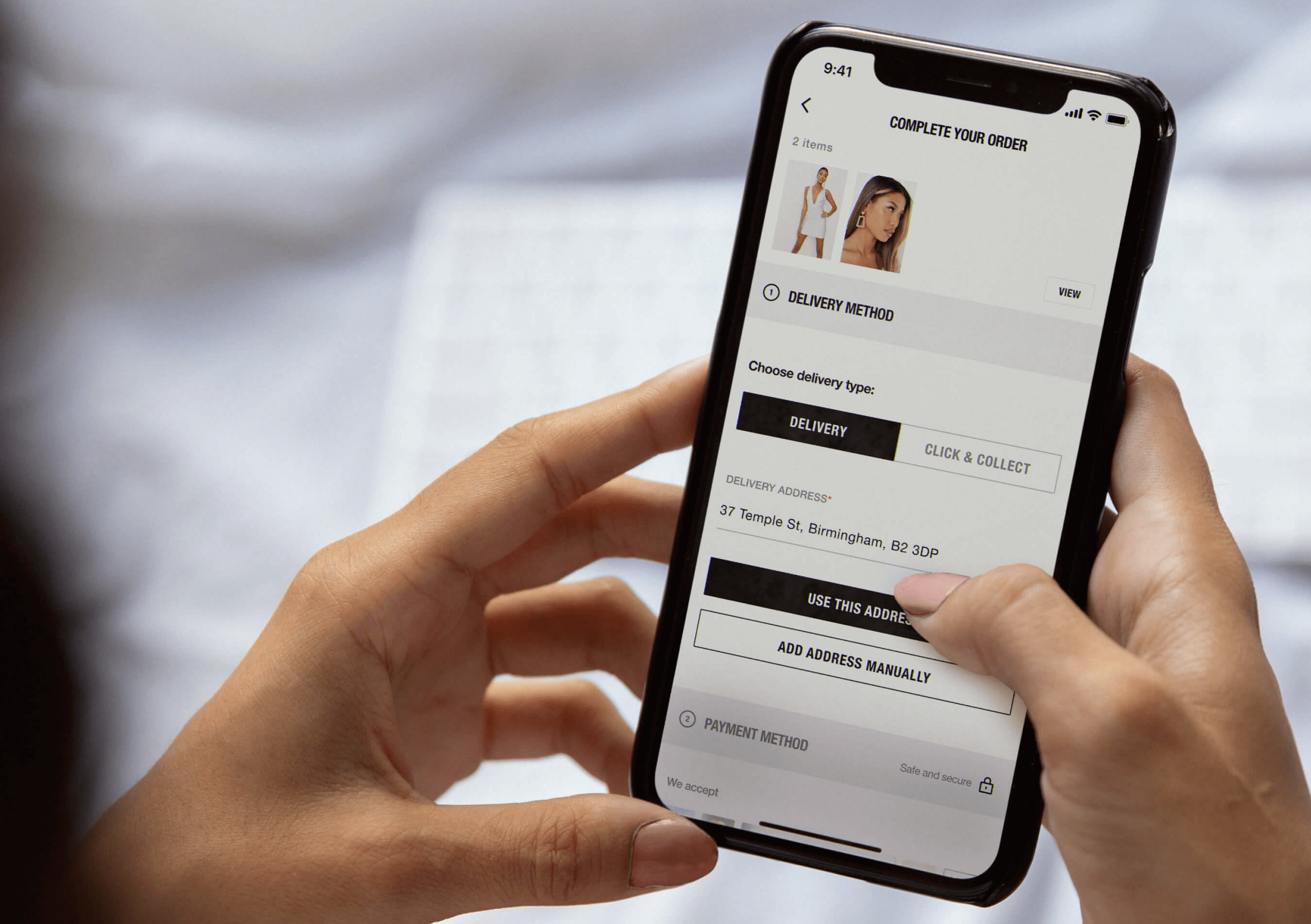
Collaborating with Missguided, the fast-fashion women's clothing brand, we deployed our Experience Review framework to refine their app's checkout user experience. Utilising key metrics, Baymard audits, funnel analysis, and usability testing we identified friction points, and opportunities to improve the customer journey and conversion rates while solidifying Missguided's competitive advantage.
Once the Experience Review had been completed, our researchers and strategists curated a backlog of value-scored recommendations, spawning from minor visual enhancements to substantive transformational changes. Each experiment was anchored by data-backed decision-making, facilitating an intuitive and engaging app checkout experience that aligns with current user expectations and trends.
The results were a testament to our proficiency in core journey redesign; Missguided's app showed significant improvements in user engagement and conversion rates, bolstering their return on investment. This venture underscores our commitment to implementing app optimisation strategies that drive real-world business impact.
You may also like…
- 15-days turnaround
- 29 screens designed
- Validated 2 prototypes with 12 participants
- 15-days turnaround
- 29 screens designed
- Validated 2 prototypes with 12 participants
- 15-days turnaround
- 29 screens designed
- Validated 2 prototypes with 12 participants
- 15-days turnaround
- 29 screens designed
- Validated 2 prototypes with 12 participants
Missguided
App checkout design and validation at speed
- MoM conversion rate of 6.9%
- LFL quarterly revenue of £265K
- MoM conversion rate of 6.9%
- LFL quarterly revenue of £265K
- MoM conversion rate of 6.9%
- LFL quarterly revenue of £265K
- MoM conversion rate of 6.9%
- LFL quarterly revenue of £265K

Hafele UK
Profitability through continual optimisation
