- Home
- Frameworks
- Product Design
- Design Systems
- Design System Creation
Design System
Creation 🏗️️
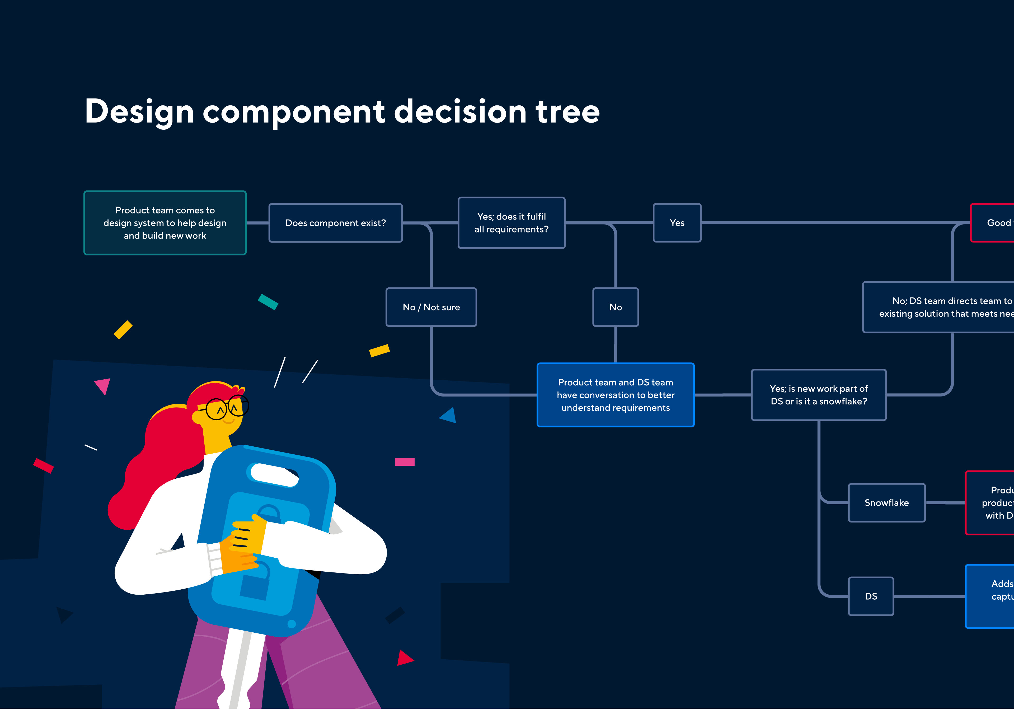
Creating a Design System from scratch, building a robust foundation and atomic process to manage design assets at scale. Incorporating brand governance, platform architecture, and scalability across multiple digital products and implementation teams.
Design Systems systemise design architecture, best practices, and implementation principles. Consolidating efficiency, consistency, and utilisation, while empowering a more concise and controlled landscape of digital products.
This framework is ideal when:
Framework key methods:
Framework deliverables:
Our Design System Creation framework sets the stage for a transformative design journey. It provides a clear, scalable path for your organisation to express its brand experience, fostering an environment of innovation, quality, and user-focused design thinking.
Book a call to discuss your Design System Creation needs

Successful examples of Design System Creation
- 1-month to deliver
- Built for optimisation
- 1-month to deliver
- Built for optimisation
- 1-month to deliver
- Built for optimisation
- 1-month to deliver
- Built for optimisation

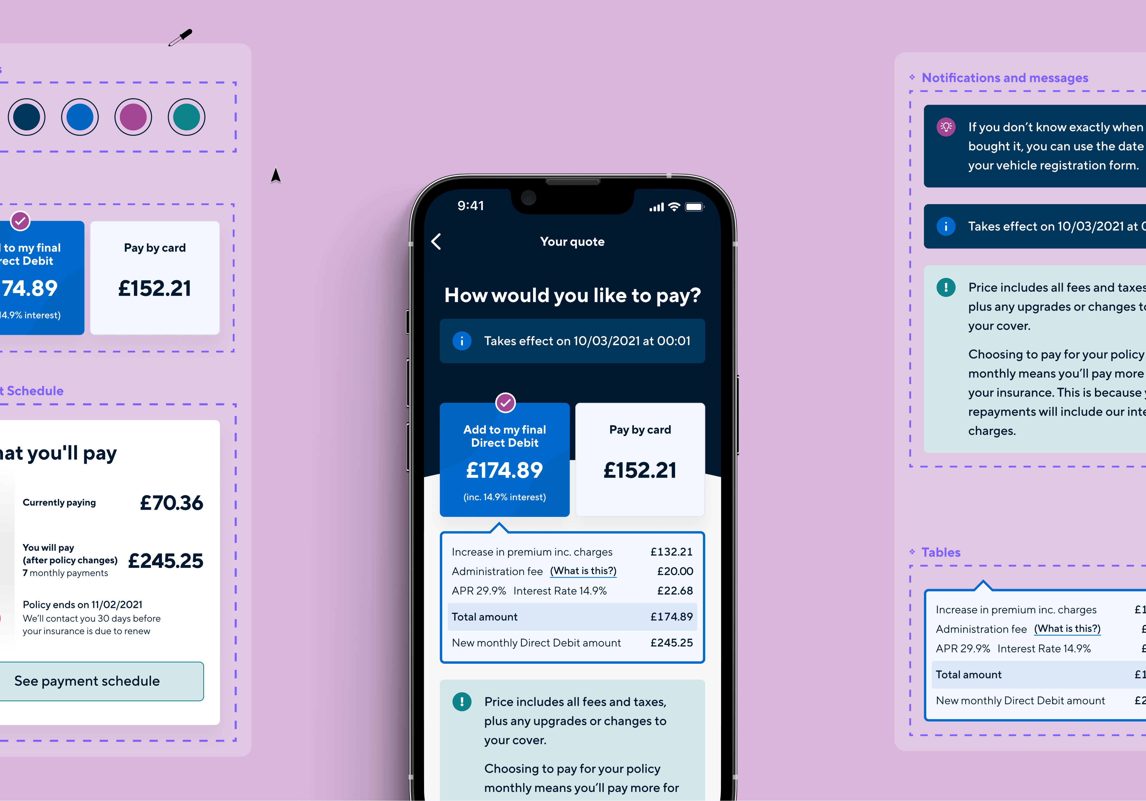
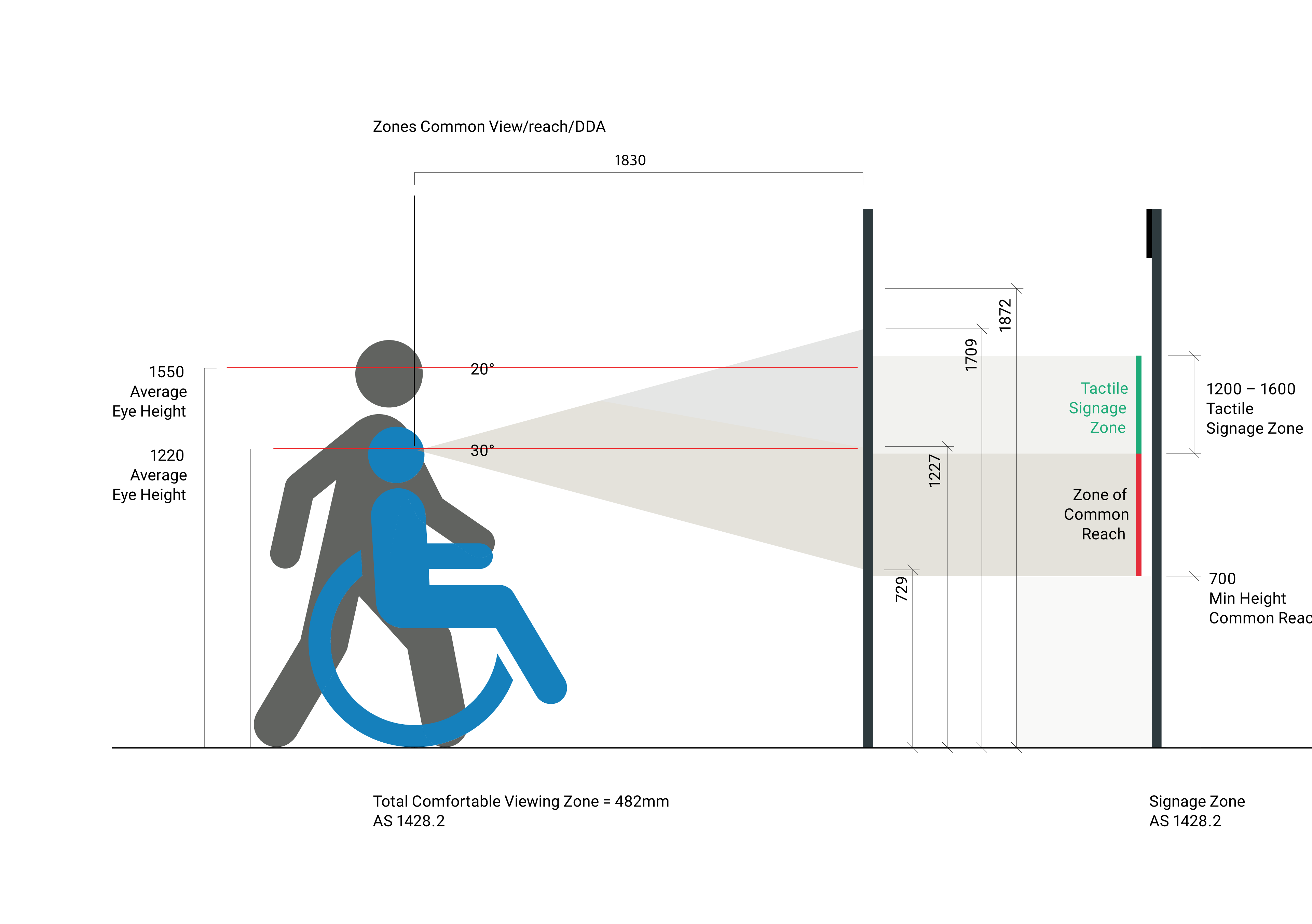
Hastings Direct
Delivering a scalable digital design system
- Design system for 20+ touchpoints
- 38 scalable icons with responsive variables
- 40% reduction in design time for new features
- Design system for 20+ touchpoints
- 38 scalable icons with responsive variables
- 40% reduction in design time for new features
- Design system for 20+ touchpoints
- 38 scalable icons with responsive variables
- 40% reduction in design time for new features
- Design system for 20+ touchpoints
- 38 scalable icons with responsive variables
- 40% reduction in design time for new features
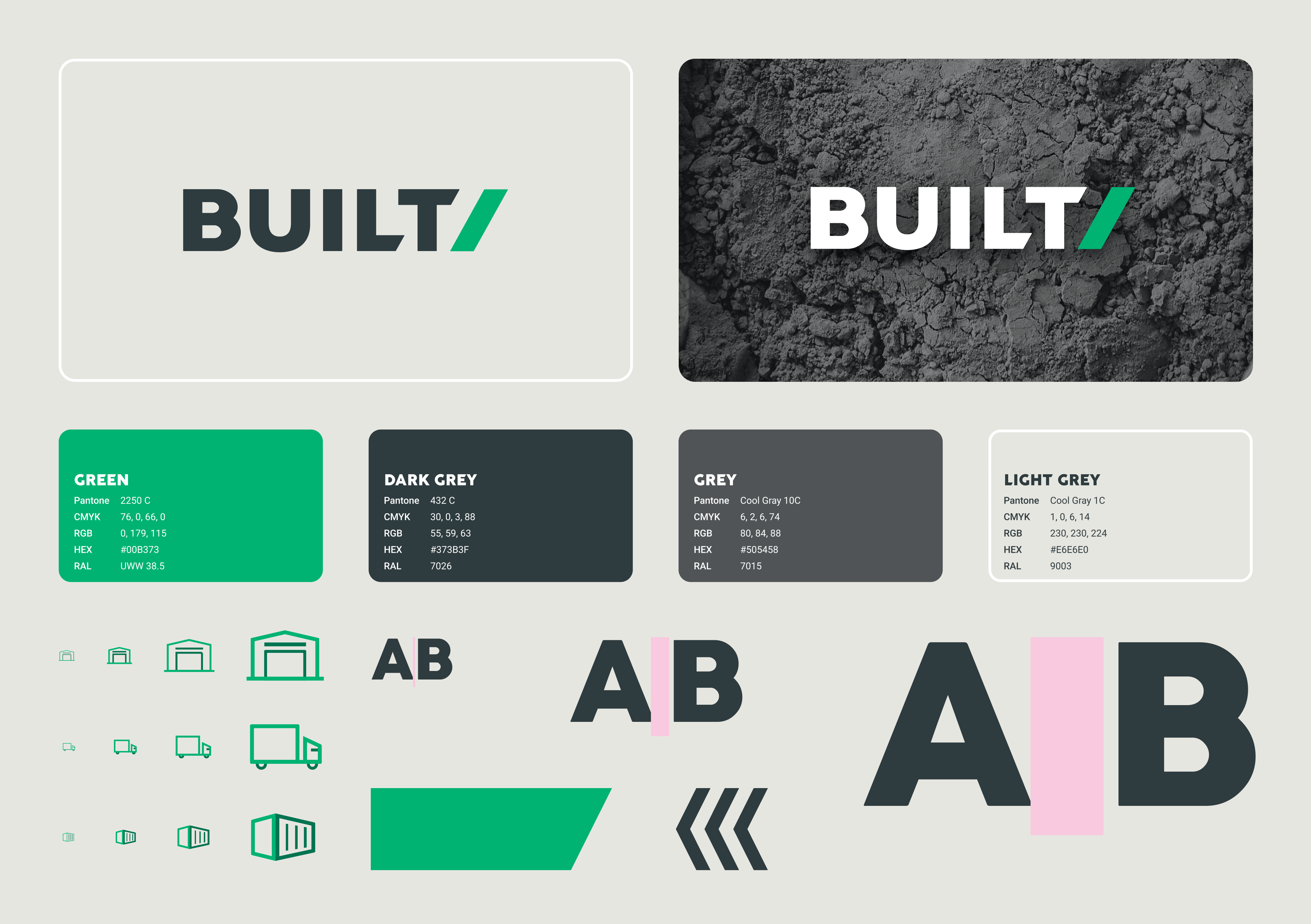
BUILT/
Design consistency across every channel
- Scalable design system fit for multi-site use
- Delivered in one sprint
- Scalable design system fit for multi-site use
- Delivered in one sprint
- Scalable design system fit for multi-site use
- Delivered in one sprint
- Scalable design system fit for multi-site use
- Delivered in one sprint
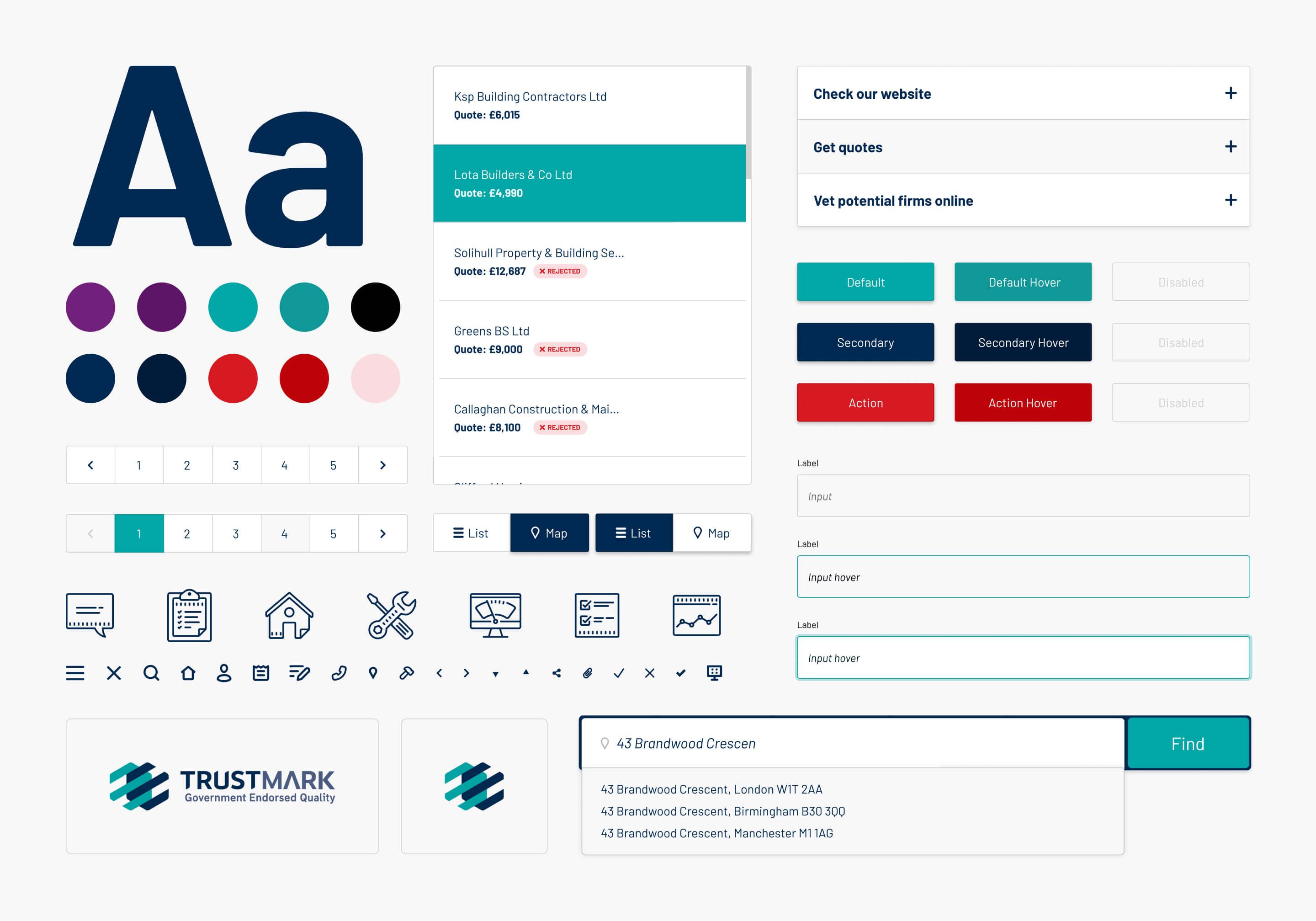
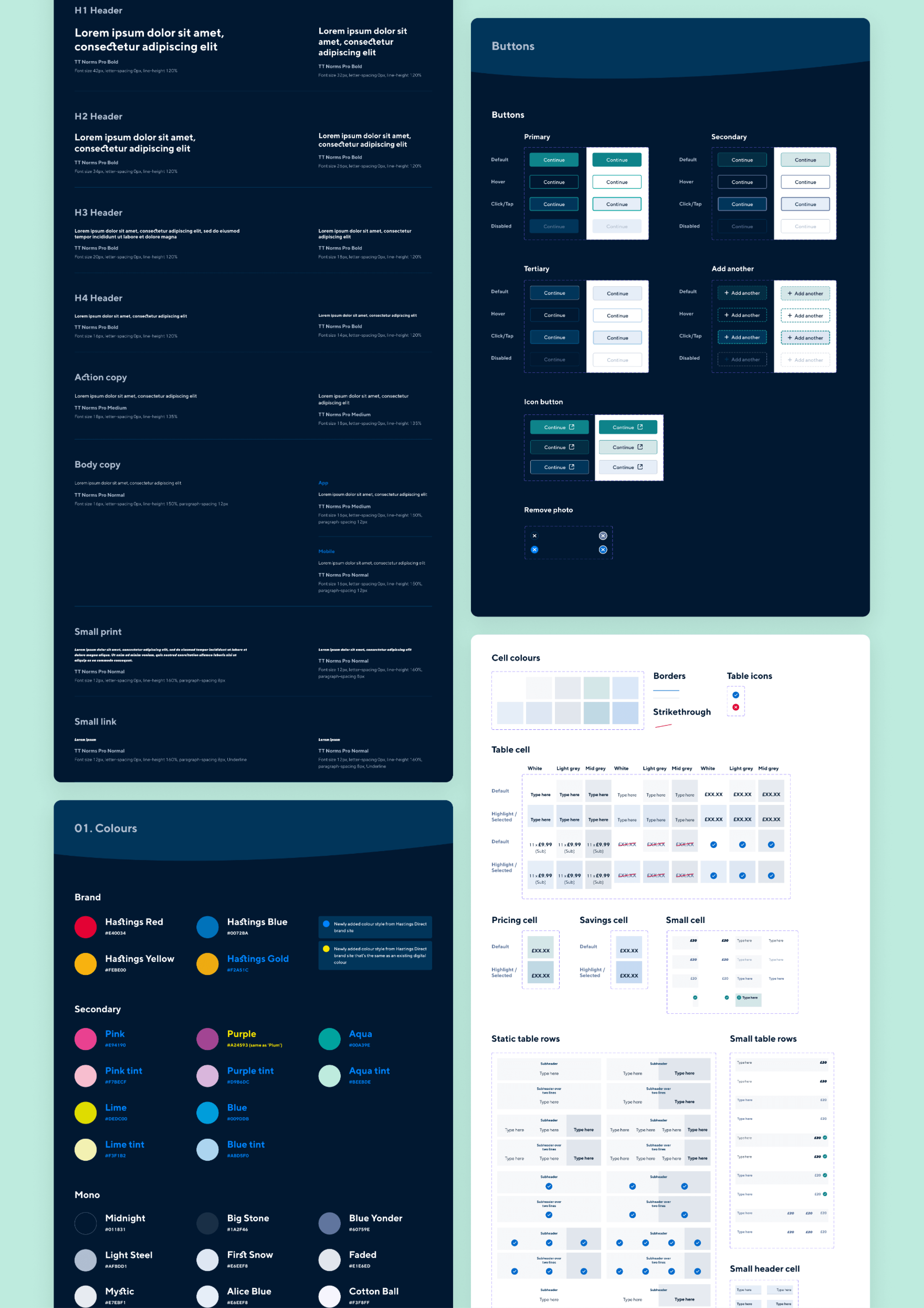
TrustMark
Multi-site design system
- 52 core components across the design system
- Delivered across two sprints
- 52 core components across the design system
- Delivered across two sprints
- 52 core components across the design system
- Delivered across two sprints
- 52 core components across the design system
- Delivered across two sprints
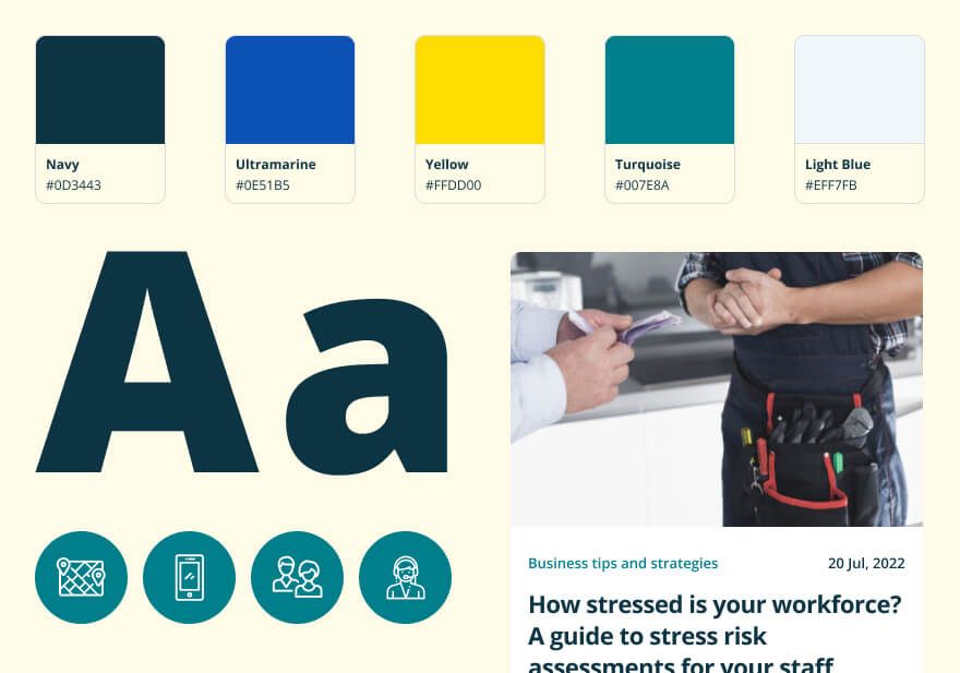
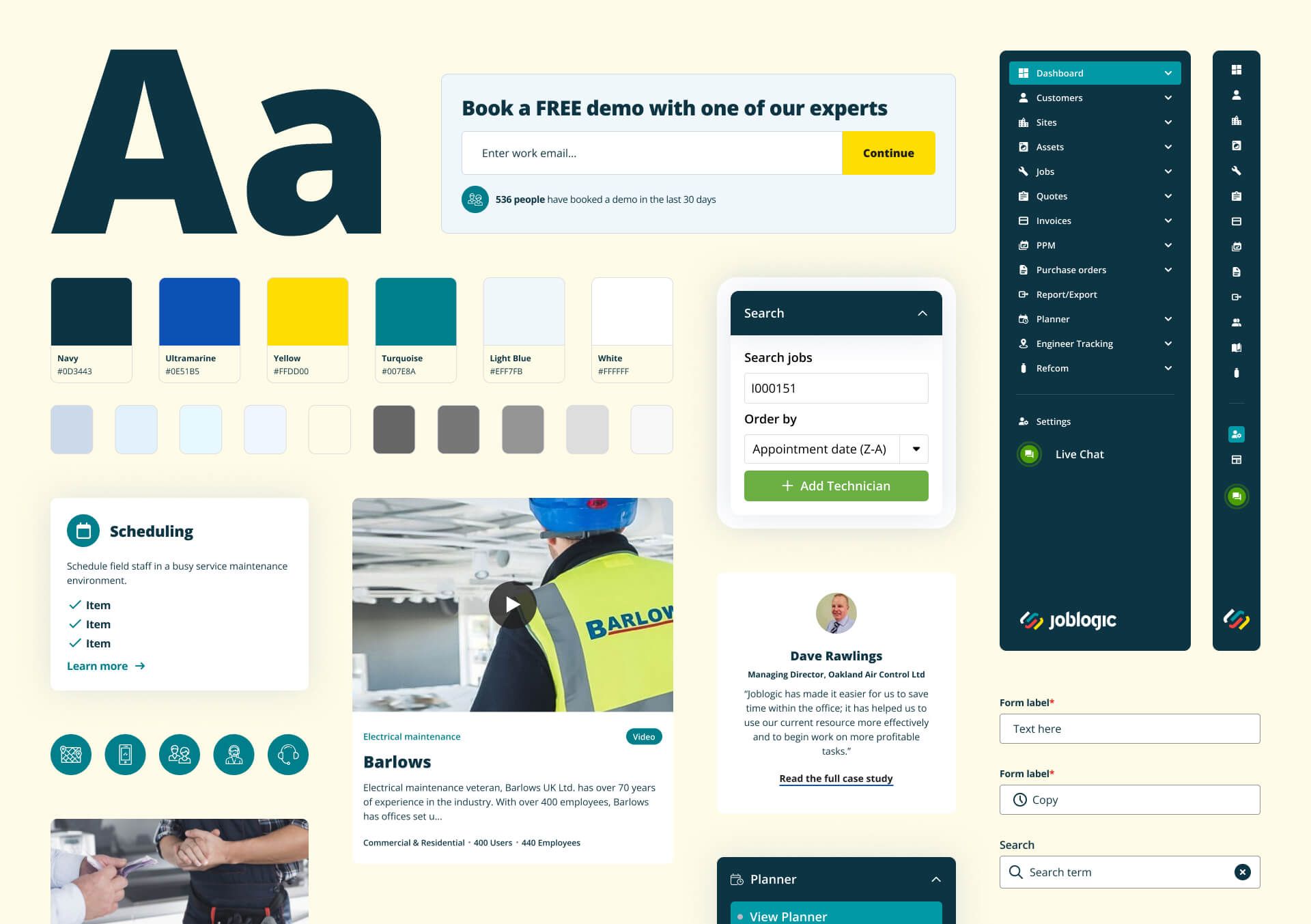
Joblogic
Brochureware website design system
Other frameworks you may also like…